- All of Microsoft

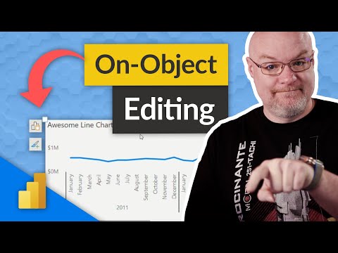
3 tips for the new On-Object editing of a Power BI visual
Have you started using the new on-object editing for Power BI visuals? Adam found some hidden gems that you may not be aware of when using it!
Have you started using the new on-object editing for Power BI visuals? Adam found some hidden gems that you may not be aware of when using it! You need to be aware of these!
On-object interaction is the new way to build and format a visual, directly on the visual. It puts common actions for creating and formatting visuals on the visuals themselves, actions such as adding fields, changing visualization types, and formatting text.
Use on-object interaction with visuals in your report (preview) - Power BI | Microsoft Learn
What Power BI visuals?
Power BI visuals are interactive graphical representations of data that are created using the Power BI data visualization tool. Power BI is a business intelligence and data analytics tool that enables users to collect, analyze, and present data in a visually appealing and interactive way.
What are the best BI visuals?
The best Power BI visual for any particular project will depend on the type of data being analyzed, the audience, and the goals of the project. However, here are some commonly used and popular Power BI visuals:
- Bar chart: A bar chart is one of the most basic and commonly used Power BI visuals. It is used to represent data as a series of rectangular bars, with the length of each bar proportional to the value it represents.
- Line chart: A line chart is used to show trends over time or to compare different data series. It is useful for visualizing data that changes continuously.
- Scatter plot: A scatter plot is used to show the relationship between two variables. It is useful for identifying patterns or correlations in data.
- Pie chart: A pie chart is used to show the proportion of different categories within a dataset. It is useful for comparing the relative sizes of different categories.
- Map: A map is used to show data geographically. It can be used to visualize data such as population density, sales by region, or the location of stores.
- Gauge: A gauge is used to show progress towards a goal or target. It is useful for visualizing KPIs or other metrics that have a defined target value.
- Table: A table is a simple visual that shows data in rows and columns. It is useful for displaying detailed data or for comparing values across different categories.