Boost Visibility: Optimal Growth with Power BI Area Charts
Technical Lead - Business Intelligence • Microsoft Certified PL-300 • Data Analyst • Power BI Youtube
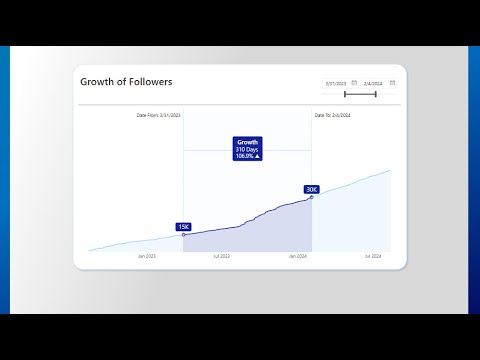
Explore Growth Using Power BI Area Chart: Visualize Time Series Effectively
Key insights
- Using an Area Chart is highlighted as a favorite method to depict Growth over Time in Power BI.
- The video was recorded under unusual circumstances during a flood, adding a unique backdrop to the tutorial.
- References to additional resources and templates like the Original PBIX from Ashish are provided for enhanced learning.
- The creator actively encourages viewers to support the channel for more insightful Power BI tutorials.
- The use of hashtags such as #POWERBI, #DATAANALYTICS, and #BUSINESSINTELLIGENCE underscores the video’s focus on professional data analysis tools.
Exploring Area Charts in Power BI
Area Charts in Power BI are a powerful way to visualize data, particularly when it comes to displaying how quantities change over time. This type of visualization fills the area between the axis and line, which emphasizes the magnitude of trends rather than just the peaks and troughs. Its application is broad, ranging from financial reporting to resource management. In the example provided, even during adverse conditions like a flood, Power BI proves to be a resilient tool for data analysis. The video also points to valuable resources and encourages community support to enable the provision of more free educational content. Furthermore, using specific hashtags can strategically enhance the visibility of educational content related to business intelligence in professional circles on social media platforms.
Injae Park's latest video delves into the effective application of area charts to demonstrate growth trends over time in Power BI. Recorded during adverse weather conditions, Park underscores his resilience and dedication to sharing knowledge. This video is highlighted as one of his favorites, focusing on the simplicity yet efficacy of the area chart in visual representations.
Originally inspired by a template from another Power BI enthusiast, Ashish, whose work can be viewed online but not directly linked here. Park adapts this template for his educational purposes, illustrating how beginners can harness powerful data visualization tools to display complex data smoothly and comprehensively. He also provides resources for viewers to get started on their projects, though direct links have been omitted for clarity.
Viewers who find Park’s instructional videos beneficial are encouraged to support his channel. This allows him to create more content focused on Power BI and related data analytics topics. Acknowledging the community’s support, he thanks them for viewing and participating in his educational journey, which covers various aspects of data analysis and business intelligence.
Exploring Power BI and Data Visualization Trends
Power BI has increasingly become a tool of choice for professionals seeking robust data visualization capabilities. It is designed to help users integrate various data sources and present them in an interactive format. This not only speeds up the decision-making process but also allows a clearer understanding of large data sets through visual aids like area charts, one of the simplest yet most powerful tools within the software.
Area charts are particularly useful in displaying cumulative totals over time using colors and shapes, making them ideal for showcasing trends in data sets. Injae Park’s demonstration using area charts provides clear insights into how beginners can effectively use such tools to present data growth or decline over specific periods.
The increasing dependency on data-driven decision-making in business environments underscores the relevance of tools like Power BI. It bridges the gap between data handling and business strategy, presenting a holistic view of operational and strategic insights.
Moreover, Park’s efforts to educate users through online videos contribute to a wider understanding of these tools. This form of online education helps many users who may not have formal training in data analysis to grasp essential concepts and apply them in real-world scenarios.
As digital transformation accelerates, understanding and utilizing data visualization tools effectively will be key to business success. Educational resources like those provided by Park play a crucial role in democratizing data knowledge, making it more accessible to a broader audience.
The community aspect of learning and sharing knowledge on platforms like YouTube further enhances the value provided by these educational videos. They create a collaborative environment where learners can also contribute, enhancing collective knowledge and refining techniques.
Power BI

People also ask
## Questions and Answers about Microsoft 365"What is the best graph to show growth over time?"
Answer: "A Line Graph is the preferred chart for illustrating changes over time. Typically, the x-axis (horizontal axis) represents time.""How do you show trends over time in Power BI?"
Answer: "In Power BI, to highlight trends over time, utilizing line charts is highly effective. These charts allow you to visualize how data points progress through different periods clearly.""Which chart is used to show information that changes over time in Power BI?"
Answer: "Waterfall charts are excellent for displaying how specific measures have evolved over time or across various categories.""When to use area chart in Power BI?"
Answer: "Area charts are ideal in Power BI for visualizing and comparing volume trends over time, especially when dealing with countable data sets."
Keywords
Area Chart Growth, Growth Over Time Visualization, Power BI Area Chart, Visualizing Growth Power BI, Time Series Analysis Power BI, Area Chart Time Series, Business Intelligence Growth Chart, Power BI Data Visualization