Power BI: Visuals Update — Zoe Douglas
Founder | CEO @ RADACAD | Coach | Power BI Consultant | Author | Speaker | Regional Director | MVP
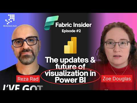
Microsoft expert interviews Zoe Douglas on Power BI visualization updates, roadmap and Fabric integration demos
Key insights
- Overview: In a Fabric Insider interview, Zoe Douglas (Power BI product leadership) outlined recent and upcoming visualization updates.
These changes aim to make reports cleaner, faster to build, and easier to maintain. - Modern Visual Defaults: Power BI now uses a refreshed base theme with a modern canvas, smoother chart rendering, improved button styles, subtitle support, and slicers that default to dropdowns.
This preview reduces manual formatting and aligns visuals with Microsoft's Fluent design principles. - Theme Schema Enhancements: The theme model now supports reusable named colors and page-size configuration.
Report creators can build consistent looks across pages and reuse palettes for faster, branded reports. - Custom Totals: Tables and matrices can now show column-level custom totals (sum, min, max, count, distinct count) and use the visual calculations engine.
Totals respect the full filter context so summary numbers stay accurate in interactive reports. - DAX Query View: The new view exposes and lets analysts edit the DAX behind visuals, inspect queries, and optimize performance.
Power users can tune measures, check query plans, and diagnose slow visuals more directly. - Impact and Availability: Most features are rolling out as previews (early 2026) and will appear in Desktop and browser editing workflows.
Report authors should expect faster design work, clearer storytelling, and stronger controls for accurate analytics.
Introduction
The latest episode of the Fabric Insider series, presented by Reza Rad (RADACAD) [MVP], features an in-depth interview with Zoe Douglas, Principal Product Manager for Power BI. In the YouTube video, Douglas outlines several visualization advances and provides a roadmap for upcoming capabilities that aim to modernize reporting and analytics. Consequently, the conversation highlights both immediate preview features and broader design directions for Microsoft's analytics platform.
Overall, the interview serves as a clear briefing for report authors, BI teams, and developers who rely on Power BI within the Microsoft Fabric ecosystem. Reza Rad frames the discussion to focus on practical impacts, while Douglas offers product-level context and demonstrations. Therefore, viewers get a mix of conceptual roadmaps and concrete examples that help set expectations for adoption and migration.
Key Visual Modernization: Modern Visual Defaults
One of the headline announcements in the video is the preview of Modern Visual Defaults, a set of updated look-and-feel defaults aligned with Microsoft's Fluent design language. Douglas demonstrated how new reports receive a refreshed base theme, improved chart rendering, and updated interactive elements that aim to make visuals more consistent and accessible out of the box. Moreover, she showed how subtitles, standardized padding, and reusable named colors create a more coherent storytelling canvas for report authors.
However, the update involves tradeoffs that organizations must weigh. For example, while the new defaults speed up report creation and improve visual consistency, they can also change the appearance of legacy reports when edited in the browser, which could disrupt established dashboards. Consequently, BI teams need to plan for selective adoption, testing, and communication to stakeholders so that design changes do not inadvertently confuse end users or break brand guidelines.
Custom Totals and Aggregation Flexibility
Another major feature showcased is Custom Totals, now in preview, which gives report authors the ability to configure how totals are calculated and displayed in tables and matrices. Douglas explained that users can choose between sum, min, max, count, and distinct count for total rows, and that these totals respect the full filter context of the visual. As a result, analytics teams can present clearer summaries that better reflect business logic and interpretation.
Still, this flexibility introduces both benefits and challenges. While custom totals improve clarity in many analytical scenarios, they increase the number of configuration decisions a report designer must make, and inconsistent choices across reports can lead to confusion. Therefore, governance around report template settings and documented guidance will be necessary to keep reporting consistent across teams and to reduce the cognitive load for report consumers.
DAX Query View and Advanced Analytics
The interview also delved into the evolving role of the DAX Query View, a capability designed to expose the underlying DAX queries and support advanced exploration and debugging. Douglas described how the feature helps analysts and developers understand query generation, optimize performance, and validate calculation logic within interactive reports. Thus, it becomes a valuable tool for teams that need to troubleshoot slow visuals or complex measures.
Nevertheless, expanding access to query-level details requires careful balance. On one hand, advanced users get powerful insight into model behavior, but on the other hand, exposing query internals can overwhelm less technical report authors and may lead to ad hoc optimizations that degrade model consistency. Consequently, product teams must pair such features with clear documentation, role-based access guidance, and training to avoid misuse while enabling deep diagnostics.
Tradeoffs, Adoption Challenges, and Roadmap Considerations
Douglas and Rad discussed the broader roadmap and how Microsoft plans to phase preview features into general availability, and they pointed to community feedback channels for prioritization. Importantly, rolling out modern defaults and new aggregation controls across a global user base brings tradeoffs around backward compatibility, performance testing, and third-party visual compatibility. Therefore, organizations should adopt a staged approach that includes pilot groups, compatibility checks for custom visuals, and migration plans for critical dashboards.
Finally, the interview underscores practical challenges in balancing design, performance, and governance. While modern visuals and richer aggregation control support better storytelling, they can also increase complexity in report maintenance and require updated governance policies. As a result, BI leaders must coordinate between design, IT, and analytics teams to define standards, monitor performance, and educate users so that new features deliver value without unintended disruption.
Conclusion
Reza Rad’s interview with Zoe Douglas offers a useful roadmap for organizations using Power BI and Microsoft Fabric, presenting both new capabilities and realistic considerations for adoption. The video balances demonstrations with frank discussion of tradeoffs, making it a pragmatic resource for report authors, BI managers, and developers. Consequently, teams planning upgrades or modernization efforts should review the preview features, run targeted pilots, and prepare governance so that the transition to modern visuals and enhanced analytics is smooth and sustainable.

Keywords
Power BI visualization updates, Future of Power BI visuals, Power BI interview Zoe Douglas, Power BI visualization trends 2026, Power BI custom visuals updates, Power BI report design best practices, Power BI AI visuals features, Power BI visualization roadmap