Power BI: One-Page KPI Dashboard
Microsoft expert on one page Power BI KPI dashboards, report development with Power BI Desktop DAX certification
Key insights
- Single-page KPI dashboard: A compact Power BI page that shows the business heartbeat with multiple KPIs at a glance.
Use interactive filters (time, region, department) so leaders can change views without navigating away. - Core data model: Build a clean semantic model that separates the indicator (current value), target (goal), and trend axis (time series).
Prepare consistent date keys and standardized measures before designing visuals. - Visual choices & layout: Use cards, gauges, and trend lines to show status, variance, and direction.
Design a clear visual hierarchy—place top-priority KPIs where the eye lands first and use color sparingly for status cues. - Interactions and UX: Add drillthrough, rich tooltips, and conditional formatting so users can explore details without leaving the page.
Optimize for mobile and test performance with realistic data volumes. - Common KPIs to include: Total Revenue, Revenue vs Target, Churn Rate, Monthly Active Users (MAU), and Pipeline Value.
Prioritize metrics that drive decisions and keep supporting details available via drill paths. - Best practices and maintenance: Implement reusable DAX measures, schedule reliable data refresh, document KPI definitions, and set thresholds for alerts.
Review dashboards periodically to keep metrics aligned with business goals.
Introduction
The YouTube video from How to Power BI demonstrates how to present essential metrics on a single executive page using Power BI. The presenter focuses on clear visual hierarchy and compact layouts so leaders can scan performance at a glance. Furthermore, the video emphasizes practical steps and a downloadable sample to help viewers replicate the design in their own reports.
Overall, the tutorial aims to help report authors combine trend context, target comparisons, and status indicators without overwhelming users. Consequently, it targets common executive needs: quick comparison of actuals versus goals, trend direction, and the ability to drill into details when needed. The video balances template examples with explanations about why each visual choice matters.
What the Video Shows
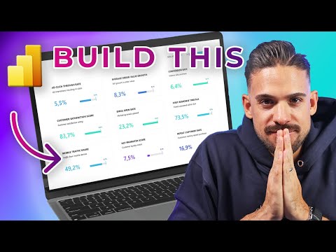
First, the creator walks through a compact dashboard that places multiple KPI cards, trend charts, and target markers on one canvas, explaining how each element supports fast decision making. The layout mixes numeric cards with mini-trends so viewers can read both current values and momentum in a single view. Also, the presenter highlights mobile considerations and how to tune visuals so the same page works on different screen sizes.
Next, the video demonstrates configuration steps, such as linking an indicator to a target and adding a trend axis for context, and it shows how conditional coloring helps call attention to exceptions. The instructor uses simple examples—revenue, churn, and active users—to illustrate those settings and to show how small formatting choices improve clarity. Moreover, the session references downloadable assets that speed up learning for newcomers.
Finally, the author includes practical tips on stacking visuals, aligning items, and keeping spacing consistent so the page reads well under time pressure. These production tips aim to reduce cognitive load and improve visual scanning. In addition, the video touches on how to organize filters and slicers so executives can change scope without navigating away from the page.
Design Techniques and Best Practices
The tutorial encourages using a clear visual hierarchy: large numeric cards for primary metrics, smaller trend sparklines for momentum, and subdued context elements for less critical numbers. This hierarchy helps viewers focus on what needs attention first and then inspect trends or supporting detail. Consequently, report viewers spend less time hunting for information and more time acting on it.
Moreover, the instructor stresses consistent color rules and explicit definitions of targets, which reduce interpretation errors. For example, green may indicate on-track while red flags underperformance, but the video also warns against using too many colors that create confusion. Therefore, the recommendation is to keep palette choices minimal and meaningful to preserve readability.
Tradeoffs and Challenges
While single-page KPI dashboards speed up executive decisions, the video acknowledges tradeoffs between completeness and clarity. Packing many metrics on one page can create visual clutter and increase cognitive load, especially when users must compare unrelated measures. Thus, designers must balance density with legibility and sometimes split content across pages or use drillthroughs for deeper analysis.
Performance is another tradeoff: many visuals and complex measures can slow report rendering, particularly with large data models. The presenter suggests optimizing the semantic model and using aggregated measures to keep interactions snappy, but notes this may limit ad-hoc exploration. Additionally, defining reliable targets and maintaining data quality remain ongoing challenges, because inaccurate targets or stale data can quickly undermine executive trust in a dashboard.
Implementation Steps and Practical Advice
Practically, the video recommends starting with data preparation—ensuring the model carries an indicator, a target, and a time axis—before arranging visuals. After that, authors should build each KPI visual with a clear purpose, configure the trend axis, and apply conditional formatting to show status. In parallel, creating a consistent layout grid reduces the iterative design time when changes arise.
The presenter also recommends testing the dashboard with actual executives to confirm that the chosen metrics and targets align with their priorities. Feedback cycles often reveal which indicators matter and which distract, so iterative refinement is essential. Finally, the video encourages documenting metric definitions and update frequency so users understand how the numbers were produced and how often they refresh.
Conclusion
In summary, the How to Power BI video provides a practical, hands-on guide to building an executive-friendly, single-page KPI dashboard in Power BI. It combines visual best practices with implementation tips and highlights real tradeoffs between density, performance, and clarity. Therefore, report authors who follow the approach should improve executive visibility while remaining mindful of data quality and model optimization.
For teams starting out, the video’s sample files and step-by-step walkthroughs offer a useful jumpstart, and the recommended feedback process ensures the dashboard evolves to meet real business needs. Ultimately, the approach works best when designers balance visual simplicity with the right level of detail, test performance early, and keep the data model clean and well-documented.

Keywords
Power BI KPI dashboard, one-page Power BI dashboard, executive Power BI dashboard, Power BI KPI scorecard, Power BI KPI visuals, Power BI dashboard tutorial, Power BI performance dashboard, single-page KPI report Power BI