Power BI Disconnected Slicers, Explained
Power BI guide on disconnected slicers and DAX to drive selected period KPIs while preserving rolling quarter trends
Key insights
- Disconnected slicer in Power BI is a standalone table used as a slicer so selections do not automatically filter the model.
Instead, DAX measures read the slicer choice and apply filters explicitly. - Use disconnected slicers for flexibility and a safer model design; they let you build a control layer that changes report logic without adding relationships.
This avoids unintended filters and reduces duplicated visuals or pages. - Typical setup uses a regular Date table linked to facts plus a separate disconnected Date table with no relationship.
The disconnected table supplies the slicer values (year/quarter) while the Date table stays as the model’s canonical calendar. - Write measures that read slicer choices using DAX functions like SELECTEDVALUE, TREATAS or SWITCH.
Combine those with quarter offsets so visuals can show custom ranges (for example, a rolling trend ending at the selected quarter). - In practice, use the slicer to let KPI cards and tables filter to the exact selected quarter while charts show a five-quarter trend that ends on that quarter.
This gives users both a precise snapshot and a short-term trend in one report page. - Build steps and best practices: create the small slicer table, add it to a slicer visual, keep it disconnected, then write clear measure logic and apply it as a visual-level filter when needed.
Always test edge cases (no selection, multiple selections, or missing dates) to ensure correct results.
Overview of the Pragmatic Works Tutorial
In a recent YouTube video, Pragmatic Works demonstrates how to use disconnected slicers in Power BI with a clear, real-world example. The presenter shows how a slicer can control report behavior without directly filtering every visual through model relationships. As a result, viewers learn to let users pick a year and quarter while keeping trend visuals that include prior periods intact.
Moreover, the walkthrough highlights practical scenarios such as updating KPI cards for a single period while showing a five-quarter rolling trend in a line chart. Consequently, the pattern gives report authors more precise control over which visuals respond to selection. Therefore, the tutorial helps bridge the gap between default slicer behavior and more nuanced reporting requirements.
Data Model and Slicer Setup
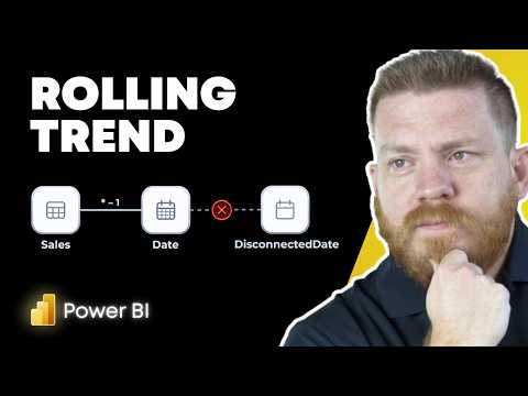
First, the video explains the underlying model that supports the approach, including a standard Date table connected to the Sales fact table and a separate disconnected Date table with no relationships. Next, the disconnected table serves solely as the source for the slicer, so the slicer selection does not apply filters automatically. Thus, the model preserves its integrity while providing a flexible control layer for the report.
Then, the presenter walks through how to populate the disconnected table with the periods you want available in the slicer, such as year and quarter combinations. In addition, he emphasizes why you should avoid creating active relationships from the slicer table to facts when you expect different visuals to behave differently. Consequently, the disconnected table functions as a user intent capture rather than a direct filter.
DAX Techniques and Implementation
Following the model setup, the tutorial focuses on DAX measures that read the slicer choice and enforce custom filter logic. For example, the presenter uses functions like SELECTEDVALUE and TREATAS to translate the slicer selection into a filter context that visuals can consume. Then, he builds a measure for a rolling trend that calculates a five-quarter window ending on the selected quarter.
Furthermore, the video shows how to use a SWITCH pattern or conditional logic to update KPI cards and tables so they show only the selected period. At the same time, the trend chart uses an offset calculation so it includes the previous four quarters along with the selected quarter. Therefore, the DAX layer becomes the bridge between the disconnected slicer and the visuals that should or should not react to the selection.
Benefits and Tradeoffs
One clear benefit of this design is flexibility: you can control multiple visuals from one slicer without restructuring the model or making duplicate report pages. Additionally, because the slicer table is not related to facts, it avoids unintended automatic filtering that could produce incorrect results. As a result, report authors gain cleaner logic and the ability to create a single interface that supports several analytical views.
However, this flexibility comes with tradeoffs. First, DAX measures tend to get more complex and require careful testing, which increases maintenance effort. Second, extensive use of disconnected slicers can raise performance concerns, particularly if measures perform many virtual relationship operations on large datasets. Therefore, teams should weigh easier report-building and user experience gains against maintainability and runtime costs.
Challenges and Best Practices
Practitioners face several challenges when adopting the pattern, such as handling multi-select behavior, supplying sensible defaults when users make no selection, and keeping interactions intuitive. Consequently, the tutorial recommends explicit handling for no-selection states and shows how to manage multi-select logic in measures. In addition, authors should document the intended behavior so consumers understand why visuals respond differently to the same slicer.
For best results, the video advises keeping the disconnected table narrow and focused, minimizing expensive filter operations in measures, and testing performance on representative data. Moreover, it suggests considering alternatives like field parameters for some scenarios, while explaining why disconnected slicers remain preferable when you need fine-grained control over period offsets and multi-visual coordination. Ultimately, the pattern is powerful but requires disciplined design and ongoing upkeep.
Conclusion
In summary, the Pragmatic Works video provides a practical, step-by-step example of how disconnected slicers and DAX can create flexible, user-friendly Power BI reports. It demonstrates how to let KPI cards show only the selected quarter while line charts display a rolling five-quarter trend, and it explains the DAX functions and model choices that make this possible. As a result, the approach is a useful addition to a report author’s toolkit when they need selective control over visual behavior.
Nevertheless, teams should balance the technique’s advantages against its complexity and potential performance impact, and they should follow best practices to keep measures manageable. Finally, for those who need to implement this pattern, the video offers a clear foundation and practical guidance for turning the concept into production-ready reports.

Keywords
Power BI disconnected slicers tutorial, Power BI disconnected slicers example, Disconnected slicers DAX patterns, Disconnected slicers use cases, Power BI measure slicer technique, Power BI parameter slicer real world, Advanced slicer techniques Power BI, Disconnected slicers vs synced slicers