Power BI
Mar 4, 2025 2:14 AM
Power BI: Tooltips with This Game-Changing Tactic!
by HubSite 365 about Wyn Hopkins [MVP]
Microsoft MVP | Author | Speaker | Power BI & Excel Developer & Instructor | Power Query & XLOOKUP | Purpose: Making life easier for people & improving the quality of information for decision makers
Power BI, Excel
Key insights
- Power BI Tooltips can be customized to provide more detailed insights, making reports more interactive and user-friendly.
- Custom tooltips enhance the User Experience by offering additional information without cluttering the main report. This allows for intuitive data exploration.
- A step-by-step guide to creating custom tooltips includes: adding a tooltip page, designing content, assigning it to visuals, and customizing its behavior.
- Best Practices for effective tooltips include keeping them concise, using simple visuals, maintaining consistency in design, and ensuring responsiveness across devices.
- Advanced Tooltip Features in Power BI include dynamic content changes based on data points, interactive elements like buttons or slicers, and conditional formatting for highlighting important data.
- Leveraging these advanced features will create a more engaging and insightful reporting experience for users.
Introduction to Power BI Tooltips
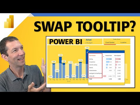
Power BI tooltips are a powerful feature that can enhance the interactivity and informativeness of your reports. In a recent YouTube video by Wyn Hopkins, an MVP in the field, viewers are guided through the process of creating dynamic tooltips that adapt based on user selections. This tutorial offers a step-by-step approach to customizing tooltips, allowing users to toggle between fields within the same visual. By the end of the video, users can create a custom tooltip system that significantly improves the user experience of Power BI reports. Tooltips are small pop-ups that appear when users hover over data points in a visual, providing additional information without cluttering the main report canvas. By customizing these tooltips, you can offer deeper insights and make data exploration more intuitive.Understanding Power BI Tooltips
In their default state, Power BI tooltips display basic information about data points, such as value and category. However, these tooltips can be customized to include more relevant details, enhancing the analytical value of your reports. Custom tooltips can incorporate various elements, including additional data fields, visuals, and even images, providing a richer context to the data being presented. This customization allows users to access supplementary information effortlessly, maintain a clean report layout, and improve data comprehension.Creating Custom Tooltips: A Step-by-Step Guide
To create custom tooltips in Power BI, follow these steps:- Create a Tooltip Page: Add a new page to your Power BI report. In the Format pane, navigate to Page Information and toggle the Tooltip option to ‘On’. Set the page size to ‘Tooltip’ under Canvas Settings to adjust the canvas to an appropriate size for tooltips.
- Design the Tooltip Content: On the tooltip page, add visuals, images, or text boxes that you want to display in the tooltip. Ensure the content is concise and relevant to the data points it will be associated with.
- Assign the Tooltip to a Visual: Select the visual in your report where you want the custom tooltip to appear. In the Format pane, expand the Tooltip card. Set the Type to ‘Report page’ and choose your tooltip page from the Page dropdown menu.
- Customize Tooltip Behavior: Specify which fields trigger the tooltip by dragging the desired fields into the Tooltips bucket in the Fields pane. This ensures the tooltip appears when hovering over data points associated with these fields.
Best Practices for Effective Tooltips
To ensure your custom tooltips are effective, consider the following best practices:- Keep It Concise: Tooltips should provide additional information without overwhelming the user. Focus on key insights that complement the main visual.
- Use Visuals Sparingly: Incorporate simple visuals like bar charts or KPIs to convey information quickly. Avoid complex visuals that may require extensive interpretation.
- Maintain Consistency: Ensure that the design and formatting of tooltips are consistent across the report to provide a cohesive user experience.
- Test Responsiveness: Verify that tooltips display correctly across different devices and screen sizes, especially if your report will be accessed on mobile devices.
Exploring Advanced Tooltip Features
Power BI offers advanced tooltip functionalities that can further enhance your reports:- Dynamic Tooltips: Create tooltips that change content based on the data point being hovered over, providing tailored insights for each data segment.
- Interactive Elements: Incorporate interactive elements like buttons or slicers within tooltips to enable users to explore data subsets without navigating away from the main report.
- Conditional Formatting: Apply conditional formatting within tooltips to highlight critical information, such as flagging underperforming metrics in red.
Conclusion
Customizing Power BI tooltips is an effective way to enhance the interactivity and informativeness of your reports. By following the steps outlined in Wyn Hopkins' tutorial, you can create dynamic tooltips that adapt to user selections, providing deeper insights and improving the overall user experience. Whether you are a beginner or an experienced Power BI user, these techniques can help you make the most of your data visualization efforts.

Keywords
Power BI tooltips smarter simple trick Power BI tips data visualization enhance tooltips improve reports interactive dashboards analytics
HubSite 365 Apps