![Power BI Multi-Layer Bar Chart Guide [IBCS] - Tutorial](https://img.youtube.com/vi/00Q6o0tddd0/hqdefault.jpg "Power BI Multi-Layer Bar Chart Guide [IBCS] - Tutorial")
Power BI Multi-Layer Bar Chart Guide [IBCS] - Tutorial
Technical Lead - Business Intelligence • Microsoft Certified PL-300 • Data Analyst • Power BI Youtube
Master Power BI: Create IBCS Multi-Layer Bar Charts for Insightful Data Visualization
Key insights
- IBCS Multi-Layer Bar Charts offer a detailed approach for comparing multiple data dimensions within a single category, effectively showcasing part-to-whole relationships and variances.
- These charts enhance clarity and interpretation of data by adhering to International Business Communication Standards (IBCS), using clean formatting, focused labeling, and thoughtful color choices.
- To create an IBCS Multi-Layer Bar Chart in Power BI, one can use the standard stacked bar chart with modifications or explore custom visuals from the marketplace such as Charticulator or xViz.
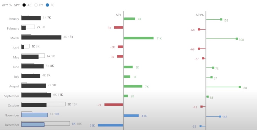
- An example use case for IBCS Multi-Layer Bar Charts includes comparing actual sales, previous year's sales, and sales forecasts, stacked within each sales category.
- When designing these charts, it's important to avoid overcrowding, limit the use of legends, and intentionally use color and size to direct attention to key information.
Exploring IBCS Multi-Layer Bar Charts
In the realm of data visualization, IBCS Multi-Layer Bar Charts stand out as a pivotal tool for professionals looking to craft insightful and visually appealing reports. These charts adhere to the International Business Communication Standards, which aim to enhance the communicative power of data visualizations by making them cleaner, more understandable, and more focused in their messaging. The multi-layer aspect of these bar charts allows for a nuanced comparison of various data sets within a single graphical element, making it easier to perform comparative analysis, understand part-to-whole relationships, and highlight deviations or variances in data.
While Power BI, a leading business analytics tool, does not natively support IBCS Multi-Layer Bar Charts, users can still create these informative visuals through a little ingenuity and exploration of third-party solutions. By either adjusting the standard stacked bar chart available within Power BI or incorporating custom visuals available through the marketplace, users can achieve the desired effect. These visuals offer a significant advantage in business and financial contexts, where clarity and precision in data presentation are paramount.
Injae Park's recent YouTube video delves into IBCS Multi-Layer Bar Charts using Power BI, a tool essential for clearer and more effective data communication. These charts are ideal for presenting complex data in an accessible format, especially in a business context. The guidelines of the International Business Communication Standards (IBCS) ensure that these visualizations are both visually appealing and informative.
The Multi-Layer Bar Chart stacks different data series within a single bar, making it perfect for comparative analysis, illustrating part-to-whole relationships, and highlighting deviations or variances. Such charts offer enhanced clarity through thoughtful color choices and clean formatting, aligning with the IBCS's aim to improve data interpretation. For business professionals, they are invaluable for presenting financials, sales breakdowns, or performance comparisons in an easily digestible manner.
To create IBCS Multi-Layer Bar Charts in Power BI, users can start with the Standard Stacked Bar Chart and modify it according to their needs. This involves structuring the data correctly, using descriptive titles, and applying a simple, IBCS-compliant color palette. For more flexibility or to access specific IBCS designs, exploring Power BI's custom visual marketplace is recommended, where tools like Charticulator and xViz can come in handy.
- Charts are tailored to enhance business presentations.
- They focus on comparative analysis and highlighting variances.
- Formatting involves using clear colors and removing unnecessary gridlines.
An example use case provided shows how to compare actual sales, previous year's sales, and sales forecasts within each sales category. The video stresses the importance of not overcrowding the chart and using visual hierarchy effectively to draw attention to the most critical data. These tips ensure that the final chart is not only informative but also engaging for the viewer.

Keywords
Power BI Tutorial, IBCS, Multi-Layer Bar Chart, Power BI Bar Chart, Power BI IBCS Standards, Power BI Visualizations, Power BI Chart Techniques, Advanced Power BI Charts