Power BI: Replace DAX with Power Query
Expert Microsoft tips: Power BI Visual Calculation replaces complex DAX for month on month analysis and cleaner reports
Key insights
-
Power BI's new Visual Calculation lets you build advanced analytics without writing complex DAX, reducing errors and speeding report creation.
-
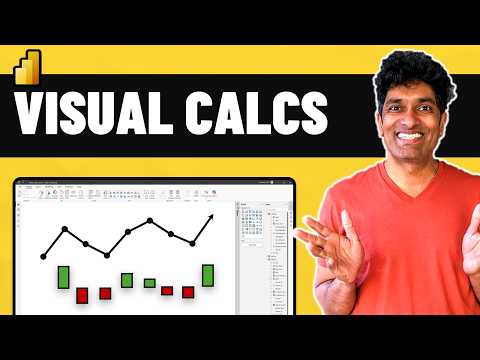
The video demo shows a sales report and a clear month-on-month comparison chart so you can compare performance visually and build reports from scratch.
-
Complex DAX creates a steep learning curve for many teams; using visual calculations or simpler tools lowers the technical barrier and improves collaboration.
-
Consider Looker with LookML for centralized modeling, Holistics with AML for built-in transformations, or Sigma for a familiar spreadsheet-like interface.
-
Other strong options include Tableau for visual dashboards, Metabase for lightweight open-source reporting, Sisense for unified modeling, Domo for real-time cloud operations, and Qlik Sense for associative data exploration.
-
Choose tools by team skills, data sources, and collaboration needs; prioritize solutions that reduce DAX dependence to deliver insights faster and with less maintenance.
Overview: Chandoo’s Practical Take on Power BI
In a recent YouTube video, the author Chandoo walks viewers through a hands-on demonstration of a new capability in Power BI called Visual Calculation. He shows how this feature can replace many complex expressions that BI teams usually write in DAX, and he focuses on a clear month-over-month chart to make the case. As a result, the video targets analysts and report authors who want to build useful visuals without wrestling with dense formulas. Overall, the presentation aims to make advanced analytics more approachable for typical business users.
The Problem: Why Complex DAX Remains a Barrier
First, Chandoo explains why DAX creates a steep learning curve for many teams, since its syntax and context rules can be subtle and error-prone. Next, he highlights how long development cycles and fragile formulas slow down iteration and collaboration among analysts. Consequently, organizations often face delays when they need new metrics or quick comparisons across periods. Therefore, alternatives that reduce formula complexity appeal to both business and technical stakeholders.
What Visual Calculation Does and How Chandoo Demonstrates It
In the demo, Chandoo builds a sales report from scratch and uses Visual Calculation to create a month on month comparison chart without authoring long DAX measures. He shows how visual-driven calculations let you define business logic through the report layer, linking visuals and filters directly to the computation. Then he walks through the steps of configuring the calculation, choosing comparison periods, and testing the output on sample sales data. Thus, viewers can see the immediate effect of logic changes without touching the model code.
Benefits: Faster Delivery and Lower Error Risk
First, the feature improves time-to-insight because analysts can prototype and validate comparative metrics in the report canvas rather than switching back to the model. Moreover, this visual approach reduces the chance of subtle context errors that are common with hand-written DAX, making results more reliable for business users. It also empowers non-specialists to make adjustments, which supports more iterative report design and faster stakeholder feedback. Consequently, teams can spend more time interpreting results and less time debugging formulas.
Tradeoffs and Implementation Challenges
However, Chandoo does not portray Visual Calculation as a silver bullet, and he outlines important tradeoffs to consider when adopting it. For instance, visual calculations can simplify many tasks but may not match the flexibility of advanced DAX for very specific or highly optimized measures. In addition, depending on dataset size and architecture, pushing logic into the visual layer can have performance implications that require careful testing. Therefore, organizations must weigh ease of use against long-term maintainability and efficiency.
How Visual Calculations Fit with Other Tools and Approaches
Furthermore, the blog notes alternatives and complementary platforms that teams sometimes prefer when they want different balances of modeling and visual control, mentioning solutions such as Looker and its LookML, spreadsheet-like interfaces from Sigma, and visual-first tools like Tableau. Each option brings its own tradeoffs between modeling centralization, user familiarity, and real-time collaboration, so the right choice depends on organizational needs. Thus, many teams find a hybrid approach works best: use model-level logic for core metrics and visual calculations for fast, interactive exploration. This hybrid stance preserves governance while enabling agility in report development.
Practical Advice for Teams Trying the Feature
Chandoo recommends that teams begin by using Visual Calculation for straightforward comparisons and exploratory visuals, while keeping canonical measures in the model for audited KPIs. Next, he advises testing performance on representative datasets and building simple governance rules so that business users do not accidentally create conflicting definitions. Finally, training and documentation help bridge the gap between non-technical editors and model owners, enabling safe and repeatable results. In short, a measured rollout reduces risk and captures the benefits quickly.
Conclusion: A Useful Option with Clear Limits
In conclusion, Chandoo presents Visual Calculation as a pragmatic alternative to complex DAX for many common analytical needs, especially period comparisons like month-on-month trends. While the feature shortens development cycles and lowers the entry barrier, teams must still consider performance, governance, and the remaining cases that require advanced formula work. Therefore, readers should view visual calculations as a valuable tool in a broader toolbox rather than a replacement for good modeling practices. Ultimately, the video offers a clear and actionable demonstration that encourages teams to experiment and adopt a balanced approach.

Keywords
power bi dax alternative, replace dax with power query, simpler dax methods, avoid complex dax, power query vs dax, dax alternatives power bi, measures without dax, quick calculations power bi