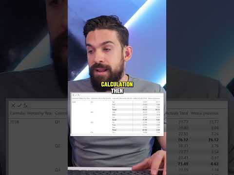
Master Power BI: DAX Visual Calculations Compared
Master Power BI: Visual DAX Calculations vs. Previous Metrics - Watch Now!
Key insights
5 Key Insights from the Power BI Visual Calculations DAX YouTube Short Video:
- Enhanced Visualization: Visual elements in Power BI now support more dynamic DAX calculations, increasing dashboard functionality.
- Compare Historical Data: Users can compare current metrics against historical data directly in visual components.
- Improved Performance: Updated features focus on optimizing calculation speed and smoother interaction.
- User-friendly Interface: Enhancements in the interface simplify the process of implementing complex calculations.
- Advanced Customization: New tools allow for more detailed customization of visual analytics to better suit business needs.
Exploring Power BI and Visual Calculations with DAX
Power BI, Microsoft's interactive data visualization tool, is integral for businesses focused on data-driven strategies. With its latest update, particularly in Visual Calculations utilizing DAX (Data Analysis Expressions), Power BI is revolutionizing the way organizations analyze their data. These enhancements not only make the tool more powerful but also more accessible to users with varying levels of technical expertise.
The ability to compare historical data visually helps businesses identify trends and patterns that were previously obscured. This feature serves as a critical tool in strategic planning and performance monitoring. Moreover, Power BI's improved performance capabilities ensure that these more robust visual calculations are executed swiftly, enhancing user experience and productivity.
The interface improvements are particularly noteworthy. They have significantly lowered the barrier to entry for performing sophisticated data operations, making it more approachable for non-technical users. This democratization of data means that more members of an organization can make informed decisions without a steep learning curve.
Finally, the advanced customization options put forth by Power BI allow businesses to tailor their dashboards and reports with greater precision, making the visuals not only more insightful but also aligned with specific organizational aesthetics or requirements. Whether it's a small enterprise or a large corporation, Power BI’s enhancements are designed to cater to various business needs, powering a smarter and more efficient analytical approach.
Keywords
Power BI comparison, DAX visual calculations, Power BI DAX tutorial, PREVIOUS function Power BI, Power BI time intelligence, compare data Power BI, Power BI advanced analytics, DAX PREVIOUS function