
Power BI Auto-Refresh Guide: Optimize Big Screen Visuals
Master Auto-Refresh in Power BI Visuals: Ultimate Guide for Flawless Presentations!
Key insights
- Setting up the auto visual refresh feature in PowerPoint for storytelling.
- Understanding how the feature works and its limitations.
- Initial setup of the report and integrating it into PowerPoint.
- The need to re-embed the visuals in the PowerPoint presentation.
- Auto-refresh is limited to slideshow mode and can be set up to a limit of 15 seconds.
Delving Deeper into Auto Refresh Feature for Big Screens
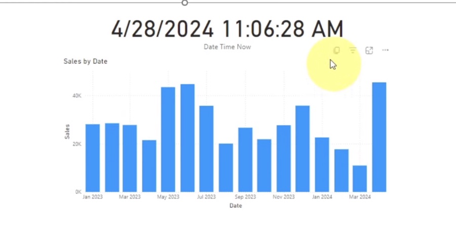
The auto refresh feature in PowerPoint is a game changer for professionals who rely on real-time data visualization. It primarily serves those looking to incorporate dynamic and automatically updating visuals into their presentations, especially useful for big screen displays in meetings or public spaces. This feature addresses the need for presentations to be more interactive and informative by showing the most current data available without manual intervention.
Key to its application is the ease of setup within PowerPoint, making it accessible not only to data analysts but also to the everyday PowerPoint user. Although it comes with the convenience of keeping your data visuals up to date, there are critical limitations to consider. For instance, the auto refresh functionality is restricted to presentation mode, emphasizing the context in which these dynamic presentations are most applicable—live presentations and displays.
The limitation of a maximum 15-second refresh interval is another aspect that users must plan for strategically to ensure that the data displayed is as real-time as possible without disrupting the flow of the presentation. This feature, despite its restrictions, opens up a new frontier in presentation design, pushing the boundaries of how data can be communicated effectively in a corporate setting or public exhibition.
This summary delves into the insights provided by Fernan Espejo, also known as Solutions Abroad, on how to effectively utilize the auto refresh visual feature in storytelling for PowerPoint add-ins, as highlighted in his you_tube_video. The focus of the discussion revolves around setting up the feature, understanding its limitations, and the considerations necessary for an optimal application, especially on big screens.
Main Areas of Focus
Setting Up for Success
The initial step involves a detailed guide on establishing the report parameters and then integrating them with PowerPoint to leverage the auto-refresh capability. Espejo emphasizes the importance of configuring reports correctly to ensure the visuals can update seamlessly during presentations. The process demands attention to detail, from selecting the right settings to embedding the visuals appropriately within PowerPoint.
Understanding Limitations
An essential part of the guide includes acknowledging the limitations of the auto-refresh feature. Despite its utility, the functionality is only available in slideshow mode and requires a re-embedding of visuals if any changes are made to the original report. Furthermore, Espejo points out that the auto-refresh can only be set to a minimum limit of 15 seconds, which may not suit all use cases.
Optimization Tips
For effective application, Solutions Abroad provides valuable considerations. Emphasizing the need for meticulous setup and the acceptance of inherent limitations as part of the process. The idea is to maximize the feature's potential within these constraints, adapting strategies to fit specific presentation needs and ensuring an uninterrupted storytelling flow on big screens.
Exploring the Power of Visualization Tools
The significance of adopting visualization tools such as Power BI in enhancing presentations cannot be overstated. With the ability to dynamically update visuals, presenters can keep their audience engaged with the most current data. However, mastering these tools requires an understanding of both their capabilities and their limitations. This ensures that the storytelling aspect of any presentation remains fluid and impactful, without technical hitches that could disrupt the narrative flow. By strategically leveraging such features, presenters can significantly improve the conveyance of complex information, making it accessible and engaging for every audience member.
The insights provided by solutions abroad in leveraging Power BI’s auto-refresh feature for big-screen presentations offer a valuable guide for users at any skill level. While there are limitations to consider, the benefits of keeping visual data current during presentations are undeniable. By implementing these strategies effectively, users can enhance their presentation's impact, making complex data more digestible and engaging for any audience. Further exploring and understanding the dynamics of such powerful tools can revolutionize the way we present and perceive data in a visually driven world.

People also ask
Questions and Answers about Microsoft 365
"How do I automatically refresh visuals in Power BI?" To activate automatic page refresh in Power BI Desktop, go to the report page you wish to set it up for. In the Visualizations pane, click on the Formatting button (depicted as a paint roller) and scroll to the Page refresh section towards the bottom. Here, you'll be able to toggle page refresh settings according to your needs. "What are the refresh limitations of Power BI?" The daily refresh quota is reset at 12:01 a.m. local time, allowing for up to eight refreshes per day. However, in the event that your semantic model is hosted on a Premium capacity, it is possible to configure up to 48 refreshes each day through the semantic model settings for enhanced efficiency. For additional details, the section titled Configure scheduled refresh in this resource might be insightful. "What are the limitations of visuals in Power BI?" In Power BI, visuals are capable of displaying up to 30,000 data points. While the default cap is set at 1,000 data points, visual authors possess the discretion to increase this limit to any value up to the maximum of 30,000, depending on the strategies they employ. "What are the prerequisites for incremental refresh in Power BI?" To aptly prepare for implementing Incremental Refresh, ensure access to a Premium workspace which facilitates real-time data updates through Direct Query. Moreover, the table intended for Incremental Refresh must include a date column, which should either be classified under the date/time or integer data type categories for optimal functionality.
Keywords
Auto Refresh Power BI, Power BI Visuals Guide, Big Screen Data Display, Power BI Refresh Limitations, Dynamic Power BI Dashboards, Power BI Auto Update, Power BI Display Considerations, Real-Time Data Power BI