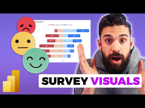
Top 3 Survey Visuals in Power BI
Elevate Power BI Skills: Master Top 3 Survey Visuals - Start Now!
Key insights
- Visualizing survey data in Power BI requires special techniques compared to standard datasets like sales.
- Three different visuals are demonstrated, showcasing how to effectively shape survey data for analysis.
- To correct a visual showing negative percentages for bad/very bad answers, change the chart to a stacked bar chart and adjust the measure formatting accordingly.
- Identifies comprehensive Power BI Design training programs and essential toolsets for users at different levels.
- Offers step-by-step guidance through video timestamps, making it easy to follow and apply the lessons.
The Evolution of Data Visualization in Power BI
Data visualization within Power BI has transcended conventional reporting, empowering users to unveil complex insights through intuitive and engaging visuals. The platform's rich visual capabilities cater to an array of data analysis needs, from the basic to the extremely complex, including the nuanced domain of survey analysis. This capability allows for the transformation of raw data into meaningful stories, ensuring that insights are not only gleaned but also effectively communicated to stakeholders of various backgrounds.
In a recent video by "How to Power BI", three innovative ways to visualize survey data using this analytics tool are discussed. Unlike standard datasets such as sales, survey data requires specific attention to detail and shaping to be effectively analyzed and presented. The video not only highlights the potential of Power BI in survey data analysis but also provides practical advice on preparing the dataset for visualization.
Introduction to Survey Data Visualization
The video begins with an important note on the complexity of survey data compared to other datasets. It places an emphasis on the need to accurately shape survey data before diving into visualization. This is crucial for businesses and analysts seeking to derive meaningful insights from respondent feedback.
Visual Insights and Fixes
- The video presents three unique visuals that can enhance the presentation of survey results. Each visual is designed to cater to different aspects of survey data analysis, making them versatile tools for data analysts.
- One notable tip shared for improving visual clarity involves adjusting the chart type to a stacked bar chart. This, coupled with setting the measure formatting correctly, remedies the issue of negative sign displays in certain data points.
Valuable Resources and Trainings
For viewers interested in diving deeper, the video also mentions various training programs focused on Power BI design and essentials. These resources are aimed at both beginners and seasoned users looking to refine their skills in data visualization and analysis.
The video serves as a comprehensive guide for individuals looking to enhance their survey data visualization techniques using Power BI. By covering everything from data shaping to specific visual adjustments, it stands as a valuable resource for both business users and data analysts alike. Those interested in furthering their knowledge have access to specialized training programs to harness the full potential of Power BI in transforming survey data into actionable insights.
Expanding on Power BI's Capabilities for Survey Analysis
Power BI offers a robust platform for transforming raw survey data into visually compelling and insightful analytics. The key to unlocking its full potential lies in understanding how to effectively shape and manipulate data to suit various visualization needs. The ability to customize visuals, filter responses, and drill down into specifics allows analysts to uncover deeper insights into respondents' opinions and behaviors.
Moreover, integrating Power BI with other data sources can enrich survey analysis, providing a more comprehensive view of customer or employee experiences. This integration capability is particularly useful for correlating survey results with operational data, thereby enhancing decision-making processes.
Effective survey analysis also involves the use of advanced features such as DAX formulas, which can compute complex aggregations or calculate sentiment scores. These advanced analytics techniques enable users to extract significant patterns and trends from the survey data, far beyond basic percentage distributions.
Another powerful aspect of Power BI is its sharing and collaboration features, allowing teams to distribute insights and foster a data-driven culture within organizations. Interactive dashboards and reports can be shared across departments, or even embedded into applications or websites, ensuring wide accessibility to survey findings.
Ultimately, the continuous evolution of Power BI, coupled with its expansive range of functionalities, makes it an indispensable tool for any data analyst or business user looking to exploit survey data to its fullest. As businesses continue to seek deeper understandings of their clientele or workforce, harnessing the power of advanced data visualization tools like Power BI becomes increasingly critical.

People also ask
How to display top 3 in Power BI?
To achieve seeing the top three, navigate to the 'Top N' option which is readily available for selection.
How do you find the top 3 values in Power BI?
Adjust the 'Top N' setting to 3 and specify this preference within the table configuration where it prompts for such information.
What are the 3 views in Power BI?
Power BI Desktop displays three core views accessible via icons on the left side: Report, Data, and Model, organized from the top downwards. The active view is highlighted with a yellow sidebar, and switching between views is as simple as clicking on the respective icons.
How to show top 5 data in Power BI?
To display the top data entries, go to the 'Show items' option and choose 'top' for the highest values. This method ensures the top five data points are showcased.
Keywords
Power BI survey visuals, top survey visuals Power BI, best Power BI survey charts, survey visualization in Power BI, top 3 Power BI visuals, Power BI survey data visualization, Power BI visualizations for surveys, survey report visuals Power BI