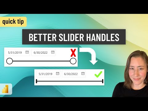
Toggle this Power BI slicer setting to "tone down" the giant slider handles!
Power Platform Developer
Master hidden settings in Microsoft Power BI and reveal secret visuals with a single click using bookmarks!
Our tech expert, Christine Payton, dives into Microsoft's powerful data visualization tool in an insightful Youtube video. Her focus is on the slicer slider feature, emphasizing its optimal usage and customization options.
"Most users often find the slicer handles in Microsoft's business analytics tool too large, unfortunately, there isn't a default resizing option," she explains in the video.For more information, check this out.
According to Christine, the solution to this slight obstacle is hidden within the settings menu. She assures us that turning those large slider handles to a more aesthetic style is swift and straightforward once you pin-point the location.
Slicing and Dicing with Power BI
Christine proceeds to demonstrate an interactive scenario with Microsoft's data analysis tool. She exhibits how to introduce action buttons that toggle certain visual displays on or off based on a button click. This innovative feature is primarily facilitated by the use of bookmarks in PowerBI.
Christine first details the initial steps of placing a right arrow button from the Buttons option on the insert tab of our report canvas, enabling both the Bookmarks Pane and the Selection Pane from the View tab.
This step is followed by creating a bookmark labeled 'Slicer Invisible'. "The next step dictates drawing a Rectangle over the button from the 'Shapes' option," Christine further elaborates. "The rectangular shape is then enhanced with a slicer and populated with the desired values."
- The construction of the Slicer Panel flow goes on.
- A 'Slicer Visible' bookmark is added and the initial button hidden.
- Consequentially, the first button is made visible and the shape, slicer, and second button hidden, updating the 'Slicer Invisible' bookmark accordingly.
- In the final touch, the Action button's type is set to bookmark and assigned to 'slicer Invisible'.
Christine assures us that these few steps will breed functionality into our Microsoft data analysis tool interface, enabling the slicer panel to be opened and closed upon demand.
By addressing common issues and sharing practical tips on customization and function toggling, Christine equips Power BI user with tricks that can significantly enhance their experience and productivity with the tool.
Learn about Toggle this Power BI slicer setting to "tone down" the giant slider handles!
The topic in focus here pertains to enhancing interactivity in visual analytics using dynamic features offered by Power BI (first count). The specific feature under discussion relates to utilizing slicer settings and toggling buttons to manage "slicer panel" visibility. This improves the overall user experience when interacting with these reports. Gaining a comprehensive understanding of these tools and their application is key to making the most of Power BI's functionality.
Sources to enhance one's knowledge on the topic can include online tutorials, interactive training courses, and comprehensive blog posts that clearly explain each step involved, much like the content of the text provided. Taking up a certified course on Microsoft Power BI (second count) from reputable platforms like Coursera, Udemy, or Microsoft Learn itself can provide a well-structured learning pathway.
Also, being a part of online forums and communities, like Stack Overflow or Power BI community can offer creative solutions and effective hacks to use these features seamlessly. Attending webinars or watching informative YouTube videos detailing the application of advanced features in Power BI (final count) can also be helpful. It is imperative to indulge in hands-on practice sessions to grasp the functionality well.
For specifics, the button-click visual interactivity can be controlled using a feature named 'bookmarks' in the Microsoft Data Visualization Tool. Implementing this feature to manage the visibility of the slicer panel offers more control over the analytics panel, augmenting the user's interaction with the report.
Additionally, Power BI's slicer settings can be utilized to tackle oversized 'slicer slider handles', furnishing a more visually appealing style. The option, albeit concealed in an unlikely location, offers the ability to switch to a better-looking style, once its whereabouts are known.
The interactivity offered by bookmarks and slicers not only improve aesthetics but also enhance user convenience and rapport with the visual analytic reports. Thus, mastering the use of these features will certainly bolster one's abilities to utilize the tool more efficiently.
You can practice these steps by designing simple reports with basic shapes and visuals, establishing a firm foundation.
Find a guide or blog post with images to follow along with as you learn about the complex features and steps in implementing them. This can give a clearer idea of what you're doing and what the final outcome should look like.
Get hands-on practice with these features by trying out various configurations and observing the results. It can provide a deep understanding of the tool's functionalities.
In conclusion, Power BI’s bookmarks and slicer settings, with their potential to enhance interactivity and aesthetics of a report, are strong assets for those who extensively work with visual analytics.
Keywords
Power BI slicer setting, tone down slider handles, Power BI giant slider, adjusting Power BI slicer, Power BI slicer tips, Power BI setting customization, improve Power BI visuals, Power BI user guide, optimizing Power BI slicer, Power BI configuration tips.