
Step-by-Step Guide: Creating Pivot Charts in Excel
Content Creator & former Microsoft Product Manager
Unlock the power of data analysis! Learn how to create and customize dynamic Pivot Charts in Excel with our comprehensive guide.
Video Summary: Creating Pivot Charts in Excel
In the tutorial video by Kevin Stratvert, the main topic covers the method of making Pivot Charts in Excel. Pivot charts serve as a potent tool for data visualization and analysis in various dimensions like categories, periods, or regions. Through this guide, you'll gain a thorough understanding of making and personalizing pivot charts. The walkthrough includes tasks such as data formatting, initiating pivot charts, field comprehension, chart type alterations, and data filters.
The presented tutorial consists of the subsequent steps:
- Data preparation for creating pivot charts
- Inserting pivot chart using the Insert tab
- Understanding fields and placing them in areas to build a pivot chart
- Changing the type of chart
- Applying filters for data refining
After viewing this video, you'll have a comprehensive knowledge of pivot charts and how they operate. You'll be able to leverage them to design interactive and dynamic charts. Moreover, you can apply these skills to make pivot tables, another way of summarizing and interpreting data.
Detailed Step-by-step Guide to Creating Pivot Charts
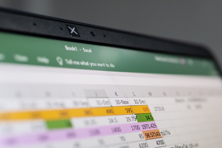
We begin with opening the desired workbook in Excel. The primary requirement is a pivot table as the pivot chart needs this data extraction to work effectively. We continue with selecting our pivot chart from Excel's Insert tab. Afterward, the range of your pivot chart is set, either by acceptance of the default range or customization as per your need.
You're also provided an option to choose your Pivot Chart’s location, either a new worksheet or an existing one. Moreover, if required, data can be removed from your pivot chart using the filters. We can then proceed with chart type modification as per your preference. Next, you can personalize your pivot chart's appearance via the Design tab. Lastly, to save your pivot chart, simply save your workbook file.
This tutorial works for both Windows and Mac devices and caters to modern versions of Microsoft Excel such as Excel in Office 365, Excel 2021, Excel 2019, and Excel 2016. For more on Excel, explore the HubSite 365.
Wrap-up and General Insights
Pivot charts are an excellent resource provided by Excel for visualizing and analyzing data. With their customization, interactive insights, and ease-of-use, they provide significant advantages over ordinary charts. Developing an understanding of pivot charts is instrumental in effective data evaluation and visualization, thereby empowering users to derive insightful information from large datasets efficiently. Not just limited to pivot charts, but also pivot tables, this knowledge aids in enhancing data management and examination in Excel.

Learn about How to Make Pivot Chart in Excel
If one is to further understand the topic tackled in the mentioned Youtube video about Pivot Charts in Microsoft's spreadsheet software, there are several approaches one can take. Firstly, it's necessary to understand the nuances of the software and familiarize oneself with other functions such as the Pivot Table, data analysis, and other basic features.
The video in question highlights the process of creating Pivot Charts, the customization of the same, and the application of filters to refine the data.
Supplementing the video are various training courses that delve deeper into topics related to Pivot Charts. For instance, a course on data visualization would be of great relevance, as it dissects various techniques of data depiction and comparison, skills pertinent to creating Pivot Charts. Furthermore, a course focusing specifically on the software functionality offers a great resource for mastering not just the basics, but also advanced features.
Integrating different sources of knowledge helps foster a well-rounded understanding of the subject matter. Hence, combining video tutorials, structured courses, and hands-on practice using the software can significantly enhance one's learning experience. Being quick to apply the knowledge gained can aid in retaining the information longer.
Further, the option of pursuing an online course targeting the software itself is an attractive prospect. Sites such as Coursera and Udemy offer specialized training on specific topics including data analysis and visualization using the spreadsheet software. Moreover, learners can practice using sample data files provided in these courses, offering a more practical learning experience.
Pivot Tables and Pivot Charts are powerful tools for data analysis – visualizing and summarizing large quantities of data in categories, regions, or time periods. By learning to manipulate these tools effectively one can efficiently monitor their data with minimal effort.
The process to make a Pivot Chart in the spreadsheet software is simple, and caters to users of both Windows and Mac. It's necessary to have a Pivot Table in place first as a Pivot Table enables one to extract and manipulate data particularly from large and detailed datasets.
A deeper understanding of the software’s plethora of features can be harnessed by getting familiar with various tabs like the Insert tab, which houses Excel’s pre-made charts, graphs, tables, and even illustrations. Understanding the workings of the Dialogue Box, the mechanism behind modifying range selections, external data sourcing – these are important foundational concepts that bolster one's ability to utilize the software to its fullest capacity.
The desired location of Pivot Charts, the filtering of data for tailored views, customization of style and aesthetics, and not to forget – the crucial step of safeguarding one's work by saving regularly – all these aspects contribute to a more comprehensive knowing of data visualization through Pivot Charts.
With several tools available for enhancement of the spreadsheet software mastery, including guides, shortcuts, and productivity tips, one can ideally find themselves well-equipped to tackle any challenges that may arise during their journey of discovery within data visualization and the spreadsheet application.
It’s also encouraged to tap into online forums, Q&A platforms, and communities, where experienced users and experts readily share their knowledge on such topics. Websites like Stack Overflow and Microsoft’s own community pages are a trove of useful threads on a variety of topics.
- Mastering Pivot Tables: The Ultimate Guide for Spreadsheet Software Users
- 7 Tips to Become a Spreadsheet Software Super user
- How to Perform Break-Even Analysis in the Microsoft Program
- The Most Useful Spreadsheet Keyboard Shortcuts
- 13 Spreadsheet Tips and Tricks to Elevate You to Pro Status
- Top 51 Spreadsheet Templates to Streamline Your Workflow
One can take advantage of the training tools and courses available to gain a complete grasp of Pivot Charts in Microsoft's spreadsheet software.
More links on about How to Make Pivot Chart in Excel
- Create a PivotChart
- Select a cell in your table. Select PivotTable Tools > Analyze > PivotChart. Select a chart. Select OK.
- Pivot Chart
- Click any cell inside the pivot table. 2. On the PivotTable Analyze tab, in the Tools group, click PivotChart. ... The Insert Chart dialog box appears. 3. Click ...
Keywords
Pivot Chart Excel, Excel Pivot Chart Guide, Create Pivot Chart, Excel Chart Tutorial, Pivot Chart Instructions, Excel Data Visualization, Using Pivot Chart Excel, Excel Pivot Chart Making, Handling Pivot Chart, Mastery Pivot Chart Excel