Power Apps
Apr 15, 2025 12:34 PM
Power Apps: Design the Perfect Responsive Home Screen for Ultimate Flexibility
by HubSite 365 about The Analyst Nik
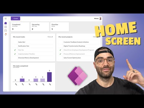
Power Apps responsive home screen: info summary, tasks, projects, user updates, complete button, bar chart.
Key insights
- Responsive Design in Power Apps allows developers to create user interfaces that adapt to different screen sizes and orientations, ensuring a consistent user experience across devices.
- The main advantages of this technology include an Enhanced User Experience, Cross-Platform Compatibility, Flexibility, and improved Efficiency.
- Basic Steps for implementing responsive design: Disable Scale to Fit, use Responsive Containers, adjust Control Properties like Stretch and Flexible width, and Test and Preview the app.
- Modern Form Screen Template: A new tool in Power Apps that simplifies creating responsive forms using responsive container controls.
- The approach now includes features like Size Breakpoints, allowing layout customization based on specific screen size ranges, enhancing adaptability across various devices.
- The responsive home screen in Power Apps advances app development by providing tools for crafting applications that are visually appealing and functional across many devices.
Introduction to Responsive Home Screens in Power Apps
The YouTube video by "The Analyst Nik" delves into the intricacies of creating a responsive home screen within Power Apps. This video is particularly relevant for developers and users who wish to optimize their applications for various devices. **Responsive design** in Power Apps is essential as it ensures that user interfaces adapt seamlessly to different screen sizes and orientations. Consequently, this provides a consistent user experience across multiple devices and platforms, which is crucial in today's multi-device world.Understanding the Technology
Responsive design in Power Apps involves crafting applications that dynamically adjust their layout based on the available screen space. This is primarily achieved through the use of formulas and responsive containers. These elements adjust the size and position of controls as the screen size changes. As a result, whether users access the app on a phone, tablet, or desktop, the design ensures that all elements fit perfectly on the screen. This maximizes both usability and aesthetics, making the application more appealing and accessible to a broader audience.Advantages of Implementing Responsive Design
There are numerous advantages to adopting a responsive design in Power Apps. Firstly, it significantly enhances the **user experience** by providing an optimal viewing experience regardless of the device in use. This ensures that users can access and interact with the app's features more easily. Furthermore, responsive apps offer **cross-platform compatibility**, allowing them to run smoothly on various devices without needing separate versions for each platform. This flexibility enables developers to create dynamic layouts that adjust based on the available screen real estate. Consequently, adding or modifying content becomes easier without compromising the app's usability. Moreover, this approach is efficient as it reduces the need for multiple app versions, enabling a single app to work seamlessly across different devices and screen sizes.Basics of Implementing Responsive Design
To effectively implement responsive design in Power Apps, there are several key steps to follow. Initially, it is important to **disable Scale to Fit** in the app settings. This allows the app to adapt to different screen sizes. Next, developers should use **responsive containers** to manage the layout and size of controls dynamically. Adjusting control properties like **Stretch** and **Flexible width** ensures that controls adapt to screen changes. Finally, it is crucial to **test and preview** the app in various scenarios to ensure its responsiveness. This thorough testing guarantees that the app performs well across different devices and screen sizes, thereby enhancing the user experience.Innovations in Responsive Design Techniques
Recent advancements in Power Apps have introduced more sophisticated tools and templates, such as the **Modern Form Screen Template**. This new template simplifies the process of creating responsive forms by leveraging responsive container controls. These controls allow forms to automatically adjust their layout on different devices and orientations. Enhanced support for dynamic controls and containers also enables developers to create more adaptable interfaces. Features like **Size Breakpoints** allow customization of layout based on specific screen size ranges. This further enhances the app's ability to respond effectively to diverse form factors and device types, providing a more tailored experience for users.Conclusion: The Future of Responsive Home Screens
The development of a responsive home screen in Power Apps signifies a major advancement in app development. By providing tools and methodologies that help developers craft applications that are both visually appealing and highly functional, Power Apps has revolutionized the way apps are designed and used. **Responsive design** not only improves the user experience but also enhances the efficiency and flexibility of app development. As technology continues to evolve, the importance of responsive design will only grow, making it an indispensable aspect of modern app development.

Keywords
Responsive Home Screen Power Apps, Power Apps UI Design, Adaptive Layout Power Apps, Mobile Friendly Power Apps, Dynamic Screens in Power Apps, User Interface Best Practices Power Apps, Customizable Home Screen PowerApps, Optimize UX in PowerApps
HubSite 365 Apps