
Enhance Your Data with Power BIs Latest Visual Features
Revamp Your Power BI Reports – Master New Visually Stunning Elements!
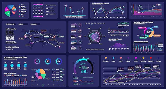
Exploring the Importance of Visuals in Power BI
Delivering an effective Power BI report hinges on the use of clear and interactive visuals. The introduction of new visualization features like the card sparkline brings a fresh and informative perspective to data points within a report. Employing careful redesigns of slicers, cards, and charts is not only about aesthetics; it addresses the ease of data interpretation and enhances user experience. By ensuring that these elements are intuitive and maintain thematic consistency, the reports cater to a more engaging analysis, culminating in informed decision-making processes.
Redesigning various elements in Power BI reports can significantly improve visual appeal and effectiveness. Let's delve into each of these elements. Slicers, cards, line charts, bar charts, and the new card sparkline can all be enhanced for better data visualizations.
Slicers are interactive filters that can be redesign for ease of use and visibility. It's important to use colors and fonts that align with your overall theme and to position them strategically for easy access. Cards display single data points and should stand out with clear, large fonts and attention-grabbing colors.
Clear contrasts help make line charts more understandable, with different colored lines and easily readable axes. Bar charts require distinct colors, clear labels, and evenly spaced bars for better legibility. The new card sparkline, a mini chart within a card, should be designed to be succinct yet informative, complementing the main data point without clutter.
The HubSite Power BI Team's video showcases these improved visual elements through examples and step-by-step guides. User experience, readability, and thematic consistency are key to creating more effective communication tools in Power BI reports. These improvements go beyond mere aesthetics, enhancing user interaction and data comprehension.
- Intro to the makeover process
- Detailed section on redesigning slicers for enhanced interaction
- How to make cards stand out more effectively in your reports
- Improving the clarity and impact of line charts
- Best practices for bar charts to improve data representation
- Incorporating the new card sparkline feature well into your design
The video proceeds with timestamps indicating the focus areas, starting with an introduction, followed by segments dedicated to each redesigned element such as slicers, cards, and charts, ending with a background discussion and the conclusion of the makeover guide.
Revitalizing Power BI Reports
Revamping Power BI dashboards with fresh visual designs isn't just about aesthetics; it's about enhancing the way users interpret and interact with data. Simple changes like upgrading slicers or rethinking card layouts can have a dramatic effect on readability and user experience. By carefully considering the design and layout of data visuals, Power BI reports can become more than just collections of figures and charts—they can tell a captivating, insightful story about the underlying data. With these updates, report makers empower users to discover trends and make informed decisions quickly, aiding the transformation of raw data into strategic assets.
Power BI Report Makeover: Enhancing Visualization Features
Revamping components in Power BI like slicers, cards, and charts, while integrating new features such as the card sparkline, can drastically improve how your reports look and function.
Here's a closer look at how you can optimize these elements:
- Refine Slicers: Better visibility and usability are key when redesigning slicers. Choose colors and fonts that fit your theme and place them where users can find them easily.
- Improve Cards: Make single data points pop by using large, clear fonts and eye-catching colors. Refine the card's background and borders for added emphasis.
- Update Line Charts: Ensuring clarity is paramount. Use contrasting hues for lines and make axes labels legible. Markers or notes can highlight significant data.
- Enhance Bar Charts: For bar charts, opt for distinct colors and legible labels. Even spacing and tooltips can offer better data insights.
- Revise Card Sparkline: Integrate a concise yet informative mini-chart in a card to succinctly complement the main data point without overwhelming.
People also ask
How can you add a new visualization to a report in Power BI desktop?
To add a new visualization to a report in Power BI Desktop, you can follow these steps: 1. Open your report within the Power BI Desktop application. 2. In the report view, find the "Visualizations" pane on the right side. 3. Click on the icon of the visualization you want to add from the list of visualization types available. 4. Power BI will create a new visualization placeholder on the report canvas. 5. With the visualization selected, drag the fields you want to visualize from the "Fields" pane to the appropriate "Values," "Axis," "Legend," etc., areas of the visualization.How do I add visuals to Power BI?
Adding visuals to Power BI involves a similar process to the one described above: 1. Ensure you are in the report view within Power BI Desktop or the Power BI Service (if using it online). 2. Click the "Visualizations" pane and select the type of visual you want to add to your report by clicking on the associated icon. 3. A new blank visual will appear on the report canvas, which you can then customize. 4. To populate the visual, drag the desired fields from the "Fields" pane to the respective data fields within the visual.How do I edit a chart in Power BI?
To edit a chart in Power BI, you will need to: 1. Click on the chart you wish to edit in the report view to select it. 2. Once selected, you will see options to adjust the visual in the "Visualizations" pane. 3. Use the "Fields" pane to adjust which data is being displayed by dragging and dropping different fields. 4. Within the "Visualizations" pane, you will find a variety of formatting options - such as colors, labels, and tooltips - under the "Format" section that can be used to further customize the appearance and functionality of your chart. 5. You can also modify the chart type by selecting a different visual from the top of the "Visualizations" pane while the chart is selected.
Keywords
Power BI Report Makeover, Enhanced Visualizations, Data Visualization Tips, Business Intelligence Reporting, Advanced Power BI Features, Modern BI Dashboard Design, Power BI Visualization Techniques, Interactive Reports Power BI, Creative Power BI Ideas, Custom Visuals Power BI