Power BI: KPI Cards with Ease in This 2025 Beginners Guide!
Technical Lead - Business Intelligence • Microsoft Certified PL-300 • Data Analyst • Power BI Youtube
Power BI DAX Excel Microsoft Teams PowerPoint OneDrive SharePoint Azure Dynamics 365 SQL Server Cortana
Key insights
- KPI Cards in Power BI are essential for visualizing performance against targets, helping track business success effectively.
- To begin creating a KPI Card, open Power BI Desktop and load your data by selecting a source such as Excel or SQL, ensuring it includes both an Actual value and a Target value.
- If your dataset does not have a target value, you can create one using Power BI's Measures feature. Example DAX formula:
Target Sales = 500000. - Add a KPI Card to your report by selecting the Card visual from the Visualizations pane and dragging your actual metric into the Fields section.
- Format the KPI Card using the Format pane to adjust font size, color, background, and border. Use conditional formatting to set color rules based on performance against targets.
- Create a KPI Visual for trend analysis by using the KPI Visual option. Drag indicators like actual metrics, target metrics, and date fields to visualize trends over time.
Introduction to Power BI KPI Cards
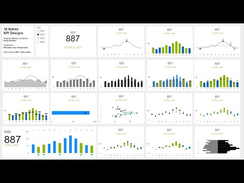
In the rapidly evolving world of data analytics, Key Performance Indicators (KPIs) play a crucial role in measuring business success. In Power BI, KPI Cards offer a visual representation of performance against set targets, making them indispensable for data analysts and business users. The recent YouTube video by Injae Park provides a comprehensive, beginner-friendly tutorial on creating 18 distinct KPI Card designs in Power BI. This article summarizes the video and explores the nuances of crafting effective KPI Cards.
Getting Started with Power BI
To begin creating KPI Cards, the first step is to open Power BI Desktop and load your data. This involves:
- Opening Power BI Desktop.
- Clicking on Home and selecting Get Data.
- Choosing a data source such as Excel or SQL and loading the dataset.
- Using the Transform Data feature if data cleaning or formatting is necessary.
Ensuring that your data contains KPI metrics is vital. Each KPI Card requires an actual value, which is the metric you aim to track, and a target value, which serves as a benchmark. If your dataset lacks a target value, it can be manually created using Power BI’s Measures feature. For example, a DAX formula like Target Sales = 500000 can set a sales target.
Creating and Formatting KPI Cards
Once your data is ready, the next step is to add a KPI Card to your report:
- Navigate to the Report View in Power BI Desktop.
- Select Card from the Visualizations pane.
- Drag your actual value, such as total sales, into the Fields section of the Card visual.
The card will now display your KPI value. Formatting the KPI Card is crucial for clarity and impact:
- Access the Format pane using the paint roller icon.
- Customize font size, color, background, and border.
- Add a meaningful title, like “Total Sales,” to enhance understanding.
Conditional formatting can further enhance the card's effectiveness:
- Enable Conditional Formatting under the Data label in the Format pane.
- Set rules for colors, such as red for below target and green for above target.
Visualizing Trends with KPI Visuals
For those interested in trend analysis, the KPI Visual offers a more dynamic alternative to the standard Card. To create a KPI Visual:
- Select the KPI Visual from the Visualizations pane.
- Drag the actual metric, target metric, and a date field, like Month, into the appropriate sections.
Formatting the KPI Visual is essential to highlight trends effectively. This approach allows users to visualize performance over time, providing deeper insights into business dynamics.
Publishing and Sharing Your KPI Report
After creating and formatting your KPI Cards and Visuals, it's time to share your insights:
- Save your work by clicking File and selecting Save As.
- Publish your report by choosing Publish and selecting Power BI Service.
- Share the report with team members through the Share option in Power BI Service.
Sharing reports fosters collaboration and ensures that all stakeholders have access to critical performance data.
Final Thoughts and Next Steps
KPI Cards in Power BI are a powerful tool for tracking business performance. By following Injae Park's step-by-step guide, beginners can create dynamic KPI visualizations that effectively monitor goals. However, creating impactful KPI Cards involves balancing various factors, such as choosing the right metrics and ensuring clear data storytelling.
Challenges may arise in data preparation and formatting, but overcoming these hurdles is key to unlocking the full potential of Power BI. As users become more proficient, they can explore advanced features like Power BI Dashboards, complex DAX calculations, and real-time KPI tracking.
For those eager to delve deeper into Power BI, subscribing to newsletters and engaging with the community can provide valuable tips and insights.
In conclusion, mastering KPI Cards in Power BI is an essential skill for data analysts and business users alike, offering a pathway to more informed decision-making and enhanced business intelligence.

Keywords
Power BI KPI Cards beginners tutorial 2025 step-by-step guide data visualization dashboard creation business intelligence