Power Apps Column Visuals for Dataverse
Principal Program Manager at Microsoft Power CAT Team | Power Platform Content Creator
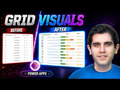
Power Apps column visualizations add sparklines heat maps star ratings and radial dials to Dataverse grids no code
Key insights
- Power Apps Column Visualizations bring native graphics into Dataverse grids, letting makers embed visuals like small charts directly inside grid cells for faster scanning.
Used in a hands-on tutorial that builds a Product Health Grid to view portfolio health without opening records. - Visualization types covered: Line Chart for trends, Heat Map for value ranges, Star Rating for scores, and Radial Dial for percentages or completion metrics.
Each type fits different column data (trend strings, single numbers, ratings, percentage values). - Configure at the column level: open Power Apps Solutions, choose the table and column, expand Advanced options, pick the visualization type, and save.
Once set, the visual appears automatically in every grid or view that uses that column. - Key benefits: improved at-a-glance readability, consistent visuals across views, less setup after initial configuration, and higher data density because visuals stay inside cells.
- Hands-on demo details: the video shows adding each visualization and creating trend data with Dataverse formula columns.
It highlights you can use visuals with no PCF controls, no JavaScript, and no Power BI embed. - Limitations and guidance: the feature is a Preview feature, so it may change and is not for production without review.
Test in non-production environments, follow preview guidance, and give feedback as you evaluate it.
Overview of the video and its purpose
Reza Dorrani’s recent YouTube video introduces Power Apps Column Visualizations, a native feature that brings compact charts and gauges into Microsoft Dataverse grids. In the clip, he demonstrates how makers can add sparklines, heat maps, star ratings, and radial dials directly inside Model-Driven App grids without writing JavaScript or using PCF controls. As a result, the video emphasizes faster visual scanning and a simpler setup path compared with embedding external reports. Consequently, the piece serves as a practical, hands-on introduction for Power Platform practitioners who want to display more insight at a glance.
What the video demonstrates
Dorrani walks viewers through building a Product Health Grid to assess portfolio status without opening each record. He configures four visualization types — Line Chart, Heat Map, Star Rating, and Radial Dial — and shows how a column-level setting automatically applies the visual treatment wherever that column appears. Furthermore, he uses Dataverse formula columns to generate trend data, which makes the example especially useful for makers who need dynamic small multiples. In short, the demonstration highlights both the ease of setup and the immediate value of embedding visuals inside tables.
How to configure column visualizations
The workflow Dorrani presents stays within the Power Apps maker experience: open the solution, edit the table, and change a column’s advanced options to choose a display type. You then save the column and the visualization appears across all grids that use that column, which reduces repetitive configuration work. He also explains practical details, such as storing trend points as comma-separated values in a text field or using formula columns to calculate series, helping viewers replicate the patterns shown. Therefore, the tutorial focuses on low-code steps while clarifying the data shape each visualization expects.
Benefits and tradeoffs
On one hand, the primary advantage of the new feature is clear: it increases data density and speeds up decision-making by turning raw numbers into small visuals inside cells. Moreover, because the visualization is configured at the column level, it promotes consistency across views and reduces maintenance when the same metric appears in many places. On the other hand, this column-level approach can limit per-view customization, so teams that need different visuals for different contexts may find the tradeoff restrictive. Thus, organizations must balance the convenience of centralized configuration against the need for tailored presentations in specific views.
Challenges and current limitations
Importantly, Dorrani and Microsoft both note that column visualizations are a Preview feature, which means functionality and behavior can change and the feature is not recommended for critical production scenarios. Additionally, some visualization types depend on particular data formats; for example, the Line Chart needs multiple numeric points stored in one field, which may require formula workarounds or pre-aggregation steps. Performance and accessibility also deserve attention, since adding many cell visuals to very large grids could affect load time and screen reader behavior unless designers test carefully. Consequently, teams should pilot the feature, validate performance at scale, and consider fallbacks until it reaches general availability.
Practical guidance and next steps
For practitioners ready to experiment, the clear next step is to try the feature in a sandbox or test environment and follow Microsoft’s preview guidance before adopting it more widely. Reza Dorrani’s example provides a concrete starting point: model the supporting Dataverse tables, create formula columns for trends, and apply a visualization to one column to observe how it behaves across views. Meanwhile, developers should weigh whether native column visuals meet reporting needs or if a full Power BI integration still delivers necessary depth and interactivity for certain scenarios. In that way, organizations can combine rapid visual scanning with more detailed reporting where each approach fits best.

Keywords
Power Apps column visualizations, Dataverse grid visualizations, Power Apps column formatting, Dataverse column customization, Power Apps grid enhancements, Conditional visuals in Power Apps, Power Apps Dataverse display columns, Custom column visuals Power Apps