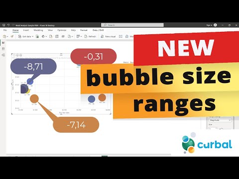
NEW options for bubble chart sizes | Power BI update august 2023
This month the power bi team released 2 new options to decide how to represent the bubble size in Power BI: Data range and magnitude. In this video I will show
The August 2023 update for Power BI introduced new options for bubble chart sizes. New features enable users to define their own bubble size in relation to data range and magnitude.
In addition to scatter and bubble charts, Power BI now also supports dot plot charts, offering a swath of possibilities from comparing large quantities of data without a predefined time series to illustrating relationships between values.
Scatter charts plot two groups of numbers as one series of x and y coordinates, revealing relationships between these two numerical values and highlighting patterns in large data sets.
- Allow up to 10,000 data points with tooltips for details.
- Displays data along a horizontal (x) and vertical (y) axis, with data points where they intersect.
- Useful to show patterns, conduct comparisons irrespective of time, and convert horizontal axis into logarithmic scale.
Bubble charts build upon scatter charts by adding a third data series, represented as bubbles of varying sizes.
- Useful in visually emphasizing value differences.
- Ideal for presenting financial data graphically, and displaying data with quadrants.
Dot plot charts build upon scatter charts capabilities with added category information on the x axis.
- Helps with quick data analysis and highlighting of important points.
- Reveals patterns, trends, clusters, and outliers.
Extra Insight: Utilising Scatter, Bubble, and Dot Plot Charts
Scatter, bubble, and dot plot charts play significant roles in advanced data visualization. These charts let us process and exploit raw data far beyond what numeric values alone can convey. By enabling trends, relationships, and patterns to be visually discernible, they help optimise data that otherwise may be inscrutable. Hence, Power BI's integration of these charts empowers organizations to make better, more informed decisions derived from their data.
Learn about NEW options for bubble chart sizes | Power BI update august 2023
Power BI provides three chart visualizations that can help to reveal relationships and patterns in data: scatter charts, bubble charts, and dot plot charts. Scatter charts display data along a horizontal (x) and vertical (y) axis, with data points representing the intersection of the two axes. Bubble charts expand on the concept of data points by representing two intersected values with a bubble, with the bubble size representing a third data dimension. Dot plot charts further expand on the capabilities of the scatter chart by allowing you to add categorical data on the horizontal axis. Tooltips are available for all data points in scatter, bubble, and dot plot charts, providing additional details for the data. Additionally, you can adjust the independent scales of the axes to reveal more information about the grouped values. Maximum data points of 10,000 can be set, and the chart visualizations can identify interesting information about your data that might not be readily apparent by just looking at the numerical values. This month, the Power BI team released two new options for representing bubble size in Power BI charts: Data range and magnitude. With these options, users can better analyze large sets of data and quickly identify trends, clusters, and outliers.
More links on about NEW options for bubble chart sizes | Power BI update august 2023
- Power BI August 2023 Feature Summary
- Aug 22, 2023 — We are introducing the new bubble range scaling setting for scatter chart and map visuals! This setting gives report creators more control over ...
- A summary of the August 2023 update changes
- 5 days ago — You can now toggle between desktop and mobile view more easily. New bubble chart scaling choice. There are now two ways of scaling a bubble ...
- Tony Cua's Post
- The August 2023 update of Power BI Desktop was released 4 days ago. My top 3 new features are: • New bubble range scaling setting - Bubble charts (boba tea…
- How to Change Bubbles Based on Size in Power BI
- Aug 2, 2023 — Here's how to use filters to control bubble sizes:1. Open Power BI Desktop, go to the report page with the bubble chart.
- How to Create a Bubble Chart in Power BI
- Aug 2, 2023 — Learn how to create a visually appealing and informative bubble chart in Power BI with our step-by-step guide.
- Power BI Update - August 2023
- Aug 23, 2023 — The August 2023 update for Microsoft Power BI includes a new layout switcher, updates to the ORDERBY function, the Editor's pick of the quarter ...
- Why does it happens? Bubble chart
- Solved: Same data, same all, just a different graph with a similar function: Kind Regards!
- Product updates | PBI VizEdit
- new Support Small multiple. Basic functionality for small multiple is support for any combination of line, bar, bubble or area chart. bug Allow report scrolling ...
Keywords
Scatter Chart, Bubble Chart, Dot Plot Chart, Power BI, Data Analysis
