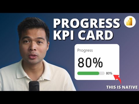
Power BI 2025: Native SVG KPI Cards Simplified
Power BI, SVGs, KPI Cards, Progress Bar, DAX, Templates, Data Analytics, Business Intelligence
Key insights
- Native Progress KPI Cards in Power BI use built-in visuals like Card or Bar Chart, enhanced with SVG graphics, to create clear and interactive progress bars without relying on third-party components.
- SVG Integration allows users to embed custom shapes, colors, and animations directly into Power BI reports by using SVG code as image URLs, offering flexible and visually appealing designs.
- DAX Measures are essential for calculating key metrics such as percentage of target achieved or month-over-month changes, which drive the dynamic updates of the KPI cards.
- Reference Lines and Conditional Formatting in bar charts help segment progress bars and add visual cues for goal thresholds, making it easier to track incremental achievements.
- Slicers and Filters provide interactivity by allowing users to update KPI cards based on their selections, such as viewing progress by month or comparing actual versus target values.
- The latest features in 2025 include direct SVG URI support, advanced spark lines, and step-by-step tutorials that guide beginners through building professional dashboards using only native Power BI tools and DAX calculations.
Introduction: Native Progress KPI Cards in Power BI
In a recent YouTube video by Fernan Espejo of Solutions Abroad, viewers are introduced to the concept of creating native progress KPI cards in Power BI using SVGs and more. This technique leverages Power BI’s built-in visuals alongside SVG graphics to produce modern, dynamic progress indicators. As business intelligence tools continue to evolve in 2025, these methods offer a practical solution for organizations seeking visually appealing and highly interactive dashboards without relying on third-party components.
Espejo’s walkthrough begins with a demonstration of how native visuals such as Card and Bar Chart can be enhanced with SVGs. By integrating these scalable vector graphics, users gain fine control over shapes, colors, and even animations within their reports. The tutorial aims to provide both beginners and intermediate users with actionable steps for upgrading their Power BI dashboards.
Why Use SVGs with Native Power BI Visuals?
The primary advantage of combining SVGs with Power BI’s native visuals lies in performance and compatibility. Native solutions are optimized for seamless operation across Power BI desktop, web, and mobile platforms. This ensures that visualizations remain consistent and reliable, regardless of where they are accessed.
Moreover, SVGs allow for a high degree of customization. Users can tailor progress bars to match organizational branding or specific reporting needs. The integration reduces dependence on custom visuals, which sometimes introduce compatibility or update challenges. By sticking with native visuals and embedded SVGs, organizations can maintain a stable and future-proof reporting environment.
Building a Native Progress KPI Card: Step-by-Step Essentials
The process starts with selecting either the Card or Bar Chart visual in Power BI to represent key performance indicators—such as progress percentages or comparisons between actual and target values. Measures are then created using DAX to dynamically calculate progress states.
SVG graphics are embedded by utilizing Power BI’s support for image URLs. This enables users to insert custom SVG code, resulting in progress bars or other shapes that adjust automatically based on underlying data. Conditional formatting and reference lines can be added for segmented bars or to highlight specific thresholds, providing further clarity.
To enhance interactivity, slicers and filters are incorporated, allowing viewers to adjust the period or criteria displayed. For additional context, small sparklines or trend lines may also be included within the KPI card, offering a quick visual summary of recent changes.
Recent Developments and Innovations for 2025
Power BI’s ongoing evolution has introduced features that facilitate the creation of minimalistic progress bar cards using only native visuals. These innovations help users avoid reliance on external custom visuals, streamlining the design and deployment process. The support for SVG URIs and image URLs within card visuals is particularly significant, as it allows for fully customizable progress bars and spark lines using gradients or bullet styles.
Another notable development is the advanced use of reference lines in bar charts. By dividing progress into segments, users can better visualize incremental achievements or threshold milestones. Dynamic KPI cards now often combine progress bars, month-over-month change indicators, and line charts to provide a comprehensive overview, all while remaining responsive to user-driven filters and slicers.
Challenges and Tradeoffs in Adopting Native SVG Progress Indicators
While the benefits are clear, there are tradeoffs to consider. Designing and embedding SVGs requires a basic understanding of SVG syntax and how to integrate them within Power BI measures. For teams new to these techniques, there may be an initial learning curve. Additionally, achieving the right balance between visual complexity and dashboard performance is crucial; overly intricate visuals could impact report loading times.
Organizations must also weigh customization needs against maintenance complexity. While native solutions are more stable, extensive custom SVGs can make dashboards harder to update or troubleshoot. Therefore, it is important to document SVG usage and ensure knowledge transfer among team members.
Conclusion: A Modern Approach to KPI Visualization
In summary, Fernan Espejo’s tutorial highlights the growing potential of combining native Power BI visuals with SVG graphics for professional, interactive KPI dashboards. This approach offers an optimal blend of customization, performance, and compatibility, empowering users to create visually compelling reports without third-party dependencies. However, success requires thoughtful implementation, clear documentation, and ongoing skill development to fully realize these benefits in a business intelligence strategy.

Keywords
Native Progress KPI Card Power BI 2025 SVGs Power BI Beginners Guide KPI Visualization Power BI Tutorial