")
Create Stunning Economist-Style Excel Charts (Free Template)
Elevate Your Excel Charts: Master The Economists Techniques – Guide Inside!
Key insights
- Learn to make a special type of Bar Chart, Dumbbell Charts, and Color-Coded Tables in Excel, resembling the quality found in The Economist magazine.
- These Excel visual techniques enhance your corporate presentation and can be applied to various charts found in news magazines or social media.
- The guide is tailored for beginners and aims to make data presentation clear and engaging.
- By the end of the tutorial, viewers will be skilled in creating eye-catching charts that elevate any report or presentation.
- The video provides easy-to-follow chart making instructions, ensuring you can create professional-looking charts quickly.
- Download the template
Delving Deeper into Excel Charting Inspired by The Economist
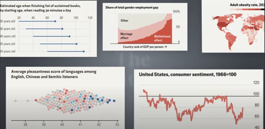
Excel charts and graphs have evolved into essential tools for presenting data engagingly and understandably. Gone are the days of dull, lifeless presentations. Inspired by the professional and eye-catching visuals found in The Economist, this tutorial arms users with the capability to transform complex data into visually appealing stories. Whether for academic, corporate, or personal projects, mastering these Excel charting techniques opens a new realm of storytelling possibilities.
Understanding how to use Excel for data visualization efficiently not only enhances your presentations but also elevates your analytic capabilities. By learning how to create a special type of Bar Chart, Dumbbell Charts, and Color-Coded Tables, users can convey complex analyses in a straightforward and compelling way. These skills are invaluable in today's data-driven world, where clear communication of information can significantly impact decision-making processes.
Moreover, these charting techniques are not confined to Excel or The Economist's aesthetic. They can be adapted and applied across various platforms, catering to endless purposes and audiences. This versatility ensures that your data presentation skills remain relevant and influential, regardless of the medium or setting. With this tutorial, embark on a journey to mastering Excel charts, thereby enhancing your data storytelling skills and captivating your audience every time.
Creating visually appealing charts in Excel akin to those found in The Economist magazine can significantly enhance your data presentations. Leila Gharani [MVP] explains how to craft three types of charts: a unique Bar Chart, Dumbbell Charts, and Color-Coded Tables. These techniques aim to elevate your corporate presentations by integrating professional visuals similar to those seen in prestigious publications.
The video tutorial is designed for beginners and those wishing to refine their skills in Excel, providing a step-by-step guide to setting up these charts. By following this tutorial, users will learn to make their data presentation clearer and more engaging. Ultimately, viewers will acquire the ability to produce striking visuals that can be a valuable addition to any report or presentation.
Highlights of the tutorial include easy-to-follow instructions for creating charts in Excel, tips for making professional-looking visuals akin to those in The Economist Magazine, and advice for dynamic and clear data presentations. The content is structured to facilitate quick learning, starting with Bar Charts, followed by Dumbbell Charts, and concluding with Color-Coded Tables, ensuring a comprehensive understanding of these chart types.
In summary, Leila Gharani’s video tutorial offers an invaluable resource for individuals looking to enhance their presentation skills in Excel. By applying these techniques, users can create data visuals that are not only informative but also aesthetically pleasing, making their reports or presentations stand out. This guide promises to make the process of chart creation in Excel accessible and enjoyable for users at all skill levels.
Advanced Charting Techniques
In today’s data-driven environment, the ability to present data in a visually appealing and comprehensible manner is invaluable. Excel offers a variety of charting capabilities that, when mastered, can transform the way we represent data. Beyond the basics lie advanced charting techniques that can communicate complex data sets simply and effectively.
Advanced charting techniques, such as those demonstrated by Leila Gharani, harness the full potential of Excel's charting tools to create visuals that catch the eye and convey messages powerfully. By adopting these methods, users can move beyond standard charts and embrace more sophisticated visuals that tell a story at a glance.
These techniques are not just about aesthetic enhancement; they serve to clarify and emphasize key data points, making it easier for audiences to grasp the underlying message. Customization options enable users to tailor their charts to fit their specific presentation needs, whether for corporate meetings, academic research, or personal projects.
As data becomes more integral to decision-making processes across industries, the demand for effective data presentation skills will continue to rise. Learning advanced charting techniques in Excel places individuals at a competitive advantage, empowering them to communicate insights more effectively.
Whether you are a beginner eager to expand your Excel capabilities or an experienced user looking to elevate your presentations, exploring advanced charting techniques is a step toward achieving greater impact with your data visualizations. The journey from simple pie charts to intricate, dynamic visuals is both rewarding and essential for anyone who seeks to make a mark with their data presentations.
Excel, with its robust set of charting tools and the guidance of experts like Leila Gharani, offers a pathway to mastering these advanced techniques. By dedicating time to learn and experiment with these tools, users can unlock new possibilities in data visualization and pave the way for clearer, more compelling presentations that captivate and inform their audiences.

People also ask
Questions and Answers about Office/Excel
"How do I make an attractive chart in Excel?"
As an expert with a focus on Microsoft Excel, I can assure you that creating attractive charts in Excel involves selecting the right type of chart for your data, utilizing color schemes that highlight critical data points, and customizing chart elements like titles and axes for clarity and impact. Precision in these steps can substantially enhance the visual appeal of your charts.
"How do I make an Excel graph look professional?"
In the world of professional finance graphs, there's a consensus on several formatting norms. These include a clear and legible font, a coherent color scheme that aligns with the data and the context in which it is presented, and the cleanliness of the graph's layout to ensure that the message is conveyed efficiently and effectively.
"How do I make my Excel bar chart look better?"
Enhancing the visual hierarchy of your Excel bar chart can be easily achieved by organizing the bars in a manner that places the longest bar at the top of your chart. This can be done by selecting the 'Categories in reverse order' option within the vertical axis settings. This adjustment not only improves your chart's appearance but also facilitates a quicker comprehension of the data represented.
"How can I improve my Excel chart?"
When aiming to elevate the effectiveness and aesthetic of your Excel charts, employing certain tips and adhering to best practices is essential. These include the thoughtful use of color to draw attention to key data points, ensuring text is readable and straightforward, optimizing the chart type to best represent your data, and refining the layout and design elements to convey your information clearly and compellingly.
Keywords
Excel charts, Economist-style visualization, beautiful Excel graphs, advanced Excel charting, Excel visualization techniques, download Excel chart templates, create professional Excel charts, improve Excel chart design