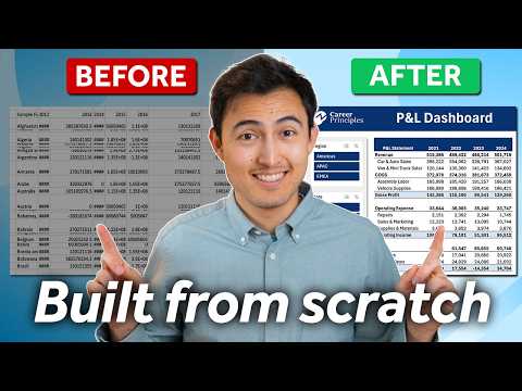
Excel Make a Dynamic Profit & Loss Dashboard with Pivot Tables
Co-Founder at Career Principles | Microsoft MVP
Master Excel: Create Dynamic Profit & Loss Dashboards with Pivot Tables!
Key insights
Create an interactive profit and loss dashboard using Pivot Tables in Excel, allowing for dynamic financial analysis by region and by month.
Utilize Pivot Table slicers to seamlessly switch between budget vs actuals dashboards in a matter of clicks.
The tutorial covers four main steps: setting up the P&L pivot table, making it dynamic, designing the dashboard, and creating the budget vs actuals feature.
Additional learning resources include specialized courses in Power BI for Business Analytics and Excel for Business & Finance.
The video is structured into chapters, starting with transforming raw data into a P&L statement and culminating in a fully functional budget comparison dashboard.
Overview of Creating a Dynamic Profit and Loss Dashboard
Creating a dynamic profit and loss (P&L) dashboard in Excel highlights the potential of Pivot Tables to transform raw financial data into an intuitive and interactive interface. This tool is essential for financial managers and business analysts who require a flexible solution to visualize and manipulate financial data efficiently. Through the use of Pivot Tables, users can filter financial outcomes by different criteria like regions and months, enhancing the analysis of trends and variances in budget versus actuals. The detailed tutorial aims at equipping individuals with the necessary skills to build and customize their financial dashboards, ensuring that they can make informed decisions based on comprehensive, real-time financial data. Overall, such a dashboard can serve as a crucial tool for financial planning and analysis, driving better business decisions.
Create a Dynamic Profit & Loss Dashboard Using Pivot Tables
In a recent tutorial on Kenji Farré's YouTube channel, 'Kenji Explains', the expert delves into how one can construct an interactive profit and loss dashboard in Excel with the help of Pivot Tables. The session begins by transforming a basic set of raw data into a more functional financial tool. This development is executed through several steps, designed to encourage viewer interaction and enhanced comprehension of financial data management.
Building and Utilizing Interactive Dashboards
Farré specifies a four-step process to achieve a dynamic dashboard. The first step involves setting up the initial Pivot Table specifically for managing profit and loss data. This setup is crucial as it lays the foundation for the subsequent steps in the tutorial. Following the setup, the dashboard is made dynamic, allowing for changes and real-time data updates, which are essential for accurate financial monitoring and forecasting.
The latter part of the tutorial focuses on the aesthetics and functionality of the dashboard design. Special attention is given to integrating features like slicers in Pivot Tables, which allow users to filter data based on various parameters like region and time. This enhances the usability of the dashboard, making it not only a tool for financial representation but also a versatile instrument for financial analysis and decision-making.
Expanding Skills Beyond Excel
While the main focus of Farré's video is on using Excel to build these dashboards, he also hints at further educational content available that expands beyond Excel. Courses on Business Analytics using Power BI and other finance-related courses are mentioned as resources for viewers who wish to deepen their proficiency in business technology tools. This approach not only aids in skill expansion but also encourages continuous learning and development in the field of business finance.

People also ask
What is dynamic profit?
Dynamic profit refers to earnings that change or adapt based on various conditions or scenarios in a business environment. Typically, it leverages technology such as the Power BI dynamic measures to accommodate fluctuations and provide real-time, adaptable business insights.
How do you plan to make a profit?
Profit planning is strategic, involving the analysis of market opportunities, cost management, and revenue maximization. The utilization of analytical tools in the Microsoft Power Platform, such as Power BI, aids in visualizing and forecasting financial outcomes to enhance decision-making processes.
How to make a simple profit and loss statement?
Creating a simple profit and loss statement can be accomplished by listing your revenue streams, subtracting the costs and expenses, and calculating the net profit. Tools like Microsoft Excel provide built-in templates and functionalities that simplify this process, making it accessible even to those with minimal financial background.
Does Excel have a P&L template?
Yes, Microsoft Excel includes templates for creating profit and loss statements. These templates can be easily customized to suit specific business requirements and provide a foundation for tracking financial performance over selected periods.
Keywords
Profit and Loss Dashboard, Pivot Table Tutorial, Dynamic Dashboard Excel, Financial Dashboard Excel, Excel for Business, P&L Reporting, Business Intelligence Tools, Excel Data Analysis