
Power BI: Master Custom Label Usage for Impact
Unlock insights with custom labels in Power BI for compelling, clear data visuals.
Key insights
Leveraging custom labels in Power BI can lead to deeper analytical understanding. They allow categorization and grouping of data in ways meaningful to specific business contexts. Mitchell emphasizes the benefit of creating custom labels for enhancing visualization effectiveness and gaining additional insights.
Custom labels enhance clarity and readability in visualizations, displaying additional information beside default data points. This conveys broader context, transforming reports into compelling and informative tools that facilitate better conveyance of insights to the audience.
Key Benefits of Using Custom Labels in Power BI:
- Enhancing Data Comprehension: They add supplementary text, annotations, or metrics to help users understand data significance.
- Highlighting Key Points: Helps emphasize specific data points or patterns within visualizations to draw attention to important insights.
- Contextualizing Data with Related Measures: Allows the display of related measures or calculated values for broader understanding and informed decision-making.
- Combining Text and Data: Accommodates both textual and data elements for a richer presentation of your visualizations.
- Personalizing Visualizations: Offers customization of the labels' appearance to match the overall report style.
Specific Examples of Custom Labels Usage in Power BI:
- Display product descriptions in a bar chart to provide context to sales data.
- Annotate customer satisfaction trends in a scatter plot with explanations of anomalies or trends.
- Compare sales and profit margins for regions using custom labels in a table.
- Embed market share percentages in pie charts for a quantitative understanding of product distribution.
- Highlight sales performance by department in a treemap, emphasizing contributions to overall sales.
Custom labels in Power BI are an invaluable enhancement to data presentation and interpretation. With thoughtful customization, these labels can significantly improve the delivery of insights and support informed decision-making processes.
Understanding Power BI Custom Labels
Power BI custom labels are a potent feature that empowers users to clarify and contextualize their data beyond the conventional capabilities. As an invaluable asset for data analysts and visualization creators, custom labels pave the way for more meaningful and action-oriented insights. By blending narrative text with quantitative data, these labels transform a simple chart into a story that speaks to the business needs and aids in strategic decision-making. Whether it's through spotlighting critical data, providing comparative analysis, or adding narrated insights, Power BI's custom labels make reports more accessible, personalized, and powerful.
Leveraging Custom Labels in Power BI
In this video, Mitchell demonstrates the use of custom labels in business data analysis using Power BI. These labels enable more profound insights by providing meaningful data groupings and categorizations.
Creating custom labels involves starting from scratch. They contribute to the effectiveness of visual presentations and can be combined with Power BI features for enriched insights.
Custom labels in Power BI enhance visual reports' clarity. They present additional information beside default data, offering more context to the viewers, making the reports not just clear but also insightful and engaging.
Key benefits of using custom labels in Power BI:
- Enhancing Data Comprehension: They add context through descriptive text, making data significance clearer.
- Highlighting Key Points: Emphasize crucial data to draw viewers' attention to important insights.
- Contextualizing Data with Related Measures: They allow for a more informed view by showing related measures.
Combining Text and Data: Mix text and data in custom labels for a more informative presentation.
Personalizing Visualizations: Customization allows for a personalized appearance of labels, aligning with the report's style.
Examples of custom labels in action within Power BI:
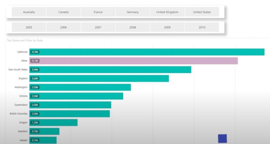
- Displaying Product Descriptions in a Bar Chart: Enhance sales data bars with contextual product information.
- Annotating Trends in a Scatter Plot: Identify and explain outliers and trends with annotations.
- Comparing Measures in a Table: Reveal profitability insights side by side with sales data.
Embedding Calculations in Pie Charts: Show quantitative distribution with market share data labels.
Highlighting Key Findings in a Treemap: Emphasize departments' sales contribution to overall figures with total sales labels.
Power BI's label feature is a potent enhancement tool for visualization. When used effectively, it doesn't just uplift the report's aesthetic value but also imparts essential knowledge that aids informed decision-making.
Understanding Power BI Custom Labels
Custom labels in data analysis tools like Power BI transform how information is displayed, leading to more actionable insights. By personalizing how data is categorized, businesses can highlight the most relevant information in their reports. These dynamic labels allow users to go beyond the surface and understand the data story better. As the need for data-driven decision-making becomes increasingly integral, utilizing such features in Power BI becomes a crucial aspect of business intelligence strategies, helping companies stay ahead by making informed decisions based on compelling visualizations and in-depth analysis.
Leveraging Custom Labels in Data Analysis: In this video, Mitchell delves into the use of custom labels to achieve a deeper understanding of your data. These labels enable you to classify and group data in a way that aligns with your unique business needs. We go over how to craft these labels from the ground up, their role in creating more impactful charts and graphs, and the way they can be combined with other functionalities to unveil further insights.
The addition of custom labels in data analysis provides a significant boost to the clarity and interpretability of your charts and graphs. They serve as a means to present additional context right alongside your standard data points. This method allows for a richer presentation of data, offering your audience more substantial information to process.
Here are some noteworthy advantages of using custom labels:
- Augmenting Data Comprehension: Beyond the basic data points, descriptive text, annotations, or complementary metrics can be included. This layers on additional understanding, enabling users to draw more significant conclusions from the data.
- Highlighting Key Points: Custom labels can spotlight particular data or patterns within a chart or graph. This focus can bring to light pivotal insights and guide viewers to the data's most critical aspects.
- Contextualizing Data with Related Measures: These labels allow you to showcase measures or calculations right next to the data points. This broadens one's grasp of the data and supports more educated decision-making.
There are more uses to these custom labels, such as:
- Combining Text and Data Elements: Bringing together text and data, you can tell a more intricate and informative story within your visualizations. This blend can improve both visual appeal and understanding of the data.
- Personalizing Visualizations: You have the freedom to alter the labels' look and feel, adjusting aspects such as font, size, color, and alignment to suit the report's style.
Delving into practical applications, here are specific examples of how custom labels can be leveraged:
- Displaying Product Descriptions in a Bar Chart: Place custom labels in a bar chart that displays sales to contextualize each bar with product details, enhancing understanding of sales data.
- Annotating Trends in a Scatter Plot: With a scatter plot depicting customer satisfaction over time, employ custom labels to mark data points, explaining atypical values or significant trends.
- Comparing Measures in a Table: In a table with sales across regions, custom labels can reveal profit margins for each, allowing for a comparative view between sales and profitability.
These examples showcase the breadth of utility that custom labels offer. From pie charts showing market share with embedded percentage calculations to treemaps with sales performance highlighted for each department, custom labels enhance data visualization across the board. Implementing these in your reports with intention and customization, you can furnish your audience with the kind of insights they need for informed decision-making in their respective domains.

People also ask
How do I use custom labels in Power BI?
To use custom labels in Power BI, you first need to have a dataset loaded into Power BI Desktop. Once your data is ready, you can create custom labels by using the data fields in your visualizations. You can drag a data field into the 'Values' section of the visualization pane, then format the label by selecting the 'Format' pane and choosing the 'Data labels' option. Here, you can adjust the text, color, and display options to create a custom label appearance.
How do I create a dynamic label in Power BI?
Creating a dynamic label in Power BI means that the label's content changes based on interactions or the current data context. You can achieve this by using DAX (Data Analysis Expressions) to create measures that respond to user interactions or filters. When you apply these measures to the 'Data labels' field in a visualization, the labels update dynamically. For example, using a measure that concatenates the selected year with a sales total can show a label like "2023 Sales: $500,000" that updates when a different year is selected.
How do I add data labels to Power BI?
To add data labels to a chart in Power BI, click on the visualization to which you want to add labels. Then, go to the 'Format' pane, and you will find the 'Data labels' option. Toggle the 'Data labels' switch to 'On.' Afterward, you can customize the labels further through the settings available in the 'Data labels' menu, such as color, text size, label position, and whether to display units.
How do I always show data labels in Power BI?
By default, Power BI might not display all data labels, especially if the chart is crowded or if the labels overlap. To force Power BI to show all data labels, click on the visualization of interest, navigate to the 'Format' pane, and expand the 'Data labels' menu. Within this menu, look for the 'Show all' setting and toggle it to 'On.' Be aware that this can lead to a cluttered visual if too many labels overlap, so it's encouraged to use it cautiously and consider alternative visualizations or label positioning to maintain readability.
Keywords
Power BI Custom Labels, Custom Label Visualization, Advanced Labeling Power BI, Enhance Power BI Reports, Dynamic Labels in Power BI, Power BI Label Customization, Power BI Label Management, Personalized Labels Power BI, Power BI Data Labeling, Interactive Labels Power BI