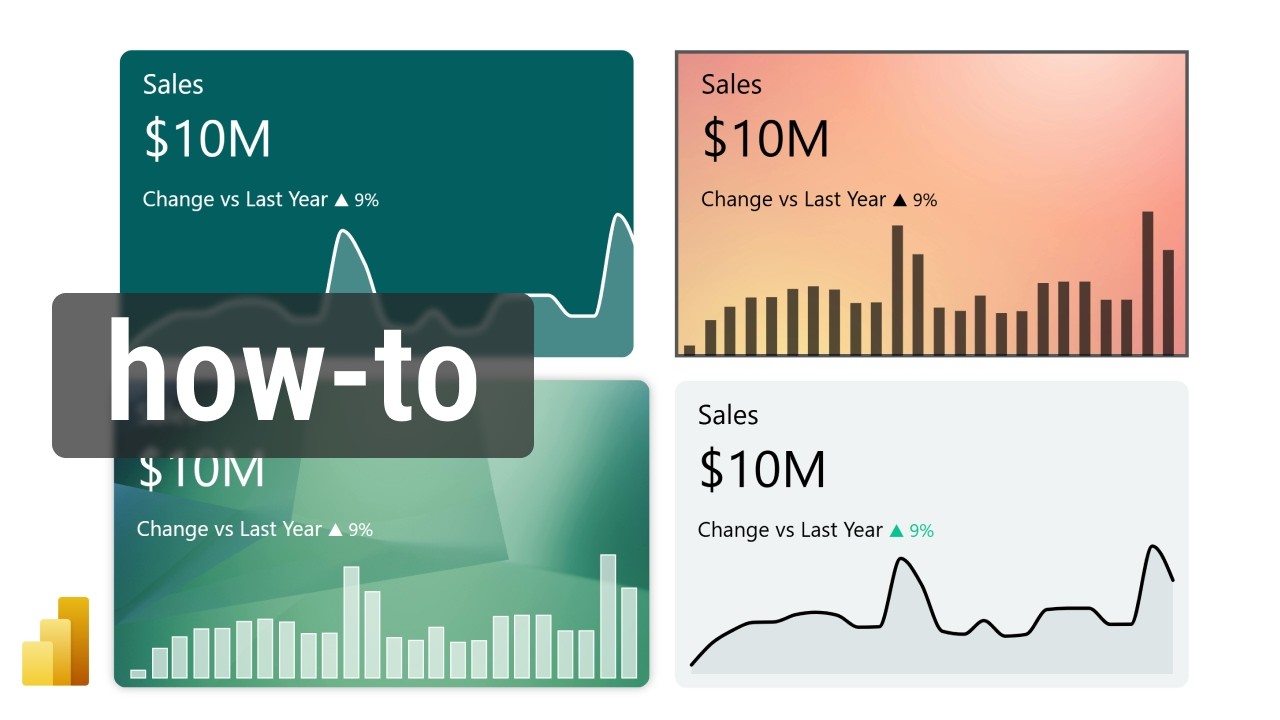
Power BI KPI Cards: Boost Your Reporting Skills
Power BI, arrow icons, color formatting, dashboard design course
Key insights
- Power BI KPI cards are visual tools that help users track progress toward specific goals, making it easy to see how current results compare to targets at a glance.
- Key Performance Indicators (KPIs) in Power BI use a base measure (current value), a target measure (goal), and sometimes a threshold, allowing quick assessment and strategy adjustments.
- KPI cards offer easy progress tracking, promote a goal-oriented approach, and provide flexibility, as they can be used in various business areas like sales, finance, and operations.
- The process to create a KPI card includes: preparing clean data with clear measures, choosing the right visual (such as the KPI or gauge visual), and setting up base values, targets, and thresholds for effective visualization.
- Tutorials now focus on step-by-step guidance for beginners, showing how to make different types of KPI cards using visuals like Matrix and Card, as well as how to use filters and slicers for more interactive analysis.
- The latest developments emphasize integrating Excel sheets for goal values and building advanced data models in Power BI. This allows deeper analysis and stronger alignment of KPIs with business strategies.
Introduction to Power BI KPI Cards
In a recent YouTube video tutorial, Christine Payton explores the process of building sleek, modern KPI cards in Power BI, offering valuable insights for business analysts and dashboard designers. KPI cards, or Key Performance Indicator cards, serve as essential visual tools that help organizations track measurable goals efficiently. These cards are prominently used in professional dashboards to offer a quick snapshot of progress, making them indispensable for decision-makers who need up-to-date performance metrics at a glance.
By integrating KPI cards into Power BI dashboards, users can visualize trends and performance data in a visually appealing manner. This approach not only enhances the clarity of information but also supports faster, better-informed business decisions. Christine’s tutorial highlights both the technical steps and the design considerations needed to create effective KPI visuals.
Understanding the Technology Behind KPI Cards
At its core, the technology behind KPI cards in Power BI revolves around tracking and displaying critical business metrics. Typically, a KPI card consists of a base measure—the current value being tracked—a target measure—the goal to reach—and sometimes a threshold that indicates how far ahead or behind the actual value is compared to the target. This setup enables users to quickly interpret whether their performance aligns with objectives.
Christine Payton’s video emphasizes the importance of preparing clean and well-structured data before creating KPI visuals. By ensuring that both current and target values are clearly defined, users can set up their KPI cards with confidence. Additionally, Power BI offers several built-in visuals, such as the dedicated KPI visual, gauge, and customizable card visuals, giving users the flexibility to choose the format that best suits their reporting needs.
Advantages and Tradeoffs in KPI Card Design
One of the primary advantages of using KPI cards is their ability to simplify complex data, making it easier to spot trends and identify areas requiring attention. For instance, Christine demonstrates how adding conditional formatting—like color changes for positive or negative trends—can make insights more intuitive. This not only aids in highlighting performance but also adds a layer of visual engagement to the dashboard.
However, there are tradeoffs to consider. While KPI cards provide clear, concise snapshots of performance, they may oversimplify nuances found in the underlying data. Relying solely on KPI visuals could lead to missed context or deeper insights that might be uncovered through more detailed analysis. Therefore, balancing simplicity with depth is crucial when designing dashboards that inform strategic choices.
Recent Developments and Advanced Features
Christine’s tutorial reflects recent trends in KPI card development, including the use of up and down arrows (using symbols like ▲ and ▼) to indicate changes, and the application of conditional color formatting (such as red for negative and green for positive outcomes). These techniques are increasingly popular as they make dashboards more interactive and visually informative.
Moreover, new approaches involve leveraging Power BI’s advanced data modeling features. For example, incorporating goal values directly from Excel sheets or using data models allows for more dynamic and automated KPI tracking. These advancements enable organizations to integrate KPI monitoring more seamlessly into their broader analytics strategies, providing real-time updates and greater flexibility.
Challenges in KPI Implementation
Despite the benefits, implementing effective KPI cards in Power BI comes with challenges. Ensuring data quality and accuracy is a significant hurdle; without reliable data, KPI cards can present misleading information. Additionally, choosing the right visual format and conditional logic requires a thoughtful approach to avoid clutter or confusion on the dashboard.
Another challenge lies in user adoption. While visually appealing KPI cards can drive engagement, users must understand the meaning behind the metrics and how to interpret them correctly. Ongoing education and clear documentation are essential to maximize the impact of these visuals.
Conclusion: The Evolving Role of KPI Cards
In summary, Christine Payton’s tutorial provides a comprehensive guide for creating modern, functional KPI cards in Power BI. As organizations increasingly rely on data-driven insights, the ability to present key metrics clearly and attractively becomes ever more important. While there are tradeoffs between simplicity and depth, and challenges in data quality and user adoption, the evolving features of Power BI continue to make KPI cards a powerful asset for business intelligence.
With ongoing advancements and accessible tutorials like Christine’s, both beginners and experienced users can refine their dashboard design skills, ensuring that KPI cards remain a central component of effective performance management.

Keywords
Power BI KPI card tutorial Power BI KPI visualization Power BI dashboard KPIs Power BI performance indicators KPI card design in Power BI create KPI cards Power BI data analysis KPI metrics in Power BI
