
Quick Excel McKinsey Chart Tutorial: Faster Than Coffee!
Unlock Excels Secret: Create McKinsey Charts Easily & Impress in Reports!
Key insights
- Learn to quickly make professional charts in Excel that are simple, modern, and effectively communicate data.
- Discover how to design charts similar to those used in top industry reports and corporate presentations using a simple Excel function.
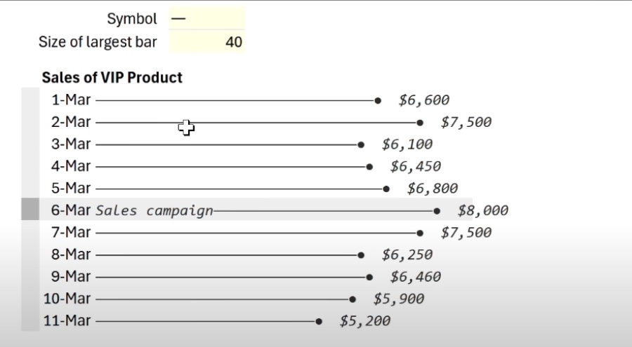
- This method allows for the creation of the McKinsey chart (lollipop bar chart or pin horizontal chart) in Excel easily and rapidly.
- Explore the flexibility of Excel's charting functionality to create not just McKinsey charts, but also customized bar charts using symbols or emojis.
- Gain knowledge on customizing and modifying charts dynamically to immediate data changes without complex software.
Enhancing Business Reports with Excel's Charting Capabilities
Leila Gharani, a Microsoft MVP, shares a quick way to create professional McKinsey charts in Excel, transforming data presentation into an engaging experience. She emphasizes the simplicity and modernity of these charts, which are perfect for corporate reports or consulting presentations. Furthermore, Gharani introduces a hidden chart function in Excel that simplifies the chart creation process.
This tutorial is designed to help users make industry-standard charts with ease, utilizing a straightforward Excel function. These highly effective visual tools are crafted without the need for complex software, making it feasible to produce an impressive McKinsey chart with just a few clicks. Gharani refers to the McKinsey chart as the lollipop bar chart or the pin horizontal chart, showcasing its versatility.
Additionally, Gharani demonstrates how to create a fast bar chart in Excel, offering customization tips like tweaking the chart to create a star bar chart using various symbols. This approach underscores the flexibility and ease of using Excel for creating dynamic, adaptable charts. She also covers the use of the REPT function to personalize chart bars with emojis and symbols and how to modify charts dynamically to respond to data changes instantly.
The tutorial includes segments on creating a McKinsey chart using a specific Excel function and customizing the chart to fit various data visualization needs. Leila Gharani's new course on Business Charts in Excel is also mentioned, promising more insights into creating effective visuals for business reports.
Enhancing Data Visualization in Excel
Data visualization in spreadsheet software like Excel has transformed how businesses and individuals interpret data. Excel's introduction of intuitive and straightforward functions for chart generation allows users with various skill levels to create professional-looking visuals. These charts help in presenting complex data in a more digestible and engaging format, making analysis and decision-making processes smoother.
The McKinsey chart, or the lollipop bar chart, is one such visualization tool that offers a clear and concise way to represent data. Its customization capabilities allow the addition of emojis, symbols, or other features to make the data even more comprehensible. This adaptability ensures that regardless of the data changes, the visualization remains accurate and reflective of the new data set.
Excel's hidden chart function, as highlighted by Leila Gharani, demonstrates spreadsheet software's potential in revolutionizing business reports and presentations. By reducing reliance on complex software for data visualization, Excel opens up new avenues for effective communication through visuals. Moreover, the ability to customize charts dynamically with simple strategies like the REPT function further enhances Excel's utility in the realm of data analysis and presentation.
As businesses and professionals continue to rely on data for strategy and decision-making, the importance of efficient and engaging data presentation grows. Excel's chart functions and customization options play a crucial role in meeting this need, offering a blend of simplicity, flexibility, and professionalism in data visualization. Such capabilities not only save time but also elevate the overall quality of business reports and presentations, making them more impactful.
In conclusion, Excel remains a powerful tool in the data visualization toolkit, capable of creating high-quality, professional charts that communicate data effectively. Whether for corporate reports, consulting presentations, or academic projects, Excel's chart functions offer a dependable and straightforward solution for enhancing the visual representation of data. Leila Gharani's tutorial provides valuable insights into making the most of these features, empowering users to elevate their data presentation game. Excel

## Questions and Answers about Office/Excel
Keywords
Excel McKinsey Chart, Fast Excel Tutorial, Quick McKinsey Chart Creation, McKinsey Chart Excel Guide, Excel Productivity Hacks, Accelerated Excel Charting, Excel McKinsey Visualization, Easy McKinsey Excel Chart