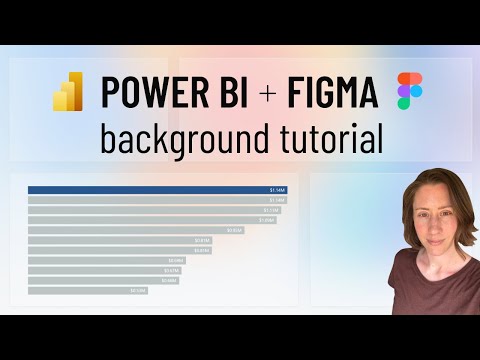
Figma to Power BI: Blurred Glass UI
Power Platform Developer
Microsoft Power BI expert tutorial with Figma: build glassmorphism dashboards, blurred backgrounds and translucent cards
Key insights
- Figma-to-Power BI workflow: Design your UI in Figma using a Power BI canvas size (commonly 1280×720), group related elements, and export visuals to import into Power BI.
Keep layouts simple so you can reproduce interactivity later in Power BI. - Blurred glass technique: Create translucent overlays in Figma and apply background blur inside the design file, then export the overlay as a transparent image to preserve the glassmorphism effect.
Layer the exported overlay over your report background in Power BI to keep the blurred look. - Import and recreate interactivity: Insert exported images into Power BI using Image and Shapes, then rebuild interactive elements (buttons, bookmarks, slicers) with native Power BI controls to match the Figma prototype.
Use bookmarks and buttons to simulate hover and navigation states. - Export settings and file types: Use PNG with transparency for overlays, SVG for icons, and JPG for large photographic backgrounds; export grouped elements to simplify placement and consider exporting at 2× for retina clarity.
Optimize file sizes to avoid slow report load times. - Limitations and performance: There is no direct Figma-to-Power BI import, so expect manual alignment and recreation of interactivity; large images can slow dashboards, so compress backgrounds and keep overlays lightweight.
Test performance on typical user devices and adjust image quality as needed. - Best practices: Match the Figma frame to your Power BI canvas, use consistent fonts and colors, plan grouped exports for easy layering, and validate readability and accessibility with real data.
Prototype component variants in Figma to speed up rebuilding states in Power BI.
Overview of the video and key premise
The recent YouTube tutorial from Christine Payton walks viewers through using Figma to create a modern Blurred Glass look and then bringing those visuals into Power BI. First, the video explains why designers might prefer creating UI elements in Figma and then importing them into reports instead of relying solely on native report formatting. Moreover, it highlights that the process is largely manual because a direct import from Figma to Power BI is not available as of mid-2025.
In addition, the video lays out a chaptered, step-by-step workflow that emphasizes frame sizing, shape creation, blur effects, and export settings. Consequently, viewers can follow a clear sequence from prototype to report-ready assets. At the same time, the tutorial cautions that interactivity must be rebuilt inside the reporting tool after visuals are imported.
Step-by-step workflow explained
First, the tutorial recommends starting with a frame sized to the typical Power BI canvas so the design aligns with the report layout. Then, the author demonstrates adding shapes, grouping elements, and applying gradients and transparency to match a dashboard aesthetic. Finally, she shows how to export backgrounds and overlays in common image formats while preserving transparency where possible.
Next, the video describes the import phase where exported images are placed into Power BI and interactive elements are recreated using native controls like buttons and bookmarks. Accordingly, viewers learn to layer images and native visuals to mimic the original Figma prototype. Therefore, the approach balances visual fidelity with the need to preserve report interactivity and data-driven behaviors.
Techniques for the Blurred Glass effect
The tutorial focuses on creating translucent overlays in Figma and applying blur to simulate frosted glass panels that sit above a background image. Then, Christine shows how to export the blurred overlays so that the soft, diffused look remains intact when brought into Power BI. Consequently, designers can reproduce modern glassmorphism styles even though the reporting tool lacks built-in blur filters.
Moreover, the video explains two options for preserving the effect: export overlays as images that already include the blur or export the background and overlay them as separate assets in the report. Each option has tradeoffs, so the tutorial demonstrates both methods to help viewers choose based on file size, scalability, and ease of updates. Thus, the guide helps designers match the visual style while accounting for technical limits.
Tradeoffs and common challenges
One major tradeoff is visual fidelity versus interactivity: exporting art as images yields a pixel-perfect look, but it breaks native interactivity and responsiveness inside Power BI. Meanwhile, recreating elements with native visuals preserves interactions but often requires extra formatting work and sometimes sacrifices the subtle visual effects designers want. Therefore, teams must weigh aesthetics against maintainability and data-driven behavior.
Another challenge is performance and file size because large blurred backgrounds can increase report load times and affect responsiveness on lower-end devices. Additionally, matching fonts, spacing, and alignment between Figma and the report requires careful testing across screen sizes and resolutions. As a result, designers should plan for ongoing maintenance, especially when dashboards must scale or be updated frequently.
Practical tips and final takeaways
To mitigate the downsides, the video suggests exporting grouped elements and minifying background images to reduce file sizes while keeping visual quality high. Also, using consistent canvas dimensions and component variants in Figma makes it easier to rebuild interactivity in Power BI, and designers should document the mapping between prototype components and native report controls. Finally, testing on multiple screen sizes and optimizing images for the web will improve real-world performance.
In conclusion, Christine Payton presents a pragmatic method that blends the design strengths of Figma with the data and interaction features of Power BI, enabling teams to achieve contemporary looks like Blurred Glass without sacrificing report functionality. However, teams must accept the manual steps required and plan for tradeoffs around interactivity, file size, and maintenance. Ultimately, the tutorial offers useful techniques and clear guidance for designers and report authors aiming for polished, modern dashboards.

Keywords
Figma Power BI tutorial, Power BI and Figma integration, Blurred glass effect Power BI, Figma to Power BI export, Power BI UI design Figma, Figma blurred glass tutorial, Power BI report design tips, Figma design for Power BI