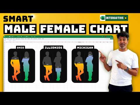
Excel Tips: Create Engaging Male vs Female Charts Fast
Excel PowerPoint XLOOKUP Data Validation Charting Dashboards
Key insights
- Male vs. Female Charts in Excel are visual comparison tools that use custom icons and interactive formatting to display gender-based data clearly, making them ideal for HR reports, presentations, and dashboards.
- This approach offers clarity, a professional appeal, and easy customization of icons, colors, and axes using only Excel’s native features—no extra software needed.
- The basic workflow includes preparing data in a table, creating a clustered column chart, adjusting the axis to show accurate percentages (0–100%), and adding male or female icons from Excel’s Illustrations menu.
- New techniques in 2024–2025 include charts that update automatically when source data changes using formulas like SEQUENCE(), more customization options such as overlapping series for fill effects, and interactive controls like sliders for real-time adjustments.
- The modern step-by-step process involves generating the base chart, calibrating the vertical axis (set bounds from 0 to 1), placing gender icons over columns, and matching icon colors with the bars using the Format Data Series option.
- Practical applications include tracking workforce diversity in HR dashboards, visualizing survey results or enrollment ratios in academic settings, and comparing customer demographics across regions—all using Excel’s built-in tools for high-impact visual storytelling.
Introduction to Male vs Female Charts in Excel
Excel continues to be a powerful tool for visualizing data, and the latest video by Chandoo explores how to create dynamic male vs female charts. These charts are increasingly popular for comparing gender-based statistics in fields like HR, education, and business analytics. By using customizable icons and interactive features, Excel users can present demographic data in a way that is both visually appealing and easy to understand.
As organizations place greater emphasis on data-driven decision-making, the ability to clearly communicate gender-related insights has become crucial. Therefore, mastering these charting techniques not only enhances reports but also supports more informed discussions during meetings and presentations.
Core Features and Advantages
One of the main advantages of this approach is its clarity. By incorporating intuitive icons—such as male and female silhouettes—Excel charts can simplify complex datasets and make key differences immediately visible. This clarity is especially important when presenting to stakeholders who may not have a technical background.
Furthermore, these charts are highly customizable. Users can adjust colors, icon styles, and axis settings to align with their company’s branding or the specific needs of their presentation. Importantly, all of this can be achieved using Excel’s built-in features, eliminating the need for third-party tools and ensuring compatibility across different environments.
Step-by-Step Creation Process
The process begins with data preparation, where users organize male and female values—often as percentages—in a structured table. Next, a clustered column chart is inserted, allowing for clear side-by-side comparisons. To ensure accurate representation, the chart’s vertical axis is calibrated, typically set from zero to 100 percent.
A unique aspect of this method is the integration of icons. By using Excel’s Insert > Icons feature, male and female silhouettes or even gender-neutral graphics can be added directly to the chart. These icons are then resized and positioned over the columns, creating an engaging visual effect. The challenge here lies in maintaining alignment and proportion, particularly when dealing with varying data ranges or custom icon designs.
Recent Innovations and Interactive Elements
Recent tutorials, including those highlighted by Chandoo, showcase several innovations introduced in 2024 and 2025. One major development is the use of dynamic formulas like SEQUENCE(), which allow charts to automatically update as underlying data changes. This feature is particularly useful for waffle-style ratio charts, where each cell represents one percent of the total.
Another trend is the use of interactive controls, such as sliders, which enable presenters to adjust data ranges in real time. This interactivity can make meetings more engaging and help audiences explore different scenarios. However, achieving a seamless user experience requires careful setup—for example, ensuring that icons and bars remain synchronized as values shift.
Tradeoffs and Challenges
While these advanced charts offer significant benefits, they also present certain tradeoffs. Customizing icons and formatting can be time-consuming, especially for large datasets or when trying to match specific visual themes. Additionally, balancing detail and simplicity is a challenge; adding too many interactive elements may overwhelm viewers, while too little customization can make the chart appear generic.
Another challenge is ensuring that the charts remain accessible. Not all viewers may interpret icons in the same way, so providing clear labels and legends is essential. Despite these hurdles, the flexibility and visual impact of Excel’s latest charting capabilities make them a valuable addition to any data storyteller’s toolkit.
Real-World Uses and Conclusion
These male vs female charts are finding practical applications in a variety of contexts, from HR dashboards tracking workforce diversity to academic reports analyzing survey results. Business analysts also use them to compare customer demographics across different regions. Ultimately, by leveraging Excel’s evolving features, users can create compelling, interactive visuals that enhance understanding and drive action.
In summary, the techniques presented by Chandoo reflect the ongoing evolution of data visualization in Excel. As new tools and functions are added, users have more options than ever to present gender-based data in ways that are both informative and engaging, while navigating the tradeoffs between customization, clarity, and efficiency.

Keywords
Excel gender charts Excel male vs female chart tutorial create gender comparison chart Excel data visualization tips make cool charts in Excel how to compare male and female data in Excel best Excel chart types for gender analysis