Power BI
Feb 26, 2025 11:13 PM
Power BI : How to Make a Project Management Dashboard in Power BI
by HubSite 365 about Christine Payton
Power Platform Developer
Power BI, Microsoft List, Planner
Key insights
- Data Sources & Preparation: Start by gathering project data from various sources like Excel, SharePoint, or SQL databases. Use Power BI Desktop to import this data and utilize Power Query for cleaning and transforming it without affecting the original source.
- Power Query Cleaning: Remove unnecessary columns or blank rows to declutter your data. Ensure proper data types are assigned to each column to prevent calculation errors. Apply all transformations before loading the refined data model into Power BI.
- Data Model Structure: Organize your data using a star schema approach with separate tables for different entities like Projects, Tasks, Resources, etc. Link these tables via key fields to improve clarity and performance.
- Create Relationships: Establish relationships between tables in Power BI so visuals can combine data effectively. Verify auto-detected relationships or manually create them using common key fields.
- DAX Measures & Visualization: Create custom DAX measures to track tasks such as overdue, in-progress, recently completed, and starting soon. Use these measures for conditional formatting in visualizations like Gantt charts and cumulative sum comparisons.
- Final Dashboard Setup: Add visual elements such as icons and dynamic titles for an interactive experience. Utilize modern card visuals with conditional formatting to highlight important metrics based on measure results.
Introduction to Project Management Dashboard in Power BI
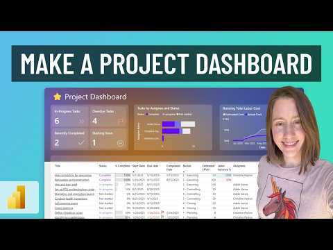
Creating a project management dashboard in Microsoft Power BI can greatly enhance the efficiency and effectiveness of tracking projects. Christine Payton's YouTube video tutorial provides a comprehensive guide on how to build such a dashboard, covering everything from importing data to designing visuals and setting up automation. This article summarizes the key steps and insights from the video, making it easier for you to create an interactive dashboard for your projects.Data Sources & Preparation
The first step in creating a project management dashboard is gathering and importing data. You can collect project data from various sources like Excel files, SharePoint lists, or SQL databases. In Power BI Desktop, navigate to Home > Get Data and select the appropriate connector based on your data source. For instance:- To import from Excel, choose the Excel connector and locate your workbook.
- For SharePoint data, use the SharePoint Online List connector and enter the site URL.
- If using SQL Server, select the SQL Server connector and provide the necessary server/database credentials.
- Removing columns/rows: Right-click columns and choose Remove Columns for those not needed.
- Filtering rows: Exclude irrelevant records, such as completed projects you don't need to report on.
- Handling nulls/blanks: Filter out or fill in missing values.
- Splitting or merging columns: If necessary, split combined fields into separate fields or merge fields for a unique key.
Structuring and Modeling Data
Organizing your data model effectively is crucial for clarity and performance. A star schema approach is recommended, where separate tables are created for different entities (e.g., Projects, Tasks, Resources) and linked via key fields. For example, a Tasks table might have a ProjectID column that connects to an ID in the Projects table. This separation into fact and dimension tables makes the model easier to maintain and improves query speed. Best practices include:- Fact tables for transactional records or performance data, such as a Tasks table with one row per task, including measures like hours worked or % complete.
- Dimension tables for categories and lookup info, such as a Projects table with project names or a Team table with employee details.
- Ensuring each table has a unique identifier (primary key) like ProjectID or TaskID to link to other tables.
Creating Measures and Visuals
Christine Payton's tutorial emphasizes the importance of creating measures to track project progress effectively. Measures such as in-progress, overdue, recently completed, and starting soon tasks can be created using DAX formulas. These measures are then used to conditionally highlight tasks in a table. For example:- Count Tasks: COUNTROWS('Project Tasks')
- Count In-Progress Tasks: CALCULATE([Count Tasks], KEEPFILTERS('Project Tasks'[Status] = "In-Progress"))
- Count Overdue Tasks: CALCULATE([Count Tasks], KEEPFILTERS('Project Tasks'[Overdue?] = "Yes"))
- Labor Variance %: CALCULATE(DIVIDE(SUM('Project Tasks'[Actual Effort Hours]) - SUM('Project Tasks'[Estimated Effort Hours]), SUM('Project Tasks'[Estimated Effort Hours])), KEEPFILTERS('Project Tasks'[Status] = "Complete"))
Designing and Formatting the Dashboard
The final step in creating a project management dashboard is designing and formatting the visuals. Christine Payton's tutorial includes tips on adding icons, conditional formatting, and dynamic dashboard titles to enhance the dashboard's interactivity and appeal. Background images and icons can be imported to give the dashboard a professional look. For instance, icons from Google can be used for different task statuses, and colors can be applied to indicate task progress:- Green (E0EEED) for in-progress tasks
- Red (F7C0BC) for overdue tasks
- Blue (650CF6) for completed tasks
- Grey for not started tasks
Conclusion
Christine Payton's YouTube video tutorial provides a detailed guide on creating a project management dashboard in Power BI. By following the steps outlined in this article, you can gather and prepare data, structure and model it effectively, create measures and visuals, and design a professional-looking dashboard. With the right tools and techniques, you can enhance your project management capabilities and make informed decisions based on real-time data insights.

Keywords
Project Management Dashboard, Power BI Tutorial, Create Dashboard Power BI, Project Management Tools, Data Visualization Power BI, Interactive Dashboards, Business Intelligence Tools, Power BI for Beginners
HubSite 365 Apps