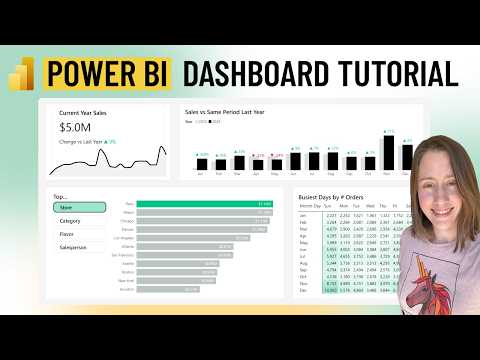
Power BI Dashboards: Step-by-Step Visuals Tutorial
Power Platform Developer
Power BI, Power Query, DAX, SQLBI, Github
Key insights
- Power BI is a Microsoft business analytics tool that helps users create interactive dashboards and share insights through visually appealing reports. The guide provides step-by-step instructions for building dashboards using the latest features in Power BI.
- The course covers essential data modeling concepts, such as connecting to various data sources, preparing data models with relationships and calculations, and using Power Query for data transformation.
- Visualizations are at the core of Power BI dashboard building. Users learn to create different visuals like charts, maps, tables, heatmaps, KPI cards, and slicers to represent data clearly and interactively.
- The 2025 update introduces AI-powered Copilot, which allows users to ask questions in natural language, generate insights automatically, and build visuals without code. This improves productivity and makes dashboard creation more accessible.
- Enhanced customization options, such as advanced sorting, new visual types (Dynamic Radial Bar Charts, Drill Down Timelines), and improved Azure Maps visuals allow for better storytelling with geospatial data and dynamic report elements.
- Improved connectivity with updated connectors (like Google BigQuery and Snowflake) enables faster access to diverse data sources. Usability improvements in slicers, buttons, parameters, and workflow automation make dashboards easier to use and maintain.
Introduction: Empowering Dashboard Builders with Power BI
Power BI continues to redefine the landscape of business analytics and data visualization in 2025. In her recent YouTube tutorial, Christine Payton offers a comprehensive guide titled "Power BI Dashboard Guide: Build Stunning Visuals with Tutorial & Files." This resource-rich walkthrough, designed for both beginners and seasoned professionals, aligns with the latest advancements in Power BI, making it easier than ever for users to build visually compelling and interactive dashboards.
As the platform evolves, new features and enhancements are introduced to help users communicate complex data with clarity. Christine’s video stands out by providing not only step-by-step instructions but also downloadable sample data and practical tips, ensuring that learners can follow along and apply concepts immediately.
Getting Started: The Fundamentals of Power BI
At its core, Power BI serves as a robust business analytics platform from Microsoft, enabling users to connect to a wide variety of data sources, model their data, and create interactive reports and dashboards. Christine’s tutorial begins by guiding viewers through downloading the necessary data files and connecting them using Power Query, an essential first step in any Power BI project.
She emphasizes the importance of data modeling, where users establish relationships and perform calculations to generate actionable insights. The tutorial then transitions into creating core visuals—such as charts, heatmaps, and KPI cards—showcasing Power BI’s built-in visualization capabilities. These foundational steps lay the groundwork for more advanced dashboard features.
New Features in 2025: AI and Enhanced Visuals
One of the most significant developments in Power BI this year is the integration of AI-powered features, particularly the standalone Copilot assistant. Christine highlights how Copilot enables users to interact with their data using natural language, asking questions and receiving instant visualizations without writing code. This advancement not only accelerates the design process but also makes data exploration more accessible.
Additionally, the platform now supports advanced visual interactions, such as visual calculations performed directly within reports and persisted sorting for field parameters. New and updated visuals—including Dynamic Radial Bar Charts and Drill Down Timelines—provide fresh opportunities for creative and informative storytelling. These enhancements, as Christine demonstrates, allow dashboard builders to balance clarity with engagement, making data stories more impactful.
Balancing Flexibility and Complexity in Parameter Management
Christine delves into the tradeoffs involved in managing parameters and data models in Power BI. On one hand, recent updates have made numeric range and field parameters more flexible, allowing them to be used in remote semantic models and making parameter editing easier within the user interface. This flexibility empowers users to build more dynamic, user-driven dashboards tailored to specific needs.
However, as dashboards become more adaptable, the complexity of managing multiple parameters and ensuring consistent data integrity can increase. Christine addresses these challenges by recommending best practices in parameter management, ensuring that even as users leverage new features, their dashboards remain reliable and easy to maintain.
Improved Connectivity, Automation, and Usability
Another key focus of Christine’s tutorial is the expanded connectivity options in Power BI. With new and improved connectors for platforms like Google BigQuery, Vertica, Oracle, and Snowflake, users can integrate larger and more diverse datasets into their dashboards. This broadens the scope of analysis and enables richer visualizations.
Moreover, Christine explores workflow automation through features like Translytical task flows, which streamline report actions and data writebacks. Usability improvements, such as enhanced slicers, buttons, and parameter controls, further contribute to a smoother user experience, making dashboards more interactive and accessible to a wider audience.
Conclusion: Navigating Opportunities and Challenges in Dashboard Design
Christine Payton’s Power BI dashboard tutorial encapsulates the evolving capabilities of the platform while addressing the practical considerations faced by dashboard creators. As Power BI introduces new AI tools and interaction features, users must navigate the balance between leveraging advanced functionalities and maintaining simplicity for end-users.
While these innovations offer immense potential for deeper insights and more engaging presentations, they also require thoughtful implementation to avoid overwhelming viewers or complicating maintenance. Christine’s guide provides a valuable roadmap for maximizing Power BI’s strengths while managing its complexities, ensuring that users can build dashboards that are not only stunning but also effective and sustainable.

Keywords
Power BI dashboard tutorial Power BI visuals guide Build Power BI dashboard Power BI data visualization Power BI report design Power BI beginner tutorial Power BI dashboard examples Free Power BI files