How I made a COLOURFUL slicer in Power BI
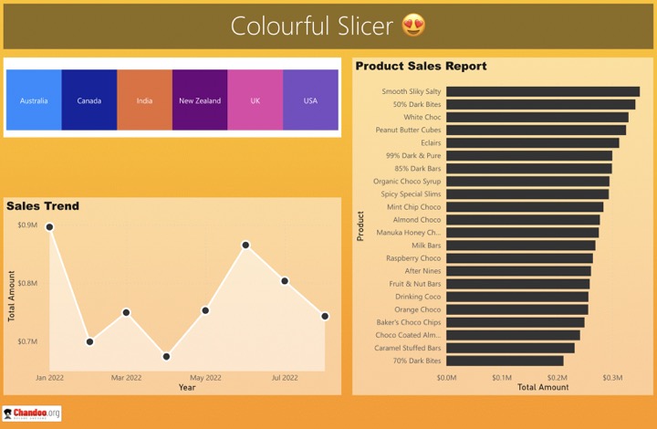
Yes, you read that right. We can get colourful slicers in Power BI using a simple trick. Check it out.
Overview of Power BI
Power BI is a business analytics service provided by Microsoft. It offers comprehensive data analysis and visualization capabilities, enabling users to create reports and dashboards from a wide range of data sources. Here are the key aspects of Power BI:
- Data Integration: Power BI allows users to connect to various data sources, including cloud-based services, on-premises databases, Excel spreadsheets, and more.
- Data Transformation and Modeling: It includes tools for transforming raw data into a structured format suitable for analysis. Users can model data by creating relationships, calculated columns, measures, and hierarchies.
- Interactive Visualizations: Users can create interactive reports and dashboards with a variety of visualization options, such as charts, graphs, maps, and slicers.
- Sharing and Collaboration: Power BI provides features for sharing reports and dashboards with others within an organization, facilitating collaboration on data-driven decision-making.
- Power BI Desktop and Service: It offers both a desktop application (Power BI Desktop) for creating reports and a cloud-based service (Power BI Service) for publishing, sharing, and collaborating on reports.
- Advanced Analytics: Power BI integrates with advanced analytics tools like AI and machine learning, providing capabilities such as forecasting, anomaly detection, and insights discovery.
- Customization: Users can customize reports and dashboards to meet specific needs, and developers can use the Power BI API to integrate these reports into other applications.
Power BI is a versatile tool that caters to a wide range of users, from business analysts and data professionals to individuals with no specialized data analysis skills. It helps organizations to make data-driven decisions by providing insights into their data in an accessible and user-friendly manner.
What are Slicers in Power BI?
Slicers in Power BI are a type of visual filter used in reports and dashboards. They enable users to quickly and easily filter the data being displayed in other visuals on the same report page. Here are some key points about slicers in Power BI:
- Interactive Filtering: Slicers provide an interactive way for report viewers to select and filter data. Users can click or select values in the slicer to change the data displayed in other visuals.
- Customization: Slicers can be customized in various ways, including their appearance, orientation (horizontal or vertical), and the values they display.
- Types of Slicers: Slicers can be created for different types of data, such as text, dates, or numbers. Each type has specific options and functionalities.
- Scope of Filtering: By default, slicers filter all the visuals on the page where they are placed. However, this behavior can be adjusted with the "Edit interactions" feature.
- Sync Across Pages: Slicers can be synchronized across multiple pages of a report, allowing for consistent filtering throughout the report.
Slicers are a powerful tool in Power BI, enhancing the interactivity and user experience of reports by providing an easy and efficient way to explore and analyze data.