Excel
Dec 13, 2024 1:57 AM
Excel: Unlock Interactive Insights with GROUPBY, Charts & Slicers!
by HubSite 365 about David Benaim
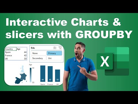
Excel GROUPBY and PIVOTBY for interactive dashboards with charts and slicers: map, treemaps, bars, and lines.
Key insights
- GROUPBY and PIVOTBY are new Excel functions that allow dynamic data aggregation, enhancing the ability to create interactive dashboards without relying solely on PivotTables.
- The functions support a wide range of charts, including map charts, treemaps, bar charts, and line charts. They also integrate with slicers for intuitive filtering capabilities.
- Key differences between these functions and PivotTables include automatic refresh capabilities, the ability to return additional functions like concatenated lists, and broader chart creation options.
- GROUPBY replicates one-dimensional PivotTables by specifying row fields, value fields, and aggregation type. It supports advanced sorting and filtering through optional inputs.
- PIVOTBY extends functionality by adding column fields and offers built-in aggregation options like SUM, COUNTA, AVERAGE, and more complex measures using LAMBDA.
- The use of dynamic arrays in GROUPBY/PIVOTBY allows for the creation of various chart types not possible with traditional PivotTables. However, certain features like timelines do not work with GROUPBY.
Introduction to Excel's GROUPBY and PIVOTBY Functions
Microsoft Excel has introduced two powerful new functions, GROUPBY and PIVOTBY, which are set to revolutionize the way users handle data aggregation and visualization. These functions allow users to perform complex data summarization tasks without relying solely on PivotTables. In a recent YouTube video by David Benaim, part of a series dedicated to these functions, viewers are introduced to the capabilities of GROUPBY and PIVOTBY, especially in creating interactive dashboards with charts and slicers.Creating Interactive Dashboards
The video emphasizes the potential of GROUPBY and PIVOTBY in crafting interactive dashboards. By integrating these functions with charts and slicers, users can achieve dynamic data visualization and filtering. This approach allows for a more intuitive understanding of data, as users can interact with various chart types such as map charts, treemaps, bar charts, and line charts.- Data Preparation: Organizing data into structured formats like Excel Tables ensures automatic adjustment of data ranges with updates.
- Applying GROUPBY: The GROUPBY function aggregates data based on specific criteria, making it easier to summarize large datasets.
Comparison with PivotTables
While PivotTables have been a staple in Excel for data aggregation, the introduction of GROUPBY and PIVOTBY offers several advantages. These functions refresh automatically, unlike PivotTables, which require manual updates. Additionally, they can return concatenated lists of values and support a wider range of chart types.- Automatic Refresh: GROUPBY and PIVOTBY functions update automatically, ensuring that data is always current.
- Enhanced Chart Options: These functions support newer chart types that PivotTables cannot, such as map charts and sunburst charts.
Advanced Aggregation Techniques
The video delves into the advanced aggregation capabilities of GROUPBY and PIVOTBY. Users can perform a variety of aggregations, from simple sums and averages to more complex statistical measures like median and mode. The functions also allow for custom aggregations using LAMBDA, enabling unique analyses such as distinct counts or comma-separated lists.- Built-in Aggregations: Common functions like SUM, COUNT, and AVERAGE are available, along with less frequently used options like variance and standard deviation.
- Custom Aggregations: With LAMBDA, users can create tailored aggregations for specific needs, offering flexibility beyond standard PivotTable capabilities.
Utilizing Charts and Slicers
Charts and slicers play a crucial role in enhancing the interactivity of dashboards created with GROUPBY and PIVOTBY. The video demonstrates how these functions can produce dynamic arrays that serve as the basis for various chart types. Slicers, in particular, provide a user-friendly interface for filtering data, although some limitations exist, such as the incompatibility of timelines with GROUPBY.- Dynamic Arrays: Charts based on dynamic arrays adjust automatically with data changes, providing real-time insights.
- Slicers for Filtering: Slicers can be linked to GROUPBY outputs through creative workarounds, enhancing data exploration capabilities.
Challenges and Considerations
Despite their advantages, GROUPBY and PIVOTBY come with their own set of challenges. For instance, they require a deeper understanding of Excel formulas, which may be daunting for some users. Additionally, while they offer greater flexibility in certain areas, they lack some of the intuitive features of PivotTables, such as drag-and-drop functionality for multiple fields.- Learning Curve: Users need to familiarize themselves with the syntax and capabilities of these new functions, which can be complex.
- Formatting Limitations: Unlike PivotTables, GROUPBY and PIVOTBY do not offer as much flexibility in formatting and layout options.
Conclusion
David Benaim's video series provides a comprehensive guide to mastering Excel's GROUPBY and PIVOTBY functions. By exploring the tradeoffs between these functions and traditional PivotTables, users can make informed decisions about which tool best suits their data analysis needs. With the ability to create interactive dashboards and perform advanced aggregations, GROUPBY and PIVOTBY represent a significant advancement in Excel's data handling capabilities. However, users must weigh the benefits against the challenges of learning and implementing these new functions.

Keywords
GROUPBY, charts, slicers, interactive dashboards, Excel, data visualization, pivot tables, Excel analytics
HubSite 365 Apps