
Excel: Slicer Tool Secrets
Microsoft MVP | Author | Speaker | Power BI & Excel Developer & Instructor | Power Query & XLOOKUP | Purpose: Making life easier for people & improving the quality of information for decision makers
Unlock Excel Slicer Secrets for Enhanced Data Analysis and Visualization - Master Tips from Insider
Key insights
Powerful Data Analysis with Excel Slicers
Access Analytic has enhanced client data handling with their expertise in Power BI and Excel, offering solutions and training globally.
Excel Slicers are essential tools in data analysis, perfect for anyone needing to filter data quickly across tables or PivotTables. Their user-friendly interface heightens productivity and provides insightful data interaction.
Interactivity and Visualization benefits are key—Slicers not only streamline data filtering processes but also amplify data interaction and bolster visualization, particularly in conjunction with PivotTables.
Simplifying Excel Slicer Creation
- To set up, select your data source and use the Insert tab or context menu to access Slicer options.
- Choose your desired fields to create a custom filter, enhancing analytical focus.
By creating multiple Slicers tied to the same source, you can achieve more nuanced data filtration, adapting efficiently to complex analytical needs.
Unleash the Full Potential of Excel Slicers
For professionals engaging with expansive datasets, mastering Excel Slicers is invaluable. This tool simplifies data exploration, creating a more dynamic, user-directed experience in Excel.
Enhancing Data Analysis with Excel Slicers
Excel Slicers elevate the data analysis experience by providing a dynamic filtering interface that allows users to sift through vast amounts of data with ease. Excel Slicers are particularly adept at offering a clear visual representation of the active filters, thereby providing an immediate understanding of the data being analyzed. Additionally, Slicers improve reporting and analytics by integrating seamlessly with PivotTables to offer a comprehensive view of the datasets, enabling concise and impactful graphical presentations. Customization options, such as changing colors and styles, further personalize the data analysis process to suit individual or business needs. By offering a quick method to filter and analyze data, Excel Slicers have become an indispensable tool for anyone dealing with complex datasets that require frequent and varied analyses. They embody the essence of efficient data manipulation and interactive visualization, paving the way for insightful business decisions grounded in robust data analytics.
Access Analytic, a team specialized in Power BI and spreadsheet solutions, delivers training globally and serves clients across Australia. Their recent YouTube presentation covers the utility of a feature in spreadsheets for data analysis and interactive filtering. Highlighted in the video is the process of setting up and customizing this feature to enable better data visualization.
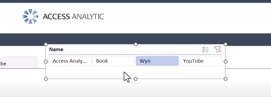
Slicers in spreadsheets are essentially interactive tools that offer a graphical method to filter data in tables and PivotTables. They're convenient to use and can elevate one’s data analysis process by providing quick access to specific data subsets. Slicers can also work with regular spreadsheet ranges, offering a wide range of usage.
These slicers function by creating individual filters for each field selected during their creation. These filters correspond to fields in the data source, and when an item is selected, the slicer filters and displays only the matching data. It’s a method that streamlines data analysis and manipulation in spreadsheets.
Using slicers comes with multiple advantages: they simplify the data filtering process, enhance the interactivity with data, and can significantly improve data visualization when combined with PivotTables. Users who deal with extensive data sets can benefit greatly from the efficiency slicers introduce.
- Easy data filtering
- Enhanced data interaction
- Improved data visualization
To implement a slicer, one needs to select the data source, open the “Insert Slicer” dialog box, and choose the fields for filtering. Following a few simple clicks, the slicer is ready to use and can then be customized in various ways, including adjusting colors and styles, or connecting multiple slicers to refine data analysis further.
Customization options for these slicers are plentiful, allowing for personalization that meets specific analysis needs. This personalization can include changing colors and styles, adding or removing items, or creating connections between multiple slicers for more in-depth analysis.
The video concludes by endorsing the use of slicers to improve the efficiency and effectiveness of data analysis within the popular spreadsheet software. Whether one is dealing with large datasets or aiming to enhance the interactive aspect of their data, slicers offer substantial benefits worth exploring.
Slicers in Data Analysis
Slicers have emerged as an integral part of modern data analysis, offering an accessible and efficient way to handle complex datasets. The ability to swiftly navigate through information and focus on relevant data simplifies the decision-making process, making slicing tools indispensable in the realms of business intelligence and Data Analytics. Their compatibility with well-known data visualization tools further cements their place as essential instruments for analysts seeking to bring clarity to data-driven insights.
Unlocking the Power of Excel Slicer Magic
Our dedicated team at Access Analytic specializes in creating Power BI and Excel solutions for a diverse clientele across Australia while also providing global training sessions. The recent video we analyzed showcases the utilization of Excel's Slicer feature— a robust tool for data management and analysis. This feature is not only influential for its technical capabilities but also enhances user experience by simplifying the complex process of data filtering.
The tutorial begins with an introduction and swiftly moves on to the core aspects, starting with how to properly set up a Slicer Table in Excel. The speaker meticulously explains the steps for crafting an effective slicer to optimize data analysis. With clear delivery, the creation process is demystified, revealing how accessible advanced Excel features can be when adequately understood.
Demonstrating Magical Slicer Formatting, the guide illustrates the transformation of raw data into a visually appealing and practical format. Emphasizing the importance of aesthetics in data presentation, the training offers viewers an in-depth look into customizing slicers for enhanced readability. This section ends with insightful tips on forcing sort order, ensuring data is displayed exactly as needed.
Mastering Data Analysis with Excel Slicers
Understanding Excel Slicers: These dynamic tools allow the user to filter both tables and PivotTables easily, elevating the standard of data analysis. Their intuitive design makes them a go-to for quick data filtration, streamlining the user's workflow.
Functionality of Excel Slicers: The slicer acts as a graphical filtering tool, making the selection process not just efficient but pleasing to the eye. It's particularly beneficial for those working with large data sets as it simplifies the task of narrowing down data based on specific conditions.
Key Advantages: Slicers promote enhanced interaction with datasets and make the filtering process a breeze. Moreover, they can significantly improve the clarity of data visualization, particularly when paired with PivotTables, to emphasize the data that truly matters in graphical representations such as charts and graphs.
Creating Your Own Slicer: Following a straightforward four-step procedure, the video instructs on how to initiate the slicer creation process, starting with selecting your data source and culminating with the slicer taking its form on the screen. Comprehensive guidance ensures even first-time users can confidently build their slicers.
Personalizing Slicers: Further showcasing the flexibility of Excel, the video takes you through customization options. You can tweak everything from the slicer's aesthetic elements to its functional setup, allowing you to refine your data filters even down to the most granular level.
Conclusion
As we wrap up our overview of the training content, it's clear that Excel Slicers present a significant opportunity for enhancing data analysis efficiency. Their ease of use combined with powerful filtering capabilities makes them an asset for anyone interested in making their data come alive. We encourage professionals and enthusiasts alike to expand their Excel expertise with slicers and witness firsthand their transformative impact on data manipulation.

People also ask
How do I make an interactive slicer in Excel?
To create an interactive slicer in Excel, you first need a pivot table or table to which the slicer will be connected. Here are the steps:
- Click inside the pivot table or select the table where you want to add the slicer.
- Go to the “Insert” tab on the Ribbon.
- Click on “Slicer” in the Filters group.
- In the Insert Slicers dialog box, check the box beside the field(s) for which you want to add a slicer.
- Click "OK," and a slicer will appear, which you can position and resize as needed.
How do you beautify a slicer in Excel?
To beautify a slicer in Excel, you can customize its look by doing the following:
- Select the slicer to activate the Slicer Tools on the Ribbon.
- Go to the “Slicer Tools” Options tab.
- Choose from the various available styles in the "Slicer Styles" group to change the appearance.
- For more customization, right-click on the slicer and select "Slicer Settings" or size and properties to adjust colors, fonts, and other formatting options.
Can you customize a slicer in Excel?
Yes, you can customize a slicer in Excel. You can change its style, format, settings, and control which items are shown or hidden. Here’s how you can customize it:
- Select the slicer and then go to the “Slicer Tools” Options tab in the Ribbon for style changes.
- Right-click on the slicer to access context-specific options like "Slicer Settings" where you can rename the slicer, decide how items are sorted or what to do with items with no data.
- Advanced customizations like changing the number of columns of buttons, button height/width, and other specific appearance options are available in the "Buttons" group under the Slicer Tools tab.
How do I open the pivot wizard in Excel?
To open the PivotTable and PivotChart Wizard in Excel, you have to first add the command to your Quick Access Toolbar since it is not part of the default Ribbon interface. Follow these steps:
- Click the down arrow at the end of the Quick Access Toolbar to customize it.
- Choose "More Commands...".
- In the "Choose commands from" dropdown, select "Commands Not in the Ribbon".
- Scroll down and select “PivotTable and PivotChart Wizard”.
- Click the "Add > >" button to move it to the Quick Access Toolbar list and then "OK".
- Now, you can click on the newly added PivotTable and PivotChart Wizard icon in the Quick Access Toolbar whenever you want to access it.
Keywords
Excel Slicer Tutorial, Slicer Dashboard Techniques, Advanced Slicing in Excel, Interactive Excel Reports, Excel Data Visualization, Dynamic Excel Charts, Excel PivotTable Slicer, Custom Slicers Excel, Excel Slicer Tips, Excel Slicer Design.