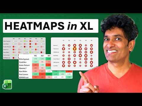
Excel Heatmaps: 3 Dashboard Methods
Excel heatmaps for dashboards showcasing conditional formatting, images in cell, bubble charts and PIVOTBY for analytics
Key insights
- Excel Heatmaps — Quick video walkthrough showing three practical ways to build heatmaps for dashboards with timestamps: 0:00 intro, 0:24 Conditional Formatting, 3:16 Images in Cell, 9:34 Bubble Chart, 15:29 conclusion.
- Conditional Formatting — Apply Color Scales to a selected range for the fastest heatmap.
Use custom midpoints and the three-semicolon trick to hide numbers and emphasize color intensity for compact tiles. - Images in Cell — Insert small images or icons into each cell to represent value intensity when you want a visual tile instead of colors.
This works well for compact dashboards and can be driven by formulas or lookup rules to match values to images. - Bubble Chart — Use a bubble chart arranged like a matrix to show magnitude with circle size and color.
Align axes and scale bubbles carefully to keep the grid readable and avoid overlapping markers on dense data. - PIVOTBY — Use the video’s demonstration of the new PIVOTBY function or a Pivot Table to build dynamic summary matrices before applying heatmap formatting.
This helps when you need aggregated views by category, time, or region. - Dashboard Tips — Prefer clear color ramps, add a legend, and set midpoints to reduce outlier distortion.
Keep visuals compact, hide raw numbers when needed, and choose the method that fits your data: tables, aggregated pivots, or spatial/geographic cases.
Introduction
In a recent YouTube video, Excel expert Chandoo demonstrates three distinct ways to build heatmaps inside Microsoft Excel. The video aims to help dashboard creators and analysts visualize matrix-style data more effectively, and it includes a downloadable sample workbook for practice. Consequently, viewers can follow along and reproduce the techniques step by step while learning tips for dashboard-ready visuals.
Furthermore, the video highlights the new PIVOTBY function as part of two of the approaches, which helps create dynamic matrices from raw data. Therefore, the content is useful both for beginners who need quick solutions and for intermediate users seeking more interactive dashboards. Overall, the presentation balances practical examples with targeted explanations.
Method 1: Conditional Formatting Heatmap
The first method covered is the familiar Conditional Formatting color scale, which Excel users can apply directly to a selected range. Chandoo shows how to choose preset gradients and then adjust midpoint rules to reduce distortion from outliers, and he explains the common three-color palette for quick value comparisons. As a result, this approach produces clear, table-like heatmaps that work well on KPI grids and compact dashboards.
However, there are tradeoffs to consider: while this method is fast and low maintenance, extreme values can skew the palette unless you customize rules or set fixed bounds. In addition, Chandoo mentions the practical three-semicolon trick to hide numeric labels when the color alone should communicate value, but this can reduce accessibility and make precise reading harder. Therefore, teams should balance visual clarity with the need for raw numbers depending on the audience.
Method 2: Images in Cell Heatmap
The second technique uses small colored images or shapes inserted into cells to create a pixel-style heatmap effect, and Chandoo demonstrates how to size and align these visuals to match the grid. This method gives designers precise control over color, shape, and exact placement, and it can deliver compact, visually appealing tiles for dashboards. Consequently, it is especially useful when you need a consistent look across platforms or want to mimic a custom design.
Nevertheless, this approach has practical challenges: image-based heatmaps increase file size, complicate copying and pasting, and may not auto-update when source values change unless you implement a structured linking process. In addition, resizing and scaling can become tedious on different devices or when users change zoom levels, so workbook maintenance can become heavier. Therefore, the method trades ease of setup for visual polish and requires discipline to keep files efficient.
Method 3: Bubble Chart Heatmap and Dynamic Matrices
The third option converts matrix values into a chart view using bubble markers where color and size indicate intensity, and Chandoo walks through positioning markers to resemble a grid. He also demonstrates using PIVOTBY to build dynamic matrices from raw tables before sending the results into a plotted view, which improves interactivity for changing data slices. Consequently, this approach can create striking, scalable visuals that emphasize magnitude and distribution.
Still, bubble charts introduce their own tradeoffs: axis alignment, marker overlap, and legend interpretation can confuse viewers if not carefully tuned, and printing or exporting can reduce fidelity. Moreover, bubble sizes require careful scaling logic to avoid misleading impressions, and chart-based heatmaps may not fit the conventional tabular layout familiar to many stakeholders. Therefore, they work best when designers plan for clear legends and axis anchors to preserve interpretability.
Tradeoffs, Accessibility, and Performance
Across the three methods, Chandoo emphasizes balancing speed, clarity, and maintainability. For example, conditional formatting is quick but can mislead with outliers, image-based tiles look great but inflate files, and chart solutions offer interactivity yet need careful scaling and labeling. Consequently, choosing an approach depends on whether you prioritize rapid deployment, visual control, or interactive exploration.
In addition, accessibility and compatibility matter: color choices should consider color-blind users, and functionality can vary between Excel versions or platforms. Therefore, test dashboards on the target devices and include numeric labels or alternative views when precision is required. Finally, keeping formulas and data sources tidy helps performance, especially on large workbooks that update frequently.
Practical Recommendations and Conclusion
In conclusion, the video by Chandoo provides a practical toolkit for making heatmaps in Excel and explains when to use each technique depending on dashboard goals. For fast, table-like visuals choose Conditional Formatting; for pixel-perfect design choose Images in Cell; and for interactive, analytical views consider chart-based solutions paired with PIVOTBY. Thus, the guidance helps readers match method to context rather than forcing a one-size-fits-all choice.
For editors and analysts preparing dashboards, the key is to weigh readability, update patterns, and file size before committing to a method, and to adopt sensible defaults for color and scale. Ultimately, Chandoo’s step-by-step demo and the accompanying sample workbook make it straightforward to test these tradeoffs in practice and choose the right approach for your audience.

Keywords
Excel heatmap tutorial, create heatmap in Excel, Excel heatmap conditional formatting, Excel dashboard heatmap, heatmap from pivot table Excel, interactive heatmaps in Excel, heatmap chart Excel, heatmap formulas Excel