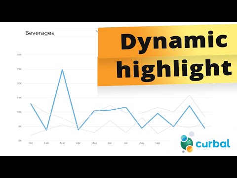
Power BI Update: Enhanced Line Chart Highlights
Unlock Power BI Line Chart Highlights in April 2024 Update with Curbals Expert Guide
Key insights
- Power BI April update 2024 introduces changes that enable dynamic highlighting in line charts, despite the lack of direct measure-based highlighting.
- Curbal demonstrates a workaround to achieve line chart highlighting using the new visual modifications.
- Users can now visually enhance their Power BI reports by implementing dynamic line chart highlighting.
- The update provides an opportunity for more interactive and visually compelling reports.
- This demonstrates Power BI’s continuous improvement and responsiveness to user feedback.
Exploring the Importance of Dynamic Highlighting in Power BI
Dynamic highlighting in Power BI is a critical feature for data visualization experts and business intelligence professionals. This capability allows users to accentuate specific sections of a line chart, making it easier to draw attention to crucial trends, outliers, or points of interest within a dataset. With the April 2024 update, Power BI continues to expand its toolkit, enabling more sophisticated and visually appealing reports. Although the platform did not originally include the option to highlight a line chart with a measure directly, the community, led by innovators like Curbal, has found resourceful ways to bypass these limitations using the new visual adjustment features. This development not only showcases the platform's flexibility but also highlights the community's role in advancing Power BI's functionality. As Power BI evolves, it remains an indispensable tool in the arsenal of those who require detailed and accessible data analysis, ensuring that reports are not only insightful but also engaging and accessible to all stakeholders.
In the latest update from April 2024, the ability to dynamically highlight a line chart in Power BI has been a notable omission. However, the insightful video by 'Curbal' demonstrates a workaround that leverages recent adjustments to the visualization options. This method enables users to effectively emphasize specific data points or trends within their line charts, despite the lack of direct support from Power BI for this feature.
The tutorial starts by addressing the absence of a native feature for highlighting line charts based on measures within Power BI. Curbal then transitions into a detailed walkthrough, showing viewers how to apply the new visual enhancements to achieve the desired highlighting effect. This approach not only bridges the gap left by the missing feature but also enriches users' ability to present their data more dynamically and informatively.
By following Curbal's guide, users can learn to manipulate the existing tools and functions in creative ways to highlight important aspects of their data visualization projects. The video underscores the flexibility and potential of Power BI, demonstrating that with a bit of ingenuity, users can surpass the apparent limitations of the software. This invaluable insight encourages users to explore beyond the default capabilities of Power BI, fostering a deeper understanding of the platform's extensive functionalities.
The significance of this tutorial extends beyond just a workaround for highlighting line charts. It represents a broader application of thinking outside the box when utilizing Power BI for data visualization. The methods introduced by Curbal could inspire users to experiment with other non-standard uses of features and functionalities within the platform, thereby unlocking new possibilities for data analysis and reporting.
Overall, the YouTube video by Curbal offers a practical solution to a specific problem faced by many Power BI users, while also empowering them to think more creatively in their approach to data visualization. As the platform continues to evolve, tutorials like this become invaluable resources for the community, enabling users to maximize the impact of their data storytelling efforts.
Exploring Power BI's Flexibility and Creativity in Data Visualization
Power BI is known for its robust data analysis and visualization capabilities, allowing professionals to create comprehensive reports and dashboards. This tool stands out not just for its technical strengths, but also for the flexibility it offers users in representing their data. Tutorials like the one provided by Curbal showcase how users can overcome apparent limitations within the software through innovative thinking and a deep understanding of Power BI's functionality.
Learning to dynamically highlight portions of a line chart, despite the absence of direct support from the tool, exemplifies the type of problem-solving skills that are invaluable in the field of data analysis. This particular workaround highlights the importance of keeping up to date with the platform's updates and understanding how to leverage new features to enrich visualization projects. The ability to adapt and innovate within the confines of the tool can lead to more effective and engaging presentations of data.
Furthermore, the community around Power BI, exemplified by content creators like Curbal, plays a crucial role in the ongoing education of users. Through sharing tips, tricks, and tutorials, they help elevate the overall utility and application of Power BI in the professional world. Engaging with this community can significantly enhance one's skills and capabilities within the platform.
Ultimately, Power BI is more than just a data visualization tool; it is a canvas for creativity and innovation in data storytelling. By exploring beyond the surface-level features and being willing to experiment with new approaches to common problems, users can unlock a whole new realm of possibilities. This not only enhances their own reports and dashboards but enriches the entire Power BI community with fresh insights and methodologies.

## Questions and Answers about Microsoft 365
Keywords
Dynamic Highlight Power BI Line Chart, Power BI April 2024 Update, Power BI Dynamic Chart Techniques, Power BI Chart Highlighting Feature, Improve Power BI Dashboard, Power BI Visualization Enhancements, Power BI 2024 New Features, Power BI Advanced Charting