
Power BI - Data Bars on NEW Card Visual
Revolutionize Data Storytelling with Power BIs Enhanced Card Visual & Dynamic Reference Labels!
The introduction of Data Bars to the new card visual in Power BI is a significant update that Power BI users should be excited about. With reference labels now available, values within cards can be given context, and data bars can be incorporated to add a visual element. This brings a new level of visual sophistication to card visuals within Power BI reports.
This video by the HubSite Power BI Team offers a comprehensive guide on the new enhancements to the card visual in Power BI, emphasizing the added functionality, user-friendliness, and interactive possibilities that are bound to improve Power BI user experiences.
A Closer Look at Power BI's New Card Visual Enhancements
The new card visual in Power BI introduces a suite of enhancements designed to make data reporting both seamless and visually compelling. With the ability to add reference labels and data bars, report creators can now present numerical data with greater clarity and contextual insights. The user-friendly interface allows for intuitive setup and customization, including options for dynamic layouts, advanced formatting settings, and interactive features like tooltips and drill through capabilities.
Power BI Visual - Card visual
The latest update to Power BI brings an exciting new feature to the Card visual: reference labels. This enhancement allows users to provide additional context to the values displayed on the card. Utilizing reference labels, it's now also possible to include data bars within the card visual for a more dynamic presentation.
The video starts with an introduction to the feature, then delves into tutorials covering everything from initial setup to advanced customization. It walks the viewer through the process of creating and editing the new card visuals, demonstrating their increased functionality and interactivity.
Updates to Power BI, particularly in the June 2023 release, have made significant improvements to the card visual feature. The goal of these updates is to enhance overall report performance and accessibility. The new card visual supports multiple sub-cards within a single container, allowing for neat organization and efficient data representation.
- The latest update allows for crafting custom card visuals more efficiently without sacrificing performance.
- The new card visual feature is user-friendly, offering easy setup instructions.
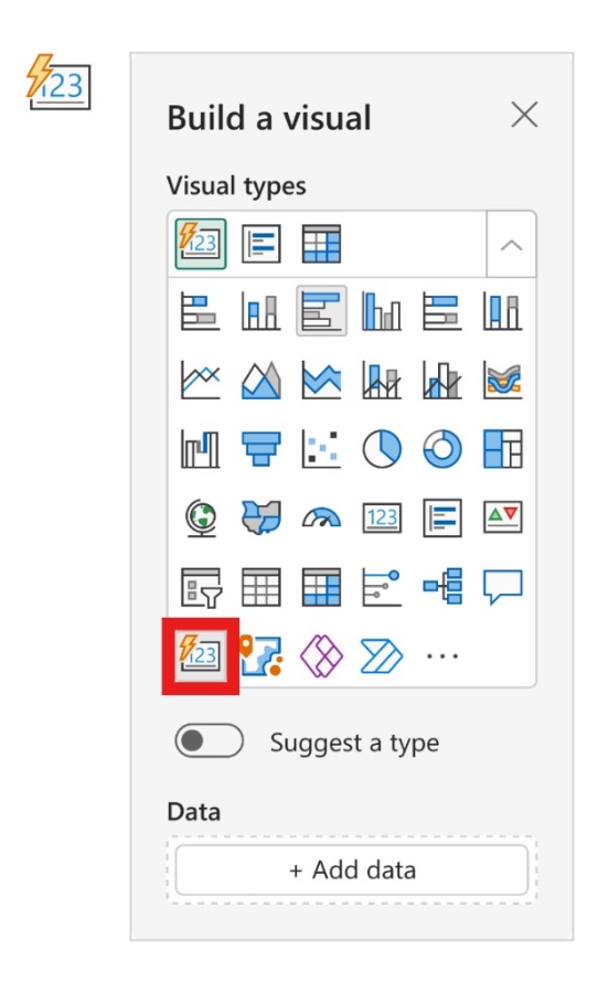
- Users can access the visual from the visual gallery, with a straightforward option to enable or disable the preview feature.
Creating a new card visual in Power BI is made seamless with multiple options for insertion. Once created, these visuals can support numerous fields and respect the order set in the data field well.
The formatting of these new card visuals is highly customizable, with a variety of options for style adjustment, including corner shaping and dynamic layout choices. There's greater control over value and label appearances, including conditional formatting and font transparency options.
The video continues to cover interactivity features such as tooltips and drill-through functionality, which elevate the user experience by providing detailed data insights and easy navigation through related information across multiple report pages.
- The new feature supports advanced tooltips options, including designing and linking report page tooltips.
- Drill through capabilities have been added to the card visual, allowing for more interactive reports.
- The new roadmap promises further enhancements, such as indicator labels and group-splitting options.
Last but not least, the video encourages community feedback on these new features, indicating a commitment to continuous improvement based on user experiences. It wraps up by underlining that there's more to look forward to with a roadmap detailing future updates to the new card visual.
Exploring Power BI's New Capabilities
The new card visual is not just a refreshed look; it's a complete overhaul that enhances user interactivity and data representation. With a growing need for advanced analytics, Power BI continues to evolve, striving to provide users with tools that simplify complex data sets into comprehensible and actionable insights. Such developments demonstrate Microsoft's commitment to making data more accessible and actionable for businesses, ensuring that Power BI remains a key player in business intelligence and data visualization.

People also ask
How do I add data bars in Power BI?
How do you create a card visualization in Power BI?
To create a card visualization in Power BI, follow these steps: 1. Ensure you have the dataset imported into your Power BI report. 2. Choose the "Card" visualization from the Visualizations pane. 3. Drag the field you want to display onto the "Fields" well on the Visualizations pane. You can select either a measure, aggregate numeric value, or a categorical data point. 4. The card will automatically update to show the value of the field you've dragged into it. Cards display a single number or text value, making them ideal for showcasing vital metrics such as total sales, average cost, or any other key performance indicator.How do I change the layout of my card in Power BI?
To change the layout of a card in Power BI, follow these instructions: 1. Click on the card visualization that you want to format. 2. Go to the "Format" tab in the Visualizations pane. 3. Expand the "Card" section to adjust general settings like the category label, data label, and whether to show the category. 4. Tweak additional formatting options such as background color, borders, and text size under respective sections within the Format pane to customize the appearance to your preference. Adjusting these settings will allow you to match the card's layout with the desired look and feel of your report.What is the difference between card and new card in Power BI?
In Power BI, a traditional card visualization and the newer card visualization, often referred to as a "KPI card" or "New Card," differ primarily in terms of functionality and design flexibility. - The traditional card visualization displays a single value and is generally used to represent critical data points on your dashboard or report. - The new card, on the other hand, is an enhanced version that allows you to include additional information like titles, subtitles, and footer text. It provides more customization options regarding field placement and formatting, making it possible to create a more informative and visually appealing presentation of your data. The choice between using a card or new card visualization in Power BI will depend on the level of information and customization you want to convey through that particular visual on your report. The new card is typically used when additional context or design granularity is needed.Keywords
Power BI Data Bars, Card Visual Power BI, Data Bars Visualization, Power BI Card Format, Data Bars in Power BI, Visualize Data Power BI, Power BI New Features, Power BI Data Representation, Custom Visuals Power BI, Power BI Reporting Techniques