
Excel Data Analysis: 3-Step Framework Explained
Co-Founder at Career Principles | Microsoft MVP
Master Excel Data Analysis: Learn Cleaning, Analysis & Visualization with Real Billionaire Dataset Tutorial!
Key insights
- Data analysis in Excel involves three crucial steps: data cleaning, data analysis, and data visualization.
- Using a real dataset on billionaires, the tutorial demonstrates practical applications of these steps.
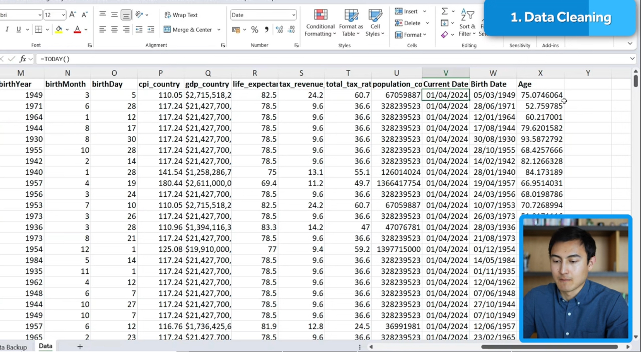
- Data cleaning includes removing duplicates, creating backups, and modifying text formatting.
- Data analysis is conducted using descriptive statistics and pivot tables to explore the dataset.
- The project culminates in data visualization, utilizing slicers and dynamic charts for interactive data presentation.
Data Analysis in Excel
Data analysis in Excel is an essential skill that encompasses a broad range of techniques aimed at transforming raw data into meaningful information. At its core, it involves cleaning, analyzing, and visualizing data to uncover patterns and insights. This process starts with data cleaning, which is crucial for ensuring the accuracy of the results by removing any inaccuracies or duplications. Following this, data analysis techniques, including descriptive statistics and pivot tables, help in comprehending the data's underlying structure and relationships. Finally, visualizing this data through charts and slicers transforms complex datasets into interpretable and interactive visuals. These steps, employed effectively, empower individuals and organizations to make informed decisions based on their data.
In a recent video tutorial, Kenji Farré (Kenji Explains) [MVP], delves into a comprehensive data analysis project utilizing Excel. The tutorial is structured around a three-part framework, essential for any robust analysis: data cleaning, data analysis, and data visualization. Through a hands-on approach, viewers are guided on how to efficiently clean, analyze, and visualize data.
The tutorial employs a real-world dataset centered on billionaires to illustrate the concepts being taught, ensuring practical applicability. The data cleaning segment is particularly informative, covering essential tasks such as removing duplicates, backing up data, and modifying text formatting. This foundational step is crucial for accurate and meaningful analysis.
Moving on to the data analysis portion, Farré introduces descriptive statistics to explore basic data insights like average, minimum, and maximum values. The tutorial further enhances analytical skills by demonstrating the use of pivot tables, a powerful tool for summarizing and examining data. Through these techniques, viewers gain the ability to uncover deep insights from their datasets.
The final section on data visualization brings the analysis to life, utilizing dynamic charts and slicers. These tools not only make the data more accessible but also interactive, allowing for a more engaging presentation of findings. Kenji Farré’s tutorial is an excellent resource for anyone looking to master Excel for data analysis, from beginners to advanced users.
Exploring Excel for Data Analysis
Data analysis is an indispensable skill in today's data-driven world, and Excel is one of the most accessible tools for this purpose. Its widespread availability and user-friendly interface make it an attractive option for individuals seeking to perform data analysis. The software supports a wide range of functionalities, from basic data organization to complex analytical and visualization techniques.
Data analysis in Excel, or similar spreadsheet software, allows for an in-depth exploration of datasets. Utilizing features like descriptive statistics and pivot tables, analysts can uncover significant insights and trends. These features enable the transformation of raw data into understandable and actionable information.
Visualizing data is a powerful method to communicate findings clearly and effectively. Excel offers various tools for data visualization, including dynamic charts and slicers, which facilitate the creation of interactive and compelling presentations. These visualizations can significantly enhance the impact of the analysis by making it accessible to a broader audience.

People also ask
How to do data analysis in Excel step by step?
For optimal data analysis in Excel, ensuring your data is clean and organized in a tabular format is crucial.
What are the steps in a data analysis project?
A comprehensive data analytics project encompasses 7 Fundamental Steps for completion.
What are the three parts of data analysis?
Data analysis is broadly categorized into three levels: reporting, insights, and prediction, representing the evolutionary stages of an organization's data analysis maturity.
How do you analyze project data in Excel?
Utilizing Excel for the web's Analyze Data feature provides a platform for exploring high-level visual summaries, trends, and patterns in your data for deeper insights.
Keywords
Data Analysis Excel, Excel Project Tutorial, Excel Data Analysis, Data Analysis Steps, Data Analysis Techniques, Excel Framework Tutorial, Excel Data Project, Data Analysis Tutorial