Power BI
Jan 25, 2025 4:30 AM
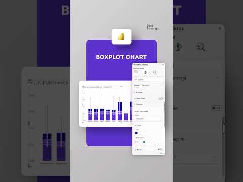
Power BI: Create Stunning Native Boxplots Without Custom Visuals!
by HubSite 365 about How to Power BI
Power BI, Power BI Desktop, DAX
Key insights
- Boxplot Creation: Learn to create a native boxplot using tools like Python's Matplotlib and Seaborn, or Microsoft Excel without the need for custom visuals. This ensures clean and professional visualizations.
- Python (Matplotlib): Install Matplotlib, use simple code to create a boxplot with example data, and customize it with titles and labels for a clear presentation.
- Python (Seaborn): Install Seaborn, which simplifies creating visually appealing boxplots. It integrates well with Pandas for enhanced data handling capabilities.
- Microsoft Excel: Easily input your data into a column and insert a Box and Whisker chart through the Insert Tab. Customize your chart by adding titles and axis labels as needed.
- Key Points: Matplotlib offers precise control over appearance but requires setup; Seaborn provides simplicity in visualization; Excel is ideal for quick visualizations without programming knowledge.
- Power BI Design Transformation Program: A comprehensive training program focusing on developing successful Power BI reports that deliver actionable insights, improve decision-making, and enhance user experience.
Introduction to Native Boxplot Creation
Creating a native boxplot is a fundamental skill for data analysts and enthusiasts who wish to visualize data distributions effectively. In a recent YouTube video by "How to Power BI," viewers are guided through the process of building a native boxplot without relying on custom visuals. The video highlights the simplicity and efficiency of using existing tools like Python's Matplotlib and Seaborn, as well as Microsoft Excel, to create these informative visualizations. This article delves into the key points from the video, exploring the advantages and challenges of each approach.
Python and Matplotlib: Precision and Control
Python's Matplotlib library is a versatile tool for creating a wide range of visualizations, including boxplots. The video begins by demonstrating how to install Matplotlib and use it to generate a simple boxplot. The process involves importing the necessary libraries, preparing the data, and executing a few lines of code to visualize the data distribution.- Matplotlib offers precise control over the appearance of the plot, allowing users to customize labels, titles, and other elements to suit their needs.
- However, this precision comes with a learning curve, as users must familiarize themselves with the library's syntax and functions.
- The video emphasizes the importance of understanding the underlying data to make informed decisions about plot customization.
Seaborn: Simplifying Visual Appeal
Seaborn, another Python library, builds on Matplotlib's capabilities by offering a higher-level interface for creating visually appealing plots. The video showcases how Seaborn simplifies the process of generating a boxplot, requiring fewer lines of code while maintaining aesthetic quality.- Seaborn's integration with Pandas makes it an excellent choice for those working with data frames, as it seamlessly handles data input and visualization.
- The library's default settings produce attractive plots, reducing the need for extensive customization.
- However, users seeking advanced customization may find Seaborn's options somewhat limited compared to Matplotlib.
Microsoft Excel: Accessibility and Speed
For those who prefer a non-programmatic approach, Microsoft Excel offers a straightforward method for creating boxplots. The video outlines the steps to input data, insert a boxplot, and customize the chart within Excel's interface.- Excel is widely accessible and familiar to many users, making it an ideal choice for quick visualizations without programming knowledge.
- The software provides basic customization options, allowing users to adjust chart elements such as titles and axis labels.
- However, Excel's capabilities may be limited for complex data sets or advanced visualizations, prompting users to seek alternative tools for more intricate analyses.
Choosing the Right Tool: Balancing Tradeoffs
The decision to use Matplotlib, Seaborn, or Excel for boxplot creation depends on various factors, including the user's familiarity with programming, the complexity of the data, and the desired level of customization. Each tool offers unique advantages and challenges, requiring users to weigh the tradeoffs involved in their choice.- Matplotlib is ideal for users who prioritize precision and are willing to invest time in learning the library's intricacies.
- Seaborn appeals to those who value simplicity and visual appeal, particularly when working with Pandas data frames.
- Excel is a go-to option for users seeking quick and accessible visualizations without programming.
Conclusion: Empowering Data Visualization
The "How to Power BI" video provides valuable insights into creating native boxplots using Matplotlib, Seaborn, and Excel. By exploring the strengths and limitations of each tool, viewers gain a comprehensive understanding of how to effectively visualize data distributions. Whether prioritizing precision, simplicity, or accessibility, users can select the tool that best suits their needs, empowering them to create impactful visualizations that drive data-driven decision-making.

Keywords
Build Native Boxplot, No Custom Visuals, Data Visualization Tutorial, Power BI Boxplot Guide, Create Boxplot in Power BI, Step-by-Step Boxplot Creation, Native Visuals in Power BI, Boxplot without Add-ons
HubSite 365 Apps