Power BI
Jan 17, 2025 12:25 AM
Power BI: Dynamic FORECAST Bands for Accurate Predictions
by HubSite 365 about How to Power BI
Power BI, Power BI Desktop, DAX, Power BI Reports
Key insights
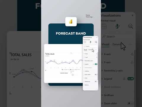
- Dynamic FORECAST Band in Power BI: This technique allows users to visually compare actual performance with forecasted values using Power BI reports or dashboards.
- Data Preparation: Ensure your dataset includes both actual and forecasted values for the same periods, and use identifiers to differentiate between them.
- DAX Measures: Utilize DAX to calculate key metrics such as actual values, forecasted values, and deviations. An example of this is calculating variance as Variance = [Actuals] - [Forecast].
- Visualization Techniques: Use line and area charts to plot data over time. Conditional formatting can help highlight whether actuals fall within the forecast band.
- Interactive Features: Implement slicers and filters for dynamic interaction, allowing changes in time periods or regions, enhancing user engagement with the report.
- Customization and Insights: Customize visuals for clarity by using color coding and transparency. Summarize performance with KPI cards or tables to check alignment with forecasts effectively.
Introduction to Dynamic Forecast Bands in Power BI
Power BI is a powerful tool for data visualization and business intelligence. One innovative feature that enhances its capabilities is the dynamic forecast band. This feature allows users to visually compare actual performance with forecasted values in reports or dashboards. The YouTube video by "How to Power BI" provides a comprehensive guide on how to create and utilize dynamic forecast bands effectively. This article will explore the steps involved, the challenges faced, and the benefits of implementing this feature in Power BI.Steps to Create a Dynamic Forecast Band
Creating a dynamic forecast band involves several key steps. First, it is essential to prepare your data. This means ensuring that your dataset contains both actual values and forecasted values for the same time periods. Additionally, an identifier should be included to differentiate between actuals and forecasts. Next, you need to create measures using DAX (Data Analysis Expressions). These measures will calculate key metrics such as actual values, forecasted values, and deviations. For example, a simple variance can be calculated as [Actuals] - [Forecast]. Adding confidence intervals is an optional step but can provide additional insights. If your forecast includes confidence intervals, you can either include these in your dataset or calculate them in Power BI using DAX. Building a line and area chart is the next step. You should add the date or time period to the X-axis and plot actuals and forecasted values on the Y-axis using a line chart. The forecast band can be added by plotting the confidence interval as an area chart over the same time period. Finally, use conditional formatting for insights. This involves creating a calculated column or measure using DAX to dynamically highlight whether actuals are within the forecast band. For instance, you can use a formula like: InForecastBand = IF([Actuals] >= [LowerBound] && [Actuals] <= [UpperBound], "Within", "Outside").Challenges and Considerations
While creating a dynamic forecast band in Power BI offers numerous benefits, there are challenges and considerations to keep in mind. One of the primary challenges is ensuring data accuracy. The effectiveness of the forecast band relies heavily on the accuracy of the underlying data. Therefore, it is crucial to validate and clean your data before proceeding. Another challenge is the complexity of DAX formulas. For beginners, writing DAX formulas can be daunting. However, with practice and the right resources, users can become proficient in creating complex calculations. Additionally, incorporating confidence intervals requires a thorough understanding of statistical concepts, which may be challenging for some users. Balancing visual clarity with data complexity is another consideration. While it is important to present data in a visually appealing manner, it is equally important to ensure that the visualizations accurately represent the data. Overly complex visuals can lead to confusion and misinterpretation.Interactive Features and Customization
One of the advantages of using Power BI is its interactive features. By using slicers and filters, you can make the forecast band dynamic. This allows users to change the time period, regions, or other dimensions, providing a more customized view of the data. Incorporating dynamic titles or labels can also help highlight deviations and provide additional context. Customization of visuals is another key feature. You can format the forecast band for clarity, such as making it semi-transparent, and use color coding to differentiate between actuals and forecast values. These customization options enhance the user experience and make the data more accessible.Practical Applications and Benefits
The use of dynamic forecast bands in Power BI has practical applications across various industries. For instance, businesses can use this feature to forecast monthly sales and compare them with actual sales. By plotting actual sales as a line chart and adding a forecasted range as the band, businesses can easily identify months where actual sales are outside the forecast band. This feature provides several benefits. It allows businesses to quickly assess their performance against forecasts, identify trends, and make informed decisions. Additionally, it enhances communication by providing a clear visual representation of data, making it easier for stakeholders to understand and interpret.Conclusion
In conclusion, the dynamic forecast band is a valuable feature in Power BI that enables users to visually compare actual performance with forecasted values. While there are challenges involved in creating and implementing this feature, the benefits outweigh the difficulties. By following the steps outlined in the YouTube video by "How to Power BI," users can effectively create dynamic forecast bands and enhance their data visualization capabilities. As businesses continue to rely on data-driven decision-making, tools like Power BI and features like dynamic forecast bands will play a crucial role in driving success.

Keywords
Power BI forecast dynamic band, Power BI forecasting techniques, Dynamic forecast visualization, Forecasting in Power BI, Power BI analytics tools, Data visualization with Power BI, Business intelligence forecasting, Advanced Power BI features
HubSite 365 Apps