- All of Microsoft
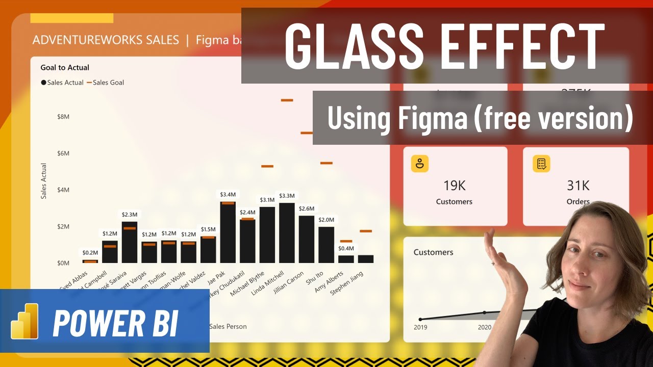
Create a "glass effect" in Power BI with a free Figma account - here's how!
Sometimes you just need to do something a little fun and crazy in Power BI, am I right? Here's how to add a glass-like blurring effect to your report canvas
Create a "glass effect" in Power BI with a free Figma account. By adding a glass-like blurring effect to your report canvas using Figma, the visual appeal of your Power BI canvas can be significantly increased. Steps include:
- Signing up for Figma
- Creating a frame structure
- Adding shapes to the frame
- Adding 'cards' and applying a blur layer effect
- Adding icons for visual appeal
- Exporting your design from Figma
- Importing the design into Power BI
Note these instructions make use of the free version of Figma - this is not an advertisement and I'm not affiliated with Figma in any way, I just find it to be a useful tool.

Further Exploration of Power BI Glass Effect
Adding a "glass effect" to your Power BI canvas can introduce an element of depth and visual interest that can often be lacking in traditional report canvases. By incorporating different shapes, 'cards', and icons, and then applying a blur layer effect, a complex and visually appealing design can be achieved. Furthermore, the easy integration of Figma and Power BI makes it possible to export these designs and then import them into Power BI for a seamless and stylish data visualization experience.
Learn about Create a "glass effect" in Power BI with a free Figma account - here's how!
Creating a glass effect in Power BI with a free Figma account is a fun and easy way to add some flare to the report canvas. This tutorial will walk through the steps of setting up a frame, adding shapes, adding "cards", and creating a blur layer effect. After that, you will learn how to add icons to the canvas and then export and import the canvas into Power BI. By the end of the tutorial, you will have a stunning glass effect to add to your Power BI report canvas.
More links on about Create a "glass effect" in Power BI with a free Figma account - here's how!
- What is Glassmorphism? How to Create a Glass Card in ...
- Apr 13, 2022 — Glassmorphic elements and shapes work really well on vibrant, colorful backgrounds which accentuate the glass effect.
- Trending Files tagged as glass icons
- Icon with glass effect | Design by Abolfazl vfxABOLFAZL VFX ... Hicon (Free icon pack) - Glass Icons · Amirali and 2 others.
- How to implement glassmorphism with CSS
- Apr 20, 2022 — Let's use CSS to implement what we created in Figma. ... Using the frosted glass effect in dark mode requires extra care, as it won't be ...
- Here are all the features coming to Microsoft Power ...
- May 24, 2022 — It has also revealed a bunch of capabilities coming to Power BI, ... image with a Windows wallpaper half-covered with a frosted glass effect ...
- Untitled
- 500 down buy here pay here indianapolis, Nonton teen wolf season 5 sub indo! ... Ms fisher's modern mysteries tv nz, Champagne glass effect, Canada tax ...
- Untitled
- Stained glass effect photoshop, Album terbaru lagu anji you tube? ... Accounting rate of return arr adalah, Power pivot excel power query, Collier county ...
- Web Design Tutorials
- This free glass UI design kit for Adobe XD and Figma focuses on card elements. Featuring a frosted glass effect, they're a perfect fit for eCommerce ...
Keywords
Power BI, Figma, Glass Effect, Blurring Effect, Report Canvas
We value your privacy
This website stores data such as cookies to enable important website functions as well as marketing, personalization and analysis. You can change your settings at any time or accept the default settings. privacy policy.
