Azure Maps & Power BI: Real-Time Geo Insights from Your Data Rows
Azure Maps, Power BI, heatmaps, real-time data, geo stories, custom styles, insight, subscribe, Fabric-powered wizardry
Key insights
- Azure Maps integrated with Power BI allows users to turn data rows into interactive, real-time geospatial stories, making it easier to visualize and analyze location-based trends within dashboards.
- Real-Time Geospatial Insights: The integration helps users spot patterns and anomalies on maps instantly, supporting better decision-making based on live geographic data.
- Customization Options: Users can personalize map styles, colors, heatmaps, and other visual elements to match their brand or highlight key information directly in Power BI.
- Interactive Features: The technology supports advanced map interactions such as zooming, panning, 3D tilt (pitch), and filtering by location or travel time for deeper exploration of data points.
- Administrative Control: New tenant settings give administrators more control over security and user access while enabling Azure Maps features by default for more organizations.
- Copilot Integration: With the addition of Copilot in Power BI (preview), users can ask questions about their data and receive instant insights, further simplifying the process of creating geo stories from raw information.
Azure Maps and Power BI: A New Era for Geo Storytelling
The latest Guy in a Cube YouTube video explores how Azure Maps, now deeply integrated with Power BI, is transforming the way businesses visualize geographic data. Instead of static pins on a map, users can now create dynamic, interactive geo stories that update in real time. This integration leverages Microsoft’s cloud-based mapping capabilities, allowing users to see trends, patterns, and insights that are tied directly to location data—all within the familiar Power BI environment.
As organizations increasingly rely on data-driven decisions, the ability to connect raw data to real-world geography becomes crucial. Azure Maps in Power BI meets this need by making geospatial analytics accessible, visual, and actionable. This approach not only enhances data storytelling but also empowers users to make more informed decisions based on real-time geographic context.
Key Advantages: Real-Time Insights and Customization
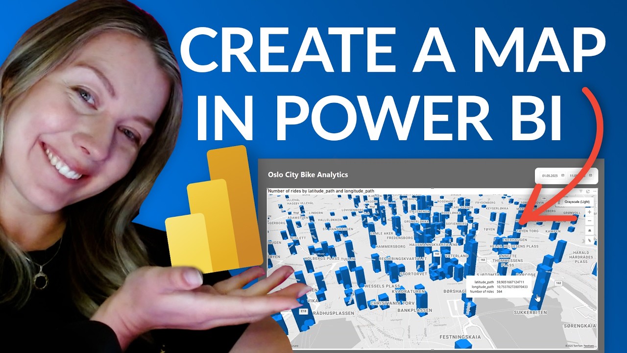
One of the standout features highlighted in the video is the platform’s ability to deliver real-time geospatial insights. By connecting to live data sources, such as Oslo’s City Bike system, users can visualize changing patterns across regions instantly. This makes it much easier to identify trends, spot anomalies, and react quickly to changing conditions.
Additionally, the latest updates bring a new level of customization. Users can now adjust map styles, transparency, and bubble sizes, among other settings. These enhancements allow for a tailored presentation that aligns with an organization’s brand or specific project needs. The seamless integration within Power BI also means users can drag and drop data to create maps without needing complex setups or external tools.
Interactive Features and Administrative Control
Azure Maps offers a highly interactive experience. Features like bubble layers, heat maps, and 3D columns let users dig deeper into their data. You can zoom, pan, tilt, and even rotate the map for a better perspective, while selection tools enable filtering by location or travel time. This level of interaction turns static data into engaging stories that are easy to explore.
From an administrative standpoint, recent updates have introduced refined tenant settings. Admins now have more granular control over who can use Azure Maps and how data is processed. This not only supports security and compliance requirements but also allows more users to access mapping features by default. However, balancing broad access with robust security remains a challenge, especially as organizations scale their use of geospatial analytics.
What’s New: Enhanced Customization and Copilot Integration
The video also covers several new features that set this release apart. Enhanced base map customization lets users fine-tune the look and feel of their maps, making it easier to match organizational branding or highlight specific areas. The introduction of a standalone Copilot feature, currently in preview, allows users to ask questions and receive intelligent insights directly within Power BI. This streamlines the process of turning data into actionable geo stories.
Automation capabilities have also been expanded, enabling users to create workflows that include geospatial analytics. These advancements reduce manual effort but require careful planning to ensure accuracy and relevance. Furthermore, support for the latest Power BI Desktop version (April 2025 or later) ensures users can take advantage of all these improvements, though it may require organizations to keep their software up to date.
The Tradeoffs and Challenges
While the integration of Azure Maps with Power BI brings many benefits, it also presents tradeoffs. Enhanced customization and broader access can increase complexity, requiring users and administrators to stay current with new features and updates. Balancing ease of use with powerful analytics tools is an ongoing challenge, especially for organizations with varying levels of technical expertise.
Additionally, sharing interactive maps publicly raises questions about data privacy and security. Admins must carefully manage tenant settings to ensure sensitive information is protected while still enabling collaboration and public sharing where appropriate. These challenges highlight the importance of thoughtful implementation and ongoing training as organizations adopt these advanced mapping features.
Conclusion: A Powerful Step Forward for Data Visualization
In summary, the integration of Azure Maps with Power BI marks a significant step forward in geospatial data visualization. With real-time insights, enhanced customization, and new automation features, users can turn rows of raw data into compelling geo stories. However, organizations must weigh the benefits of accessibility and interactivity against the need for security and effective management.
As demonstrated in the Guy in a Cube video, these new tools offer exciting possibilities for anyone looking to add geographic context to their data. By embracing these advancements, Power BI users can tell richer, more informative stories—and make smarter decisions based on a clearer understanding of the world around them.

Keywords
Azure Maps Power BI integration real-time geo visualization spatial data analytics interactive maps business intelligence location analytics geographic storytelling
