- All of Microsoft
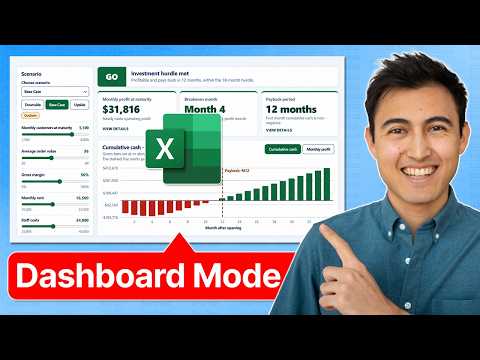
Excel Dashboard Mode: Game-Changer
Co-Founder at Career Principles | Microsoft MVP
Microsoft Excel Copilot canvas dashboards with live updates sliders scenario modeling Insider preview audit caveats
Key insights
-
This YouTube video demonstrates Excel’s new interactive canvas, a dashboard-style workspace that helps users build app-like reports by describing what they want to Copilot to create.
The feature is currently available to Microsoft Insiders. -
The canvas supports UI controls like dropdowns, sliders, clickable KPI cards, chart filters and transaction drilldowns.
Dashboards update automatically when workbook data changes or when new rows are added. - Real examples shown include an executive sales dashboard (revenue, profit, trend analysis), a multi-sheet management report (actuals vs budget with variance explanations), and a scenario tool for store financial models with downside/base/upside switches and adjustable sliders.
-
AI integration: Copilot and Agent Mode let users describe reports in plain language and perform multi-step workbook tasks like building formulas, charts, and summaries.
Excel also supports Python analysis and web-enriched data through functions such as =COPILOT. - Key benefits include faster dashboard creation, dynamic charts that resize with dynamic-array data, easier data exploration with filters and PivotTables, and improved transparency via the Show Changes feature.
- Important limitations: some calculations and selected ranges are hard to audit, design edits often require new prompts instead of direct editing, and broader access may be limited while the feature remains in Insiders builds.
Excel Farré (Kenji Explains) [MVP] recently published a YouTube video demonstrating what he calls Excel’s new Dashboard Mode, and the feature set is already drawing attention from power users and analysts. In the video, he walks through an interactive canvas that combines charts, filters, and AI-driven elements to create app-like dashboards inside Excel. Consequently, the demonstration suggests a shift in how people build and present spreadsheet analysis, especially for reporting and scenario planning. Importantly, Kenji notes that this functionality is available to Microsoft Insiders, which means general access remains limited for now.
What the video shows
Kenji showcases an interactive canvas that supports dropdowns, sliders, clickable KPI cards, chart filters, and transaction drilldowns, and he demonstrates how the visuals update automatically as workbook data changes. For example, one scenario tracks executive sales metrics like revenue and profit trends, while another combines actuals versus budget across multiple sheets and highlights variances. He also turns a financial model into an interactive scenario tool, letting users switch between downside, base, and upside assumptions or adjust sliders to see effects on profitability and cash flow. Thus, the canvas feels more like a simple app layer on top of a workbook rather than a static report.
How AI fits in
Throughout the video, Kenji uses Copilot and mentions Agent Mode to describe how natural-language prompts can generate or modify the dashboard elements. In practice, this means a user might describe the desired report and let the AI create charts, filters, and summary cards instead of building them manually. As a result, the process can speed up common tasks like summarizing sales by region or highlighting underperforming products. However, Kenji also points out that many design changes currently require further prompts rather than direct drag-and-drop editing, which changes how people interact with the layout.
Use cases and examples
Kenji demonstrates three main scenarios: essentials with a single dataset, a report spanning multiple sheets, and a financial model turned into an interactive scenario planner. For operational teams, the first two scenarios show how recurring reports can be consolidated into a single interactive view that updates as new rows are added or data changes. For finance teams, the scenario planner illustrates how stakeholders can explore downside and upside cases with sliders and see immediate effects on payback and cash flow. Therefore, the canvas can reduce manual setup time and make exploratory analysis more accessible to non-technical users.
Tradeoffs and auditability
Despite the clear productivity gains, Kenji stresses important tradeoffs, especially around auditability and control. The canvas often hides the exact calculations and selected ranges behind AI-generated components, which can make it difficult for auditors or collaborators to verify the logic behind a number. Moreover, while Copilot can speed layout and analysis, the reliance on prompts raises reproducibility concerns because subsequent edits may produce different results unless users carefully manage prompts and versioning. Consequently, organizations will need to balance the convenience of AI-assisted dashboards with governance, documentation, and review procedures.
Practical challenges and limitations
Kenji flags limitations that teams should plan for, including performance on very large datasets, the need to validate any external data used by AI functions, and the potential complexity of debugging AI-generated formulas. He also notes that access is limited to Microsoft Insiders, so broader user testing and feedback are still pending, which could change feature behavior. Security and privacy remain practical concerns when dashboards blend internal workbook data with web-sourced context via the COPILOT function, so IT and data governance teams will need to set clear policies. Thus, while the feature offers exciting possibilities, organizations must prepare for governance and operational overhead.
Outlook for adoption
Overall, the video by Kenji Farré presents a compelling view of how Excel may evolve into a more interactive and AI-driven analysis hub. As Microsoft refines access and improves transparency around calculations, the feature could significantly shorten the time from data to insight and make dashboards more approachable. Yet adoption will depend on how well the company addresses auditability, reproducibility, and governance concerns, and whether performance scales to enterprise workloads. For now, the preview gives a clear taste of what’s possible, and stakeholders should evaluate both the benefits and the tradeoffs before rolling it out widely.

Keywords
Excel dashboard mode, New Excel dashboard features, Excel dynamic dashboards, Excel dashboard tutorial, Excel dashboard walkthrough, Excel dashboard tips and tricks, Excel dashboard mode review, How to use Excel dashboard mode