- All of Microsoft

Excel Risk Matrix: Build One in Minutes
Co-Founder at Career Principles | Microsoft MVP
Build a dynamic risk assessment matrix in Excel with dropdowns, INDEX MATCH, conditional formatting and Power BI
Key insights
- Risk Table: Create a table with columns for risk name, probability, impact, and calculated risk level using dropdowns for consistent entries and formulas to keep values dynamic.
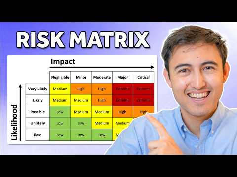
- Text Matrix: Build a grid that maps likelihood categories against impact categories to view risk levels quickly; use text labels (e.g., Low to Extreme) for an easy first pass.
- Numerical Matrix: Assign numeric scores (for example 1–5) to likelihood and impact, compute a combined score (often by multiplying) and use scores to rank risks objectively.
- Conditional Formatting: Apply color rules (green to red) to matrix cells so high-risk items stand out; link formatting to dropdowns and formulas for automatic updates.
- Risk Matrix Chart: Plot risks on an Excel scatter chart using numeric scores to show all items visually; add gradient or colored zones to highlight priority areas and hotspots.
- Automation & Templates: Use templates, INDEX/MATCH or similar formulas, and modern Excel features or AI assistants to speed setup, update dashboards, and generate clear reports
Overview
Kenji Farré (Kenji Explains) [MVP] published a concise YouTube tutorial that shows how to build a Risk Assessment Matrix in Excel in roughly 15 minutes. First, he walks viewers through a clear workflow that begins with a risk table and moves toward a visual chart, and he demonstrates practical Excel techniques along the way. The video emphasizes both a text-based approach and a numerical approach, and it closes with a scatter-plot chart that uses a gradient from green to red. Consequently, the tutorial suits those who need a fast, practical guide to visualizing and prioritizing risks.
Creating the Table and Text Matrix
To start, Kenji designs a simple table that lists each risk alongside assessed likelihood, impact, and the resulting risk level. Then he builds a text-based matrix where rows and columns represent qualitative categories, which helps stakeholders quickly see which risks fall into low, medium, high, or extreme zones. This approach improves readability for non-technical audiences, and it makes it easier to discuss mitigation priorities in meetings. However, qualitative labels can hide nuance, so teams should document how they decide each category.
Adding Dynamics and Numerical Scoring
Next, the tutorial adds interactivity with dropdowns and formula-driven lookups using functions such as INDEX-MATCH, so the matrix updates when inputs change. After that, Kenji converts the labels into a numerical matrix ranging from 1 to 5 to enable simple math for prioritization and sorting. This numeric layer supports automation—such as calculating risk scores by multiplying likelihood and impact—but it also introduces choices about scaling and thresholds. Therefore, teams must balance the benefits of precise numbers with the risk of creating a false sense of accuracy when assessments remain subjective.
Charting Risks with a Scatter Plot
Finally, the video shows how to plot all risks on a single scatter chart so viewers can see spatially where risks cluster and which need urgent attention. He applies a gradient fill that moves from green for low risk to red for extreme risk, which enhances at-a-glance interpretation and supports quick decisions. Moreover, Kenji explains how to label or annotate points so the chart remains informative even when many risks appear close together. Still, visual overlaps and the limits of two axes mean that charts sometimes require filters or interaction to remain actionable for large risk sets.
Tradeoffs and Practical Challenges
Balancing simplicity versus depth proves to be a core tradeoff in Kenji’s approach: a clean matrix fosters communication, whereas richer data improves analysis but increases maintenance. In practice, automation like dropdowns and formulas speeds updates, yet it demands disciplined data entry and version control to avoid misleading outputs. Additionally, scoring decisions remain subjective, and teams must invest time to align on definitions for likelihood and impact, otherwise comparisons across projects may be inconsistent. Emerging tools such as AI-assisted features can speed setup and highlight patterns, but they still require human oversight to verify assumptions and context.
Key Takeaways
Overall, the video offers a practical, step-by-step method to create a dynamic Risk Assessment Matrix in Excel, useful for project managers and risk owners who need a fast visual tool. Moreover, it highlights several useful features—dropdowns, lookup formulas, conditional formatting, and scatter-plot visualization—while also reminding viewers about the importance of clear scoring rules and ongoing maintenance. Therefore, teams should adopt the template as a starting point, tailor the scales to their context, and pair the matrix with documented mitigation plans and ownership. In short, Kenji’s tutorial is an efficient primer that balances clarity and functionality for everyday risk management.

Keywords
risk assessment matrix excel, excel risk matrix template, how to create risk matrix in excel, project risk assessment in excel, risk matrix spreadsheet template, excel risk register and matrix, conditional formatting risk matrix excel, step by step risk matrix excel