- All of Microsoft

Customize tooltips in Power BI - Microsoft Fabric
Boost your Power BI reports with custom, visually rich tooltips using our detailed guide, designed for Microsoft Power BI experts.
Tooltip Features in Power BI inside of Microsoft Fabric
The YouTube video by "Guy in a Cube" focusing on tooltips, a significant feature within Power BI, creates a rewarding learning experience. The feature discussed is the creation of visuals-rich tooltips by the author, based on report pages created in Microsoft Power BI inside of Microsoft Fabric
Tooltips work when a user hovers over visuals, and the author emphasises on customised tooltips that can include visuals, images, and any collection of items. For new users, the author suggests the 'Customize tooltips' feature in Power BI which provides incredible guidance to start modifying tooltips.
The author explains the convenience of creating numerous tooltip pages, each being associated to one or more fields in a report. The tooltip created on the said page appears as you hover over a visual, making it filtered by the datapoint over which the cursor hovers.
The video then delves into creating a report tooltip page. To start, a new report page is to be created by selecting the + button along the Power BI Desktop canvas. A crucial note from the author is keeping the tooltip size reasonably small and to adjust the Page View, for better visualization of the completed tooltip.
The next section visualizes how to name a report page clearly by selecting the Page Information card and typing the name in the Name field. The author then explores how a report tooltip page can be populated with the desired visuals.
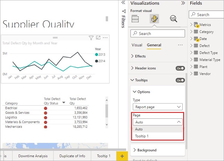
Configuring a tooltip report page involves turning the Tooltip slider to On in the Page Information card and specifying the fields for tooltips. Fields can be added by dragging them into the Tooltip fields bucket, found in the Fields section of the Visualizations pane.
With the capability of including both categorical and numerical fields, including measures, a tooltip report page is ready to act as a tooltip in visuals using any of the added fields, thus replacing the defaul tooltip.
Moreover, specific visuals can be manually set for tooltips. This process incorporates the use of a Tooltip card found under the Formatting pane of the visual's pane. This tooltip functionality: providing an override to the default tooltip selection, is also explored by the author.
The video then focuses on the behavior of report tooltips when interacting with line chart visuals, their behavior during cross-highlighting, and specific considerations and limitations while using tooltips in Power BI.
Exploring features such as 'Use drillthrough', 'Focus mode', and 'Feedback' among others, each offering distinct ways to represent visual data, and further explore Microsoft's Power BI's platform.

Learn about Are you thinking about your tooltips in Power BI?
Power BI is a robust tool for data analysis, culminating in visual representations such as reports and dashboards. To enrich your analysis and enhance your data understanding, Power BI provides attributes like tooltips. Tooltips are an interactive feature that provides additional insights on a given visual on hover. You can create detailed tooltip report pages that provide more context to your visuals.
Learning how to use tooltips in your BI projects adds an extra level of depth and clarity. Courses or webinars, focusing on features like tooltips, can be very helpful. You can check out Microsoft's own learning platform, Microsoft Learn, for structured, in-depth courses on Power BI, including tooltips creation. Additional resources include platforms such as Coursera, Udemy, and LinkedIn Learning, which provide comprehensive Power BI coursework, spanning from beginner to advanced levels.
Concentrating specifically on tooltips, you'll discover how to create visually rich tooltips-based report pages directly within your BI service. The tooltips ioffer immense flexibility. You can create tooltip report pages and align them with various fields in your report, giving users additional insights when they hover over visuals containing those selected fields.
One fundamental aspect of tooltips is the tooltip report page. This is a page you would create in your report for the purpose of serving as a tooltip. An informative tooltip could contain visuals, images, and any collection of items you concoct for that page. Canvas offers diverse spaces to craft helpful tooltips customized for your analysis.
Keywords
Power BI tooltips, Tooltips optimization, Advanced tooltips in Power BI, Power BI tooltip guide, Improving Power BI tooltips, Custom tooltips in Power BI, Controlling Tooltips in Power BI, Power BI tooltips tricks, Enhancing Power BI tooltips, Power BI tooltip practices.