- All of Microsoft

Canvas PowerApps ComboBox MULTI-Default-Selected-Items
Senior Software Developer at St. Jude Children's Research Hospital Power Platform Developer | PowerApps | Power Automate | Power BI | Dataverse | Power Platform Community Super Use
Master the Canvas PowerApps ComboBox for efficient data retrieval in business applications, enabling multiple selections and server-side search.
Todays' topic is a YouTube video by "Ahmed Salih (Power Platform Place)" focusing on Power Apps' utility with emphasis on the ComboBox MULTI-Default-Selected-Items. There are scenarios when developing business apps where users need to make multiple selections from given choices, like looking up employee records or contact details for specific brands.
Power Apps provides a solution with the combo box, a control that lets users seek out specific items and select several of these. The search operation occurs server-side utilizing the SearchField property, accommodating large data sources conveniently.
Let's break down how to use the combo box in Power Apps for searching, filtering, and setting default values.
Using the Combo Box in Power Apps
The combo box is an essential feature in Power Apps; it might seem like a drop-down tool, but its versatile functionality goes beyond that. To create one, select "Insert" then "Controls" and pick "combo box."
The default is ComboBoxSample, but a Data pane opens to your right. Substitute the data source in the drop-down. Following that, the layout selection offers three options: Single, Double, or Person. Lastly, define the primary and secondary text (for double layouts) and the SearchField.

The SearchField determines the combo box's search area when a user types into the box. Its default setting is the primary text, which can be altered. An effortless way is to adjust the value in the SearchField. However, to search multiple fields, opt for "SearchFields" from properties and include the desired fields.
Further Functions Of The Combo Box
Filtering becomes crucial when working with vast data sets to avoid overwhelming users. In the example, the data was filtered so that combo box only displayed values where SalesPerson = Pamela.
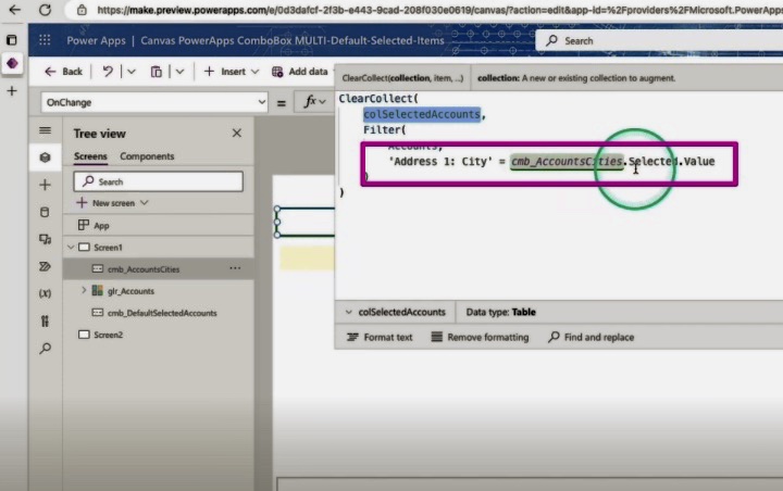
The box doesn’t typically use “default” as a property. Instead, it employs “DefaultSelectedItems” that sets specific records to show by default. Additionally, several functions come with the combo box. For instance, SelectMultiple, if set to "false", prevents users from making multiple selections.
The SelectedItems are used to recall the output of a combo box, returning a table of information from your selections. The Concat function is used to convert a field in the table output from SelectedItems into a text string.
The combo box may seem like a basic drop-down, but it has enhanced functionalities and demands some unique functions. These include search, filter, and value settings, plus a couple of specially useful features.
The combo box is designed to pass records. As long as you remember that, you should be able to utilize the box to extract required data for your business. Using the combo box effectively will enable your business to customize data retrieval according to your specific needs.

ComboBox MULTI-Default-Selected-Items
In this digital era, developing applications for your business that fulfill specific requirements is an essential task. For instance, you may need to create an application that facilitates users in selecting from an array of different options, such as looking up employee records or retrieving the contact details of brand representatives. A tool like Microsoft's Power Platform can be incredibly useful in such scenarios.
Within this platform, there is a control named combo box which is designed to enable users not only to look up specific items but also to select multiple items at a time. The server-side performance of the search using the SearchField property makes it extremely competent to manage large data sources.
In the following sections, we share tips on utilizing the combo box to search, filter, and set default values. While going through this guide, feel free to reference the related YouTube video to gain a more in-depth understanding.
Search, Filter, and Set Default Values with a Combo Box in Microsoft's Platform
An integral part of Microsoft's Power Platform is the combo box, a control that simulates a dropdown tool but offers a lot more functionality. Let’s learn how to employ it to search, filter, and set default values.
Constructing a Combo Box
The process of creating a combo box starts with selecting “Insert” followed by “Controls.” Subsequently, choose “combo box” from the drop-down list. The system will automatically default to ComboBoxSample, but you can alter the data source via the Data pane that will appear on the right.
Following this, choose to display layout. There are three options:
- Single - This option displays one data field in the combo box.
- Double - This option displays two data fields. The initial usage example demonstrated this.
- Person - Similar to the double layout but includes an image too.
Lastly, choose the primary and secondary text (for double layouts) along with the SearchField.
Performing a Search
SearchField dictates the field where the combo box will search when the user inputs a term. The primary text is the default search field, which you can alter.
A straightforward approach is to change the value in SearchField. However, if you aim to search several fields, choose “SearchFields” from the properties dropdown next to the functions. Then, merely include the desired fields. For instance:
SearchFields = ["Work"] became SearchFields = ["Car1", "Car2"].
In this case, both the company name and the salesperson name were searched when a term was input.
Filtering Data Entries
Filtering can ease the process when handling a large set of data, as you wouldn’t want to bombard your users. In the illustrative example, data was filtered so the combo box displayed values where SalesPerson was equal to Pamela. The related code on the property, Items, looked like this:
Filter('[Work].[Customer]', Person = "peter")
Setting a Default Value
With a combo box, the “default” property is not functional. To establish a default value, utilize “DefaultSelectedItems.” This facilitates the display of specific records by default. By applying the Filter function to the same datasource used for your Items property, you can set DefaultSelectedItems.
Additional Functions of Combo Box
Some other intriguing functions of the combo box can prove significantly beneficial:
- SelectMultiple: If you don’t want users to make multiple selections, set SelectMultiple to “false.”
- SelectedItems: To decipher the output of a combo box, utilize the SelectedItems property. It returns a table of information from your combo box selection.
- Concat: To convert a field in the table output from SelectedItems into a text string, use Concat.
- DisplayFields: Alter these to change what data returns when a user makes a selection.
In conclusion, even though a combo box emulates a drop-down menu, it offers more features and warrants different functions. With comprehensive understanding and application of the mentioned tips, you can optimize the use of a combo box in augmenting data retrieval and handling in your business.
Keywords
Canvas PowerApps ComboBox, Multi-Default-Selected-Items, PowerApps default selection, PowerApps Multiple Selection, PowerApps ComboBox tips, Canvas PowerApps Default, ComboBox in PowerApps, PowerApps Select Items, PowerApps ComboBox guide, Default Items PowerApps