- All of Microsoft
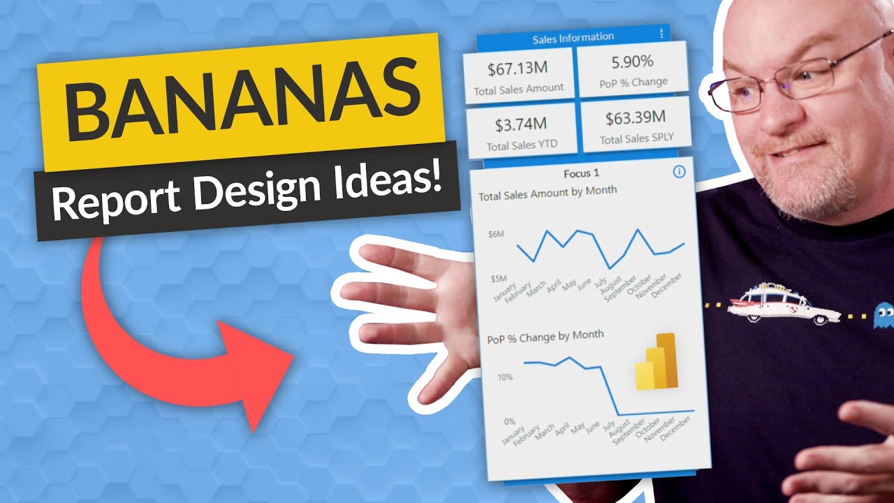
Here's a BANANAS report design idea!
There are many things you can do in a Power BI report that aren't super complex. Here are a few ideas to get you thinking! If Adam can do this, you definitely can! Shout out to Chris Hamill for this design!
Tips for designing a great Power BI dashboard
Consider how to make your dashboard practical as well as attractive now that you've built it and added some tiles. It often refers to making the most crucial information stand out and keeping everything organized and simple.
Tell a story on one screen
Having all the tiles on one screen is ideal because dashboards are designed to display significant information quickly. Are scroll bars on your dashboard avoidable?
The dashboard may be too crowded. Remove anything but the most important, understandable information.
Think about your audience
What are the most important metrics that will guide their decisions? What purpose will the dashboard serve? What cultural or educational presumptions might influence design decisions? What details are necessary for your audience to succeed?
Remember that the dashboard provides an overview and a centralized location to track the status of the data right now. The reports and information on which the dashboard is built frequently have a ton of details. From your dashboard, readers may dive down into the reports. Therefore, unless that is what your readers need to watch, don't put the detail on the dashboard.
What location will the dashboard be visible? You may display more information on a huge monitor. But if viewers
- Tips for designing a great Power BI dashboard
https://docs.microsoft.com/en-us/power-bi/create-reports/service-dashboards-design-tips - Dashboard design best practices video
https://www.youtube.com/watch?v=-tdkUYrzrio
