- All of Microsoft

Power BI Legends: Perfect Color Guides for Data Visualization
Power BI, Legends, Charts, Data Visualization, Clarity, Kristyna Ferris, Training Courses
Key insights
- Legends in Power BI act as guides, helping users clearly understand which colors represent specific data categories or metrics, reducing confusion in complex reports.
- Using structured legend systems lowers the mental effort needed to match colors with data points, making charts easier and faster to read.
- The approach supports accessibility, ensuring that people with color vision deficiencies can interpret charts by pairing colors with clear text or symbols.
- Consistency is achieved by following set color rules and palettes across all reports, so teams can standardize their visualizations for better collaboration and presentation on different devices.
- The method includes embedding legends directly within visuals, using automated dynamic labeling, and possibly integrating interactive features like click-to-filter for a more engaging user experience.
- This strategy aligns with modern UI/UX principles, focusing on easy understanding and memory efficiency while taking advantage of Power BI’s latest built-in tools to streamline dashboard creation.
Stop Guessing Colors: Legends That Guide in Power BI
Understanding the Challenge of Color Ambiguity
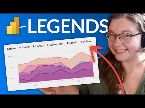
In a recent YouTube video from Guy in a Cube, the focus shifts toward a persistent challenge in data visualization—color ambiguity in Power BI charts. Often, users find themselves wasting time trying to match chart colors to their corresponding data points, especially when reports become complex and filled with overlapping dimensions. As the video highlights, this guesswork can create confusion, slow down data interpretation, and lead to errors.
Consequently, the need for clearer legend systems becomes apparent. When viewers cannot easily identify what each color means, the effectiveness of the entire dashboard suffers. By addressing this issue, teams can ensure that their reports deliver the intended insights without unnecessary barriers.
Key Benefits of Structured Legends
The methodology presented by Kristyna Ferris and discussed in the video emphasizes several important advantages. First, structured legends significantly reduce cognitive load by providing clear, direct associations between colors and data categories. This means users no longer have to mentally map chart elements, making it easier to absorb information quickly.
Moreover, accessibility is greatly improved. By pairing colors with explicit text or symbols, the approach accommodates users with color vision deficiencies. This not only supports inclusivity but also aligns with best practices for accessible design. Additionally, consistent legend systems help mitigate display issues caused by different monitors or projectors, ensuring that everyone sees the same information regardless of their device.
How the Methodology Works
Although the video does not reveal all technical details, it outlines a clear path for implementing effective legends in Power BI. The first step involves designing legends that integrate textual or symbolic identifiers directly within the visuals. This helps users instantly recognize what each color or symbol represents.
Next, the approach recommends establishing strict color system rules. By defining a set palette and usage guidelines, teams can avoid accidental inconsistencies across multiple reports. Finally, dynamic labeling—automating the association between data and legend items—further reduces the risk of manual errors. These steps are rooted in proven UI and UX principles, which prioritize clarity and minimize the burden on users' memory.
Innovations in Power BI Integration
The latest version of Power BI offers new capabilities that make these legend strategies more powerful and easier to implement. According to the video, users can now rely on native formatting features within Power BI, eliminating the need for external tools or custom scripts. This integration streamlines the process and ensures that legend systems remain consistent as reports evolve.
Furthermore, the video hints at interactive legend features, such as click-to-filter, which can make dashboards even more engaging and user-friendly. While the primary focus remains on color-legend relationships, the possibility of combining patterns or shading for added redundancy is also suggested. This layered approach can be especially helpful for users who have difficulty distinguishing certain colors.
Balancing Tradeoffs and Overcoming Challenges
Implementing structured legends in Power BI comes with its own set of tradeoffs. On one hand, adding text or symbols to every visual can increase chart complexity and take up valuable screen space. Teams must balance the need for clarity with the desire for clean, uncluttered reports. Additionally, standardizing color systems across an organization may require extra coordination and training.
However, the long-term benefits often outweigh these initial challenges. By reducing the "interpretation tax" that slows down decision-making, effective legends help teams unlock the full value of their data. As Power BI continues to evolve, these strategies will likely become even more central to creating accessible and impactful reports.
Conclusion: Making Data Speak Clearly
Ultimately, the insights from Guy in a Cube underscore the importance of thoughtful legend design in Power BI. By moving beyond basic color labels and embracing structured, accessible legends, organizations can ensure that their data visualizations communicate effectively. As the video demonstrates, even small changes in how we present information can make a significant difference in how it is understood and acted upon.
For those looking to improve their Power BI skills, this approach offers a practical path to clearer, more user-friendly dashboards—helping every data point "shout its name" with confidence.

Keywords
Power BI color guide Power BI legends color tips Power BI visualization colors best Power BI dashboard design color theory data visualization colors Power BI color palette tips