- All of Microsoft

Customize Data Labels in Power BI for Enhanced Visualization!
Enhance Your Power BI Reports With Custom Data Labels For Ultimate Visualization Control!
Enhance your data visualization control with custom data labels in Power BI! Customizing data labels in Power BI leads to more personalized and accurate data presentations. Let's dive into the steps required to achieve this.
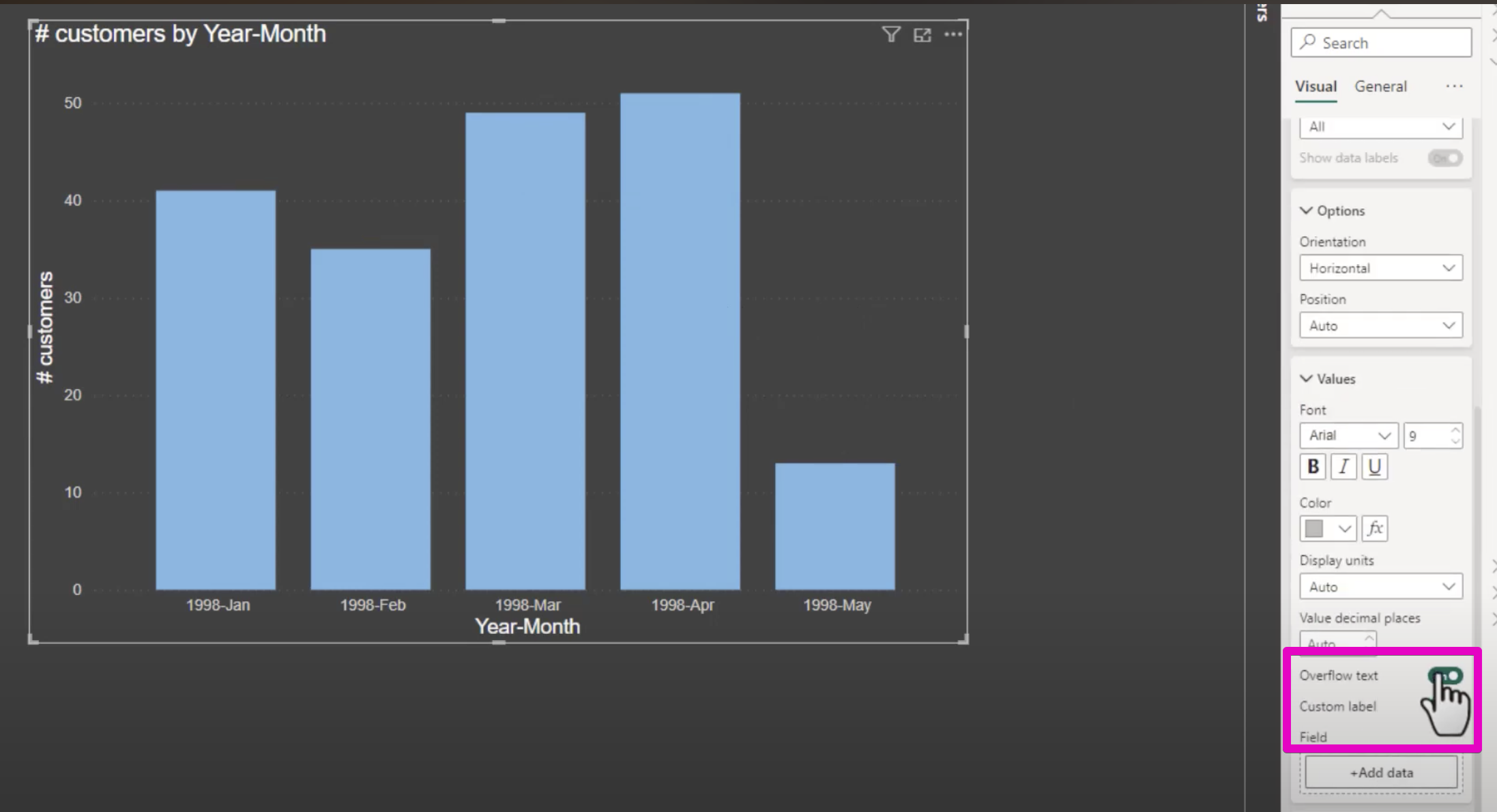
Firstly, pick your desired chart or graph for adding custom labels. You need to access the options pane by clicking on the visualization, then head over to the "Format" tab. Here, in the "Data labels" section, you'll find various customization options such as label visibility, font adjustments, color changes, and formatting choices.
Power BI also offers advanced label formatting capabilities. You can format labels to match your data types like currency or percent, apply conditional formatting for color changes, and alter label positions for clarity. These advanced options give your visuals a clean and clear appearance.
For those needing intricate customizations, label expressions in Power BI are available. You can incorporate measures or calculations within your labels for dynamics. Additionally, it's possible to display certain data points as labels by dragging a field into the label section.
Once you've applied custom labels, preview your visual to ensure label accuracy and visibility. If necessary, tweak your settings to make your data more readable and effectively presented. The review and adjustment process is crucial for polished results.
In cases where labels might overcrowd your visual, consider using tooltips. Tooltips offer more details when a user hovers over a visual element, helping to maintain clarity. Also, strive for consistency in label formatting across all your visuals to present a uniformly professional report.
Lastly, don't forget to tap into the Power BI community and official documentation. They are treasure troves for advanced tips and illustrative examples. The primary objective of using custom data labels is to simplify data comprehension with a glance, remembering to balance the amount of detail with the visual cleanliness.
General Insights on Power BI Data Visualization
Power BI is a versatile tool for creating compelling data stories through visualizations. It empowers users to transform raw data into informative, interactive, and easily understandable visuals. Its customization capabilities allow for tailored presentations that cater to specific audience needs while maintaining stylistic consistency across reports. Advanced users can dive deeply into functionality with expressions and integrated Power BI resources. Emphasizing clarity and simplicity ensures the intended message is conveyed without overwhelming viewers. Embrace Power BI's potential to deliver insightful and impactful data narratives.

Learn about Create Custom Data Labels In Power Bi For More Control Over Your Data Visualization!
Customizing Data Labels in Power BI
Enhance your data visualization by creating custom data labels in Power BI for greater control and personalization. It's a straightforward process that can drastically improve the comprehension of your data. This customization allows for unique presentation adjustments specific to your needs.
To begin, select the chart or graph of your choice on which you intend to add custom labels. Once selected, access the label options by clicking on the visualization, which will bring up the options pane. Within this pane, you'll find the "Format" tab where you'll start your customization journey.
Under the "Format" tab, look for the "Data labels" section. Here, you’re given an array of choices, such as toggling labels on or off, and altering the font size, color, and overall format to your preference. The aim is to tailor your labels for the clearest and most informative display.
Advanced Data Labeling Techniques
Moving on to more sophisticated labeling options, you can engage with label formatting to ensure the number format aligns with your specific data requirements. Conditional formatting is another powerful feature, allowing label colors to change in response to data values or criteria. Additionally, the positioning of labels can be adjusted to enhance clarity, with options like inside end, outside end, and center.
Label expressions present an opportunity for those who need nuanced customization. By utilizing label expressions, you can insert measures or calculations directly within your labels, making them dynamic and data-rich. For field-based labels, simply drag a field into the label section to represent specific data points.
As part of the refinement process, it's important to test and adjust your labels. After configuring your labels, preview the visualization to check their appearance. Any necessary adjustments can be made to optimize readability and the presentation of the data.
Enhancing Clarity and Consistency
At times, labels can become too detailed and create a cluttered appearance. In such cases, consider using tooltips to relay additional information discreetly when a data point is hovered over. This helps maintain clarity without sacrificing detail.
It's also crucial to maintain uniform label formatting across all visuals within a report to achieve a professional and cohesive look. Consistency in design and presentation can elevate the overall impact of your data visualizations.
For those seeking to expand their expertise, exploring the community feedback and official documentation relating to this visualization tool can provide advanced techniques and examples. It's a wealth of knowledge that can help in mastering the art of data label customization.
Custom data labels are designed to simplify the comprehension of your data. Remember, the objective is to present your data in the easiest way for your audience to understand without bombarding them with too much information. Striking the right balance between clarity and detail is essential for effective data visualization.
Understanding Data Presentation in Power BI
Effective data presentation is critical when working with analytics tools. It involves the strategic placement, formulation, and customization of data points within visualizations to ensure that the audience can quickly and accurately comprehend the underlying information. Streamlining data through visualizations not only aids in understanding but also enhances the storytelling aspect of data analytics.
More links on about Create Custom Data Labels In Power Bi For More Control Over Your Data Visualization!
- How to Add Labels in Power BI
- 4 days ago — Customizing Your Labels in Power BI: Font, Color, and Size Options · Select the visualization to which you want to apply the customizations.
Keywords
Power BI Custom Data Labels, Data Visualization Customization, Advanced Power BI Labeling, Customize Data Labels Power BI, Power BI Data Label Control, Personalize Power BI Data Labels, Enhanced Data Labels Power BI, Power BI Visualization Techniques, Power BI Label Customization, Power BI Data Display Customization