- All of Microsoft

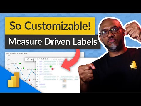
Create MEANINGFUL data labels with measures in Power BI
Tired of the usual text data labels that only have one value? Looking for something different? Patrick shows you how to customize your data labels using DAX in
Create MEANINGFUL data labels with measures in Power BI like never before! Tired of the usual text data labels that bear only a single value? There is a fresh option available-Patrick shares insights on how to modify your data labels using DAX in your Power BI reports. DAX, which stands for Data Analysis Expressions, is a formula language that is primarily used with Power BI, Analysis Services, and many other Microsoft technologies.
DAX formulas encompass functions, operators, and values to execute advanced calculations and queries on data in Power BI, Analysis Services, and Power Pivot in Excel. It encompasses a few intriguing key concepts one ought to understand when DAX is applied in Power BI reports.

- Calculated Columns: You can add Calculated Columns to tables already present in your Power BI dataset which then becomes available to all reports using that dataset.
- Measures: A measure stands as a calculation established specifically for data analysis and is computed exclusively for the context where it is employed. Measures conduct calculations on data model fields.
Diving Deeper into DAX
If you are working with data analysis or report generation, tapping into the potential of DAX can be immensely beneficial. Calculated Columns and Measures are stepping stones that allow you to transform your data into meaningful insights. Notably, the use of measures allows for dynamic calculations. Understanding and utilizing these advanced options can significantly enhance the comprehensibility and interactivity of your Power BI reports.
Learn about Create MEANINGFUL data labels with measures in Power BI
Power BI is a powerful tool that allows users to create meaningful data labels with measures by using the Data Analysis Expressions (DAX) formula language. DAX formulas include functions, operators, and values which are used to perform advanced calculations and queries on data. Core concepts of using DAX in Power BI reports include Calculated Columns and Measures. Calculated Columns are columns added to existing tables in the dataset and are made available to all reports using that dataset. In contrast, Measures are calculations that are created specifically for data analysis and are only computed in the context in which it is used. Measures perform calculations on data model fields and the results can be used to create meaningful data labels with measures.
More links on about Create MEANINGFUL data labels with measures in Power BI
- Sensitivity labels in Power BI
- Feb 14, 2023 — In the Power BI service, sensitivity labels can be applied to datasets, reports, dashboards, and dataflows. When labeled data leaves Power ...
- How to Add Data Labels in Power BI in Filled Map
- Jun 16, 2023 — Another way to format data labels in Power BI is to use conditional formatting. This allows you to change the color or font of the label based ...
- Measure-driven data labels
- May 28, 2023 — With measure-driven data labels you are able to replace the default label values with a custom field or measure. In my case, I created a ...
- Measure driven data labels - Amal's Newsletter
- Jun 2, 2023 — ✓With Measure driven data labels option, we can now easily replace our default data labels with more significant values based on a chosen field ...
- Display Only the End Label on a Line Chart in Power BI
- Step 5: Under Data Labels, turn off the data labels for the Sum of Sales line chart. This results to the below visual. We now only have the data label ...
- Is there a way to display additional measures in t...
- Is there a way to display additional measures in the data labels in Pie or donut charts? ... 1 Create a Calculated column ... 2 Create a Pie or Donut Visual.
- Power BI Data Visualization - Ideas & Wishlist
- Oct 4, 2022 — To do this, you need to follow the below instructions: Open Tabular Editor 2 or Tabular Editor 3. Connect to your dataset. Create a calculation ...
Keywords
Microsoft Power BI, Data Analysis Expressions (DAX), Calculated Columns, Measures, Power Pivot, Excel