- All of Microsoft
Power Apps: Gallery Views & Columns
Power Platforms Consultant | Content Creator
Microsoft expert on Power Apps dynamic gallery: adaptive header, combo box view, column toggle via JSON config, mobile
Key insights
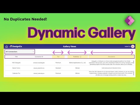
- Video summary: This tutorial video shows how to build one Dynamic Gallery in Power Apps that adapts to multiple views, layouts, and column settings using a single Combo box control.
It avoids duplicating galleries and keeps app logic cleaner and easier to maintain. - Core capabilities: The solution demonstrates an Adaptive header, Show/hide columns behavior, and Sortable headers so users can change views and sort data interactively.
It uses a simple JSON config to manage multiple views and keep galleries synchronized. - Step-by-step build: Key steps include creating the Header Gallery, preparing header data, adding containers and buttons, then creating the Items Gallery and text controls to display rows.
Copy/paste patterns, adjusting FillPortions, and updating the gallery’s Items property are shown to speed development. - Mobile and responsive design: The demo walks through a Mobile-responsive view and shows how to change Column visibility for smaller screens so layouts remain usable on phones and tablets.
Responsive grid and alignment settings ensure consistent display across devices. - Integration and theming: The gallery connects to common Data sources like SharePoint, Dataverse, or Excel and respects app Theme support for colors and fonts.
Developers can programmatically enable Layout switching (list, grid, card, table) without complex workarounds. - Benefits: This approach improves Scalability and reduces duplicate screens, speeds maintenance, and enforces consistent visuals via Fluent Design patterns.
It also enhances Accessibility through better keyboard support and contrast, making apps more inclusive.
Quick overview of the video
In a clear, step-by-step YouTube tutorial, Isabel Liu demonstrates how to build a single, adaptable gallery in Power Apps that can switch between views, column sets, and layouts without duplicating screens. She frames the solution around a simple combo box that drives the gallery’s configuration, and she highlights why this reduces maintenance overhead. The video remains practical, focusing on reusable patterns rather than one-off hacks, so viewers can apply the approach to real business apps.
How the dynamic gallery works
Isabel begins by showing how to create a header gallery and a separate items gallery, then bind both to a shared configuration so that changes propagate across the app. Next, she builds a compact JSON-style configuration to manage multiple views, which controls column visibility, layout type, and sort behavior in real time. Throughout the demo she walks through concrete steps—creating the combo box, preparing header data, and adding containers and buttons—so developers can reproduce the flow in their own apps.
Key features and benefits highlighted
The tutorial covers several practical features, including dynamically showing and hiding columns, clickable headers for sorting, and mobile-responsive view switching that adapts layout and column visibility based on device width. Isabel emphasizes that the pattern keeps apps clean and consistent, while reducing the need for duplicated galleries and messy logic. She also points out accessibility and design wins by leveraging Modern Controls and aligning visuals with Fluent Design principles to ensure a polished user experience across devices.
Tradeoffs and implementation challenges
Although the single-gallery approach simplifies maintenance, it introduces tradeoffs around complexity and initial setup. For example, building a robust JSON configuration that covers all views can become verbose and requires careful naming and testing, which adds upfront work. Moreover, dynamic layouts that run well on desktop may need additional tweaks to perform acceptably on low-end mobile devices, so developers must weigh responsiveness against rendering cost and interaction simplicity.
Practical tips, performance, and best practices
Isabel suggests practical steps to manage these tradeoffs: keep the configuration concise, use containers to control layout consistently, and limit the number of visible columns on small screens to preserve performance and readability. She also recommends testing sort and filter logic with representative data to catch edge cases early, and to reuse simple helper formulas where possible to avoid repeating complex expressions. Finally, she advises balancing visual fidelity with speed by choosing appropriate controls and avoiding overly complex nested layouts that can slow down rendering on some devices.
Why this matters for Power Apps authors
Overall, the video offers a compelling pattern for teams that want a scalable gallery solution without creating separate screens for each view. By centralizing configuration and using a single, responsive gallery, teams can reduce technical debt and keep app logic easier to follow. As a result, organizations gain faster iteration cycles and simpler governance when multiple makers maintain the same app.
Takeaways and next steps
To adopt this approach, start small: build one responsive view and a minimal configuration, then expand to more views as confidence grows. Also, document the JSON config and naming conventions so other developers can extend the gallery without breaking it. In short, Isabel Liu’s tutorial provides a practical, repeatable way to make galleries more flexible, and it balances maintainability with the realities of performance and accessibility.

Keywords
Power Apps dynamic gallery, Power Apps switch views, Power Apps change columns, Power Apps gallery layouts, Power Apps responsive gallery, Power Apps toggle gallery view, Power Apps gallery templates, Power Apps gallery best practices