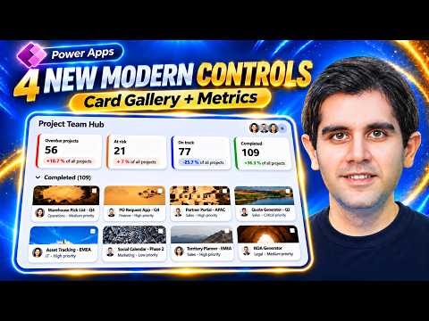
Power Apps: use four modern controls in canvas apps
Principal Program Manager at Microsoft Power CAT Team | Power Platform Content Creator
Power Apps makers can use Card Gallery, Metrics Card, Avatar Group, and Persona controls to build canvas app screens with less custom layout work.
Key insights
- Card Gallery lays records out as responsive cards and supports grouping, selection, and multi-selection.
- Metrics Card displays a value and trend, but the app must supply the calculations and trend meaning.
- Avatar Group and Persona display people from data supplied by the app; presence is not looked up automatically.
- Turn on Modern controls and themes in App Settings > Updates before using the controls.
Power Apps' Card Gallery, Metrics Card, Avatar Group, and Persona controls give canvas app makers built-in ways to present records, metrics, and people. They can reduce the number of individual controls and formulas needed for common screen layouts, while leaving data preparation and app behavior in the maker's hands. Reza Dorrani demonstrates the controls with a SharePoint project list and a canvas app screen.
What's new
The four controls address different display needs. Card Gallery presents a table of records as cards, with a predefined layout rather than a gallery template assembled from child controls. Its card fields can show a title, subtitle, description, image, and header image, with values mapped from a data source or supplied using Power Fx.
The gallery adjusts its number of columns to the available width. Makers can set a maximum column count, card dimensions, and spacing, and can group records by a field. Groups can expand and collapse. Selection is available, including multi-selection, so other parts of an app can respond to the selected record or records.
Metrics Card is a display control for a formatted value and context such as a title, description, trend value, and trend text. The app supplies those values and determines whether the trend is positive, negative, or neutral. The control presents the information; it does not calculate totals or compare time periods automatically.
Avatar Group displays several people in a compact space, while Persona presents one person with an avatar and up to three text lines, plus an optional presence badge. The supplied data determines what the controls show. In particular, neither control automatically retrieves live Teams presence.
Who it is for and what you need
These controls are aimed at canvas app makers who want reusable, structured layouts for records, summary metrics, or people. Card Gallery can suit record lists where a standard card layout, responsive columns, grouping, or selection is useful. Metrics Card is for a value whose calculation and interpretation have already been handled by the app or its data source.
Before adding them, turn on Modern controls and themes under App Settings and Updates. The demonstration also notes that the app's authoring version must meet the version requirement shown there; it does not give a specific version number. The supplied material does not state licensing requirements, regional availability, rollout status, or whether the controls are preview or generally available, so makers should check the linked Microsoft documentation for current details.
For Avatar Group and Persona, prepare the people data the app needs, such as names, images, and presence values. The demonstration uses profile information and a collection for the group. If an app needs actual presence from Microsoft Graph, the presenter describes a possible approach involving an Entra app registration, permissions, and a custom connector; those pieces are separate app setup, not automatic behavior of the controls.
How it works
- In the canvas app, open App Settings, select Updates, and enable Modern controls and themes. Confirm the authoring version meets the requirement displayed in the app.
- Add Card Gallery and connect it to a table or data source. Set its title, subtitle, description, image, and other available card properties to the relevant fields or Power Fx expressions. For example, a choice field can provide its Value, and an image URL or image column can supply a card image.
- Configure the layout and interaction. Set grouping to a field expression such as ThisItem.Priority.Value, then choose whether users can select one or multiple cards. Use the selected record or SelectedItems in formulas for details panes, filters, or actions.
- Add Metrics Card controls for summary values. Provide the formatted value, supporting text, trend value, and trend type. If clicking a metric should filter the gallery, connect its OnSelect behavior to a variable and use that variable in the gallery's Items formula.
- For people information, bind Avatar Group to a table of people and Persona to a single person's fields. Supply presence values if a badge is needed; do not assume the control discovers presence on its own.
In the demonstrated project-list example, the gallery's selection drives a details area, and metric cards set a filter used by the gallery. Multi-selection can also drive a bulk update interface. The app's update action uses Patch against selected records; the control itself does not perform data updates. Makers should build and test that data logic for their own data source and requirements.
Limitations and open questions
Card Gallery's predefined card layout is the tradeoff for reducing custom layout work. A classic gallery remains a better fit when the screen requires a highly customized per-record template. The demonstration contrasts the controls with an older approach built from a gallery, labels, images, and other individual controls; that approach offers more direct control but requires more layout and responsive logic.
Metrics Card does not derive its own KPI or trend. The app must calculate the number, provide any comparison, and assign the trend interpretation. Likewise, Avatar Group and Persona only render values supplied to them. The demonstration's calendar-based presence example is an approximation, not live Teams presence; connecting to a presence API requires additional setup.
The source material does not establish licensing, rollout timing, supported regions, or preview status. It also does not provide a full reference for every property or data-source behavior. Check Microsoft's control documentation before adopting a control in a production app, particularly where accessibility, scale, or specific interaction requirements matter.
Sources
- Microsoft documentation: Card Gallery
- Microsoft documentation: Metrics Card
- Microsoft documentation: Avatar Group
- Microsoft documentation: Persona
- Reza Dorrani's Power Apps control demonstration
Frequently asked questions
How do I enable modern controls in Power Apps?
In the canvas app, go to App Settings > Updates and turn on Modern controls and themes. The authoring version must also meet the requirement shown in the app.
Does the Power Apps Metrics Card calculate KPIs automatically?
No. The app or its data source must calculate and provide the value, trend information, and whether the trend is positive, negative, or neutral.
Do Avatar Group and Persona show live Teams presence?
No. They display presence values supplied by the app and do not retrieve Teams presence automatically. The demonstration describes Graph and custom-connector setup as a separate approach.
What license do the four Power Apps controls require?
The supplied material does not state licensing requirements. Consult Microsoft's control documentation and applicable Power Apps licensing information before deployment.