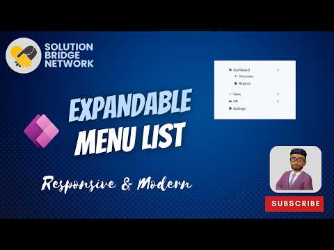
Power Apps: Responsive Expandable Menu
Microsoft Power Apps Canvas App responsive expandable sidebar menu with submenus for modern UX and reusable components
Key insights
- ExpandMenu: A responsive navigation control for Power Apps canvas apps that shows icons and labels and can expand or collapse to save screen space.
Use it to build a modern sidebar with smooth expand/collapse behavior. - Expanded and Collapsed states: The menu shows full labels when expanded and a compact icon rail when collapsed.
This improves discoverability when open and gives more content space when closed. - layout containers: Use horizontal and content containers to keep the menu and main area aligned as the menu changes width.
Containers prevent overlap and let the main content use leftover space reliably. - Basic sizing formula: bind the menu width to the expand state so it switches automatically (for example, wider when expanded, narrower when collapsed).
Adjust values for your target screen sizes to keep the layout responsive. - Key properties to control behavior include Items, IsExpanded, IsNavigationEnabled, DefaultExpandValue, and Width.
Use collections or variables for Items to manage submenus and navigation targets centrally. - Best practices: build submenus as reusable components, manage state with variables/collections, and follow a Fluent-inspired layout for consistent UX.
This approach speeds development and keeps navigation scalable for enterprise apps.
Solution Bridge Network released a practical tutorial video that shows how to build a responsive, expandable sidebar menu inside a Power Apps Canvas app. In a concise walkthrough, the creator demonstrates a dynamic navigation pattern that expands to show labels or collapses into an icon rail, which makes apps look modern while saving space. Reporters note that the video targets makers who want cleaner navigation on both desktop and mobile layouts, and it emphasizes reusability through components and simple data-driven menus. Overall, the clip mixes step-by-step guidance with design reasoning, making it useful for developers and business app builders alike.
Overview of the Video
The video by Solution Bridge Network starts with a clear goal: create an expandable menu with submenus inside a Canvas app from scratch. First, the presenter outlines the visual states—expanded and collapsed—and then moves into how to structure the menu data so items, icons, and target screens are driven by a collection. Next, the tutorial walks through building reusable components for the menu and its submenus, demonstrating how variables and collections control visibility and navigation. Finally, the video shares best practices that encourage consistent design and easier maintenance.
How the Expandable Menu Works
At the heart of the approach is the ExpandMenu concept, which toggles between two widths to change how much label text is visible. The presenter shows a common formula that uses the menu’s expanded state to set its width, so the main content container can adapt automatically. In addition, the tutorial explains how binding the control to a collection makes the menu items data-driven, which reduces repetitive UI work and supports hierarchical submenus. By combining layout containers with component-based design, the solution keeps the main canvas responsive and avoids overlapping controls when the menu changes size.
Tradeoffs and Challenges
Choosing a responsive expandable menu involves tradeoffs between discoverability and screen real estate. On one hand, an expanded menu improves discoverability because users see full labels; on the other hand, it costs horizontal space that could be used for forms and dashboards. Designers and developers must weigh which state to default to and how to handle intermediate viewports, because a one-size-fits-all width can hurt usability on small screens.
Implementing the pattern also raises technical challenges, such as maintaining consistent behavior across browsers and devices and managing performance when menus include many nested items. Using collections and component properties helps, but complex hierarchies can still require careful testing to keep navigation intuitive. In addition, the tutorial notes that ExpandMenu remains experimental in platform docs, which means makers should plan for changes in behavior or properties and avoid hard-coding critical logic into a single control.
Implementation Notes and Best Practices
The video recommends combining the expandable control with layout containers to keep positioning fluid as the menu width changes. Makers should use a width expression tied to the control’s expanded state, and they should let the main content use the remaining space so the UI does not leave gaps or overlap controls. Moreover, using a structured collection for menu items lets teams centralize navigation entries and update them without altering many controls.
For reuse and maintainability, the presenter suggests building the menu and submenu items as components that accept properties like item list, selected state, and navigation flags. This approach supports consistent styling and faster updates when business needs change. Finally, the video emphasizes simple state variables over complex formulas where possible, which helps other makers understand and modify the app later.
Who Should Use This Pattern and Final Takeaways
The pattern suits enterprise builders and makers who need scalable navigation for multi-screen apps, especially when users access the app on a mix of desktop and mobile devices. Beginners can follow the tutorial to learn practical Power FX techniques while more experienced developers will appreciate the focus on reusability and layout containers. However, teams should keep in mind the experimental status of some controls and test thoroughly to avoid surprises in production.
In summary, the Solution Bridge Network tutorial offers a measured, hands-on way to implement a responsive expandable menu in Power Apps. It balances design and technical advice, highlights tradeoffs, and provides clear steps to help makers create cleaner, more flexible navigation without rebuilding core behaviors from scratch.

Keywords
Power Apps responsive menu, Power Apps expandable menu, Power Apps navigation menu tutorial, Power Apps responsive layout design, Power Apps adaptive menu components, Power Apps collapsible menu tutorial, Power Apps UI navigation patterns, Power Apps menu responsive design